Exploring the Impact of Minimalism in Romance Book Covers
In recent years, the romance genre has witnessed a significant shift in cover design aesthetics. Publishers and independent authors alike have embraced a less is more approach, moving away from the traditional clinch covers and elaborate illustrations. This trend towards minimalism has gained traction, reflecting broader design movements across various industries.
The minimalist revolution in romance book covers can be traced back to the early 2010s, coinciding with the rise of e-books and self-publishing. As digital storefronts became crowded, authors sought ways to make their titles stand out in thumbnail-sized images. Simplified designs with bold typography and clean lines proved effective in catching readers’ eyes, even on small screens.
Major publishing houses soon took notice of this indie-led trend. They began experimenting with more understated cover designs, often featuring abstract patterns, single objects, or negative space. This departure from the genre’s visual tropes allowed romance novels to appeal to a broader audience, potentially attracting readers who might have been deterred by more explicit or clichéd cover art.
The influence of social media platforms, particularly Instagram, has also played a crucial role in the popularity of minimalist covers. Instagrammable book covers became a marketing strategy in themselves, with simple, aesthetically pleasing designs more likely to be shared and featured in curated feeds. This organic promotion has further fueled the minimalist trend in romance novel design.
Another factor contributing to the rise of minimalism is the desire to challenge stereotypes associated with the romance genre. By adopting more sophisticated and contemporary design elements, publishers aim to elevate the perception of romance literature and appeal to readers seeking a more mature or literary experience.
The minimalist approach has also allowed for greater flexibility in representing diverse stories within the romance genre. Instead of relying on character depictions that might not resonate with all readers, abstract or symbolic cover designs can convey themes and emotions more universally, making books more inclusive and accessible to a wider audience.
As the trend continues to evolve, we see variations within the minimalist style. Some covers incorporate a single, striking photographic element against a plain background, while others play with negative space and geometric shapes. Regardless of the specific execution, the emphasis remains on simplicity, elegance, and visual impact.
Color psychology in minimalist book covers
Color plays a crucial role in the effectiveness of minimalist romance book covers, often serving as the primary visual element that conveys mood, genre, and emotional tone. In the realm of minimalism, where design elements are stripped down to their essentials, the strategic use of color becomes even more significant.
Warm colors like reds, pinks, and oranges are frequently employed in romance novel covers to evoke passion, love, and desire. These hues can instantly communicate the genre to potential readers, even without traditional imagery. For instance, a simple red cover with minimal text can powerfully suggest a steamy romance, while softer pinks might indicate a sweeter, more tender love story.
Cool colors such as blues and purples are often used to convey depth, mystery, or sophistication in romance novels that might have elements of suspense or fantasy. These colors can add an air of intrigue or otherworldliness to a minimalist design, hinting at the story’s complexities beyond the romantic plot.
Neutral tones like beige, gray, or white are increasingly popular in minimalist romance covers, particularly for contemporary or literary romance. These colors can suggest elegance, maturity, and a more serious approach to the genre, potentially appealing to readers looking for romance with substance.
“Color is a power which directly influences the soul.” – Wassily Kandinsky
This quote from the renowned artist Kandinsky underscores the profound impact that color can have on human emotions and perceptions, a principle that designers of minimalist romance covers leverage to great effect.
The use of color gradients or color blocking in minimalist designs can add depth and visual interest while maintaining simplicity. A subtle gradient from light to dark can create a sense of progression or transformation, mirroring the character development often found in romance narratives.
Contrast plays a vital role in minimalist color schemes. A bold, single-color background with contrasting text can create a striking visual that stands out in both physical and digital marketplaces. This high-contrast approach ensures that the cover remains impactful even when viewed as a small thumbnail image online.
Publishers and designers are also experimenting with unexpected color choices to differentiate titles within the saturated romance market. Non-traditional colors for the genre, such as greens or yellows, can pique curiosity and suggest unique storylines or fresh takes on romantic themes.
The psychology of color extends beyond individual hues to color combinations. Complementary colors can create vibrant, eye-catching designs, while analogous color schemes can evoke harmony and balance. These color relationships can subtly communicate the nature of the romantic relationship within the story.
Seasonal color trends also influence minimalist romance cover designs, with publishers often aligning their color choices with current fashion and design trends to ensure covers feel contemporary and relevant.
As the minimalist trend in romance book covers continues to evolve, the strategic use of color remains a powerful tool for conveying emotion, attracting readers, and differentiating titles in a competitive market. The careful selection of hues, tones, and color combinations allows designers to create covers that are both visually striking and rich in meaning, all while adhering to the principles of minimalist design.
Typography and its role in minimal cover designs
 Typography in minimalist romance book covers plays a pivotal role in conveying the essence of the story and capturing the reader’s attention. In the absence of elaborate imagery, the choice of font, size, and placement of text becomes paramount in communicating the book’s genre, tone, and emotional appeal.
Serif fonts, with their classic and elegant appearance, are often employed to evoke a sense of timelessness and sophistication in romance novels. They can lend an air of literary quality to the cover, appealing to readers seeking a more refined romantic narrative. On the other hand, sans-serif fonts are frequently used for their clean, modern look, which aligns well with contemporary romance or stories set in urban environments.
The weight of the font is another crucial consideration. Bold, heavy typefaces can convey passion, intensity, and drama, while lighter, more delicate fonts might suggest a gentler, more nuanced love story. Designers often play with font weight to create contrast and hierarchy, drawing the eye to the most important elements of the cover, typically the title and author’s name.
Font pairing is an art in itself, with designers carefully selecting complementary typefaces to create visual interest without cluttering the minimalist design. A common approach is to use a bold, eye-catching font for the title and a simpler, more readable font for the author’s name and any taglines.
The placement and layout of text on minimalist covers are equally important. Centered text often conveys a sense of balance and harmony, while asymmetrical layouts can add dynamism and intrigue. Some designers opt for unconventional text orientations, such as vertical or diagonal placements, to create a unique visual impact that stands out on bookshelves or in digital marketplaces.
Negative space, a hallmark of minimalist design, is used strategically in typography to enhance readability and create a sense of elegance. The judicious use of white space around text elements can make the cover feel more open and inviting, allowing the words to breathe and command attention.
Custom lettering and hand-drawn typography have gained popularity in minimalist romance covers, adding a personal touch and uniqueness that can set a book apart in a crowded market. These bespoke typefaces can convey emotion and character in ways that standard fonts cannot, often becoming a visual representation of the story’s tone or the author’s brand.
Typography can also be used to create texture and depth in minimalist designs. Techniques such as embossing, debossing, or foil stamping can add a tactile element to physical book covers, enhancing the overall sensory experience for the reader.
The interplay between typography and color is crucial in minimalist covers. Designers must ensure that the text is legible against the background color while maintaining the desired aesthetic. High contrast between text and background colors can create bold, striking covers, while more subtle color combinations can evoke a sense of sophistication or mystery.
As technology advances, some designers are experimenting with animated typography for e-book covers, adding a dynamic element that can captivate potential readers scrolling through online bookstores.
The power of typography in minimalist romance book covers lies in its ability to convey complex emotions and themes through simple, elegant design choices. By carefully selecting and arranging typefaces, designers can create covers that not only attract the eye but also resonate with the reader on an emotional level, enticing them to delve into the pages within.
As we consider the impact of typography on minimalist romance covers, it’s worth pondering: How much can a font choice influence our perception of a story before we’ve read a single word? How do these design decisions shape our expectations and experiences as readers? These questions invite us to look more closely at the books we encounter, appreciating the artistry and intention behind every typographic choice.
Reader perception and sales impact of minimalist covers
The shift towards minimalist cover designs in romance novels has significantly influenced reader perception and purchasing behavior. As readers increasingly encounter these simplified covers, their expectations and preferences have evolved, leading to notable impacts on sales and market trends.
Minimalist covers have been found to broaden the appeal of romance novels to a wider audience. By moving away from stereotypical imagery, these designs attract readers who might have previously felt self-conscious about being seen with traditional romance covers. This expanded readership has opened up new market segments and contributed to increased sales in some cases.
Studies have shown that minimalist covers can enhance the perceived literary value of romance novels. Readers often associate these sleek designs with more sophisticated content, leading to a shift in the genre’s reputation. This perception change has encouraged some readers to explore romance titles they might have otherwise overlooked, potentially boosting sales in the literary fiction crossover market.
The simplicity of minimalist covers has proven particularly effective in the digital marketplace. With many readers discovering books through small thumbnail images on e-commerce platforms, clean and bold designs stand out more effectively. This increased visibility in online stores has translated to higher click-through rates and, consequently, improved sales for many titles featuring minimalist covers.
However, the impact on sales is not uniformly positive across all segments of the romance market. Some dedicated romance readers express a preference for traditional cover art, feeling that minimalist designs fail to convey the emotional depth or specific subgenre elements they seek. This divide in reader preference has led some publishers to adopt a dual approach, offering different cover designs for print and digital versions of the same book.
Minimalist covers have also influenced reader expectations regarding content. The subtlety of these designs often leads readers to anticipate more nuanced or character-driven stories, which can sometimes result in disappointment if the content doesn’t align with these expectations. This mismatch between cover and content has prompted discussions within the industry about the importance of authentic representation in book design.
The trend has sparked creativity in book marketing strategies. With less reliance on cover art to convey a book’s essence, publishers and authors have had to innovate in their promotional efforts. This has led to more engaging book descriptions, creative social media campaigns, and an increased focus on author branding to complement the minimalist aesthetic.
Reader engagement with minimalist covers on social media platforms has become a significant factor in sales impact. The clean, aesthetically pleasing designs are more likely to be shared and featured in reader posts, creating organic marketing opportunities. This increased visibility on platforms like Instagram and Pinterest has contributed to the discovery of new titles and authors, often translating to improved sales figures.
The minimalist trend has also influenced reader behavior in physical bookstores. The distinctive look of these covers makes them easily identifiable on shelves, often drawing the eye more quickly than busier designs. Booksellers report that minimalist covers frequently prompt readers to pick up and examine books they might not have noticed otherwise, potentially leading to impulse purchases.
As the market continues to adapt to this design trend, publishers are closely monitoring sales data and reader feedback to refine their approach to minimalist covers. The ongoing challenge lies in striking a balance between artistic innovation, market appeal, and accurate representation of the book’s content to ensure sustained positive impacts on reader perception and sales in the ever-evolving romance genre.


 The interplay between light and texture on book covers creates a powerful synergy that can instantly communicate genre, mood, and narrative themes to potential readers. This dynamic combination allows designers to craft multi-layered visual experiences that engage the viewer on both conscious and subconscious levels.
 Visual imagery and symbolism are powerful tools in book cover design, capable of instantly conveying complex emotions and themes. A well-chosen image or symbol can encapsulate the essence of a book, creating an immediate emotional connection with potential readers. When selecting imagery, designers must consider not only the literal representation of the book’s content but also the underlying emotions and ideas they wish to evoke.
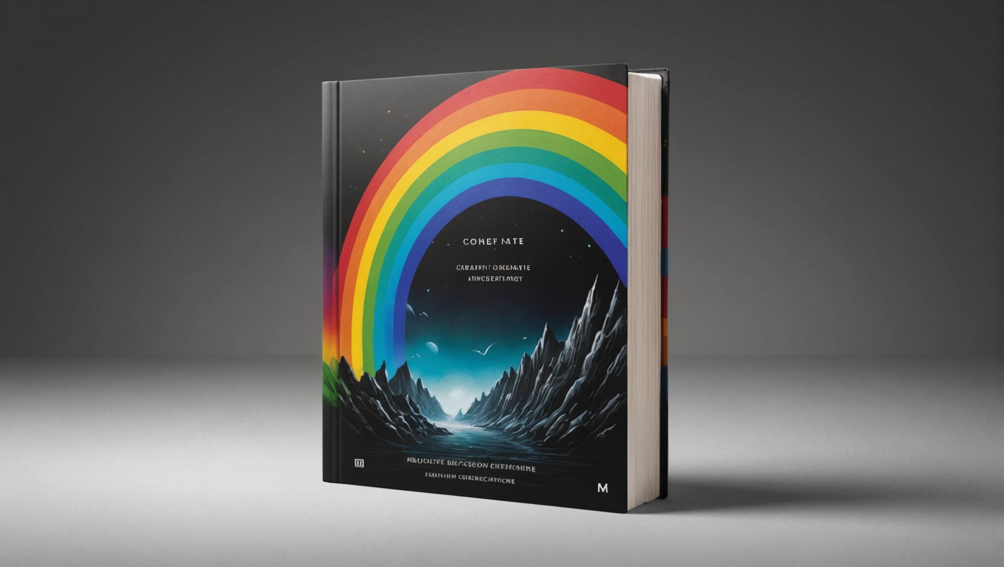 Colors have a profound impact on human emotions and decision-making processes, making them a powerful tool in book cover design. Understanding and leveraging color psychology can help your cover evoke specific feelings and attract your target audience.
 When it comes to character representation across a book series, consistency is key to maintaining a strong brand image and fostering reader connection. Characters are often the heart of a story, and their visual representation on book covers can significantly impact how readers perceive and remember the series.
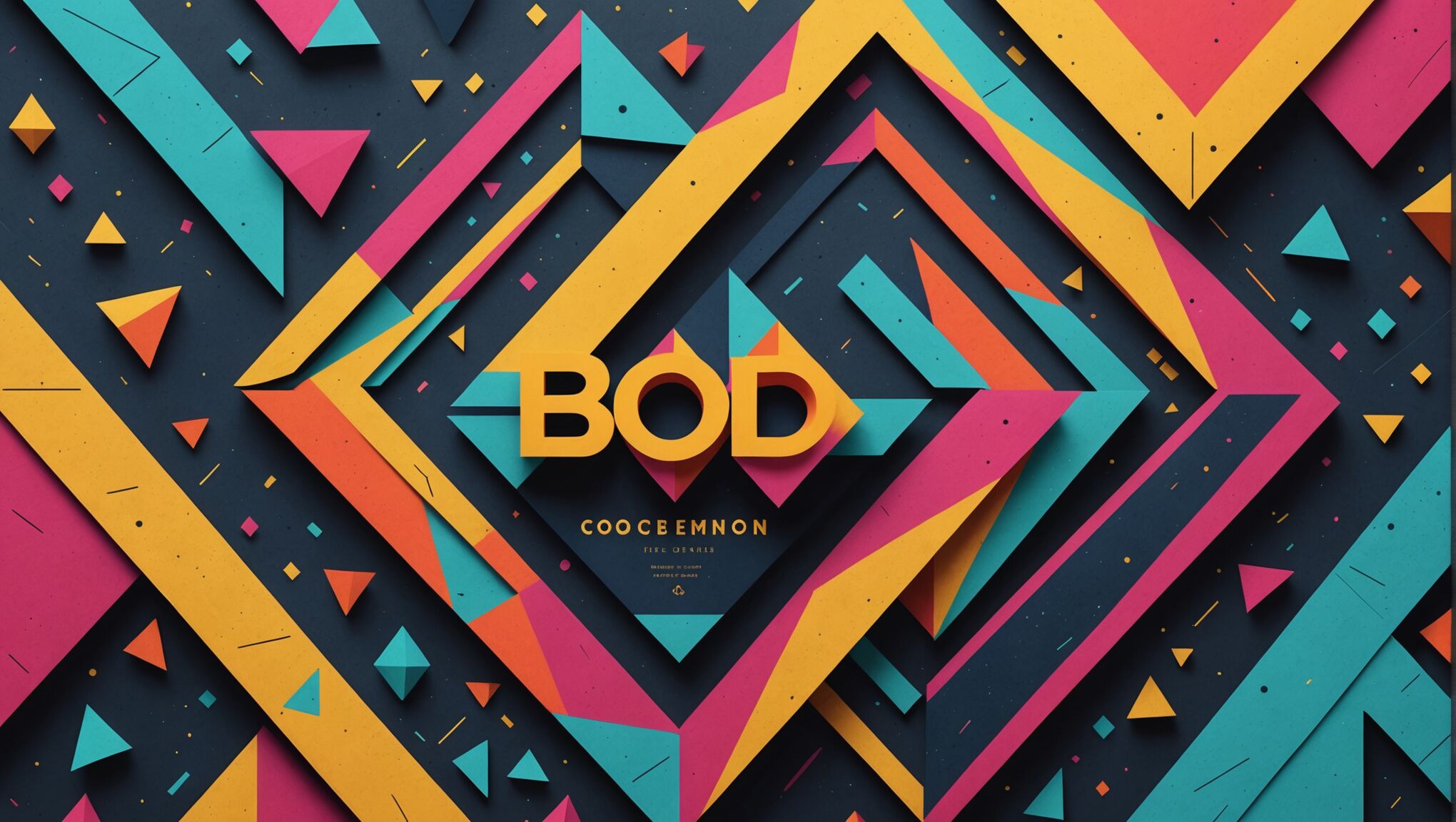
 Repetitive patterns have become a powerful tool in modern book cover design, offering a way to create visual texture and depth that can instantly captivate potential readers. By skillfully employing these patterns, designers can evoke specific moods, suggest themes, and add a layer of complexity to the overall aesthetic.
 When it comes to creating a captivating book cover, image editing and manipulation tools are indispensable. These powerful software options allow you to transform ordinary photographs or illustrations into eye-catching visual elements that can make your book stand out on the shelves or in digital marketplaces.
 The delicate balance between text and imagery on a book cover is crucial in creating a design that is both visually appealing and informative. This equilibrium can make the difference between a cover that captivates potential readers and one that fails to make an impact. Designers must navigate the challenging task of conveying essential information while maintaining an aesthetically pleasing composition.
 Striking the right balance between abstract and figurative elements in fantasy and romance cover design is a delicate art that requires careful consideration and artistic finesse. This harmony can create a visually compelling cover that both intrigues potential readers and accurately represents the book’s content.
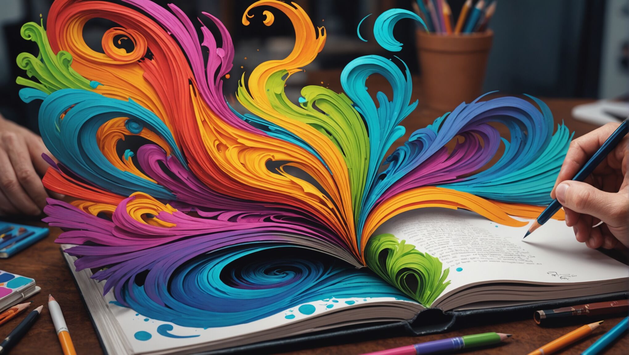 Once a concept has been selected from the array of rough sketches and ideas, the refinement process begins in earnest. This stage is where the chosen design evolves from a rough outline into a polished, professional cover that accurately represents the book and appeals to its target audience.