Skip to content

Adding Subtle Details to Create Mystery in Fantasy Covers

Adding Subtle Details to Create Mystery in Fantasy Covers

Fantasy book covers are a gateway to the magical worlds within, and clever use of symbolism can entice readers while hinting at deeper mysteries. Artists often weave subtle visual clues into their designs, rewarding attentive observers with hidden meanings and foreshadowing. A seemingly innocuous object in the foreground might represent a character’s inner struggle or a pivotal plot point. For instance, a partially obscured hourglass could suggest time manipulation or impending doom. Alchemical symbols are particularly effective in fantasy cover art, adding an air of arcane knowledge and mysticism. These esoteric signs can be discreetly incorporated into borders, clothing patterns, or even integrated into landscape elements.

Color symbolism plays a crucial role in conveying mood and themes. A predominance of purple might hint at royalty or magic, while a splash of red could signify danger or passion. Artists can use this to their advantage, creating visual paradoxes that pique curiosity. For example, a serene blue backdrop punctuated by a single, vibrant red object can immediately draw the eye and suggest conflict. “Visual storytelling” through symbolism extends to character positioning and interactions as well. A figure turning away from the viewer or obscured by shadow can imply secrets or a hidden identity, while intertwined elements like vines or smoke can represent complex relationships or interconnected destinies.

Incorporating mythological references adds another layer of intrigue for knowledgeable readers. A discreet Ouroboros symbol might hint at cycles or eternity, while a subtle nod to classical creatures like the Phoenix could suggest themes of rebirth. These elements not only enrich the cover’s visual appeal but also provide a satisfying “aha” moment for those who recognize the references. By carefully selecting and placing symbolic elements, cover artists can create a visual puzzle that mirrors the mystery within the book, inviting potential readers to unravel the enigma before they even open the first page.

Atmospheric elements to evoke intrigue

Atmospheric elements play a crucial role in evoking intrigue on fantasy book covers. The skilled use of mist, fog, or smoke can create an air of mystery, obscuring parts of the scene and leaving viewers to wonder what lies beyond. These ethereal elements not only add depth to the composition but also suggest the presence of magic or otherworldly forces at work. A thin veil of mist rising from the ground can transform an ordinary forest into an enchanted grove, while wisps of smoke curling around a character can hint at hidden powers or a looming threat.

Lighting effects are equally powerful in setting an intriguing mood. A cover bathed in the soft glow of twilight immediately creates a sense of the in-between, a time when anything might happen. Alternatively, a single beam of light piercing through darkness can draw the eye to a focal point while leaving the surroundings shrouded in mystery. Artists can use dramatic backlighting to create silhouettes, leaving the viewer to imagine the details of a character or creature.

Weather elements can also contribute to the atmosphere of intrigue. A storm brewing on the horizon suggests impending conflict or danger, while a swirling vortex of leaves or snow can imply magical forces at play. Even subtle details like a light drizzle or the suggestion of a breeze through long grass can add movement and life to a static image, inviting the viewer to imagine what’s causing these effects.

“The task of the artist is to make the human being uncomfortable.” – Lucian Freud

This quote from Lucian Freud resonates with the goal of creating intrigue in fantasy cover art. By incorporating unsettling or mysterious atmospheric elements, artists can create a sense of discomfort that compels viewers to look closer and question what they see.

Color palettes are instrumental in setting the tone and evoking emotion. Deep, rich hues like midnight blues, forest greens, and burgundies can create a sense of depth and hidden secrets. Conversely, using unexpected pops of vibrant color against a muted background can create visual tension and draw attention to specific elements. The interplay of warm and cool tones can suggest conflict or duality within the story.

Texture in atmospheric elements adds another layer of intrigue. The rough edges of storm clouds, the smooth surface of still water reflecting a mysterious sky, or the grainy quality of sand being blown by desert winds can all contribute to the sensory experience of the cover. These textures invite the viewer to imagine how the world feels, not just how it looks.

By carefully orchestrating these atmospheric elements, cover artists can create a sense of wonder and mystery that entices potential readers. The goal is to present a world that feels alive and full of secrets, prompting viewers to pick up the book and discover what lies within those intriguing pages.

Texture and layering techniques for depth

Adding Subtle Details to Create Mystery in Fantasy CoversTexture and layering techniques are powerful tools in the arsenal of fantasy cover artists, allowing them to create depth and intrigue that goes beyond surface-level imagery. By skillfully combining various textures and layers, artists can craft a visual experience that invites viewers to explore the cover as if it were a portal to the fantasy world itself.
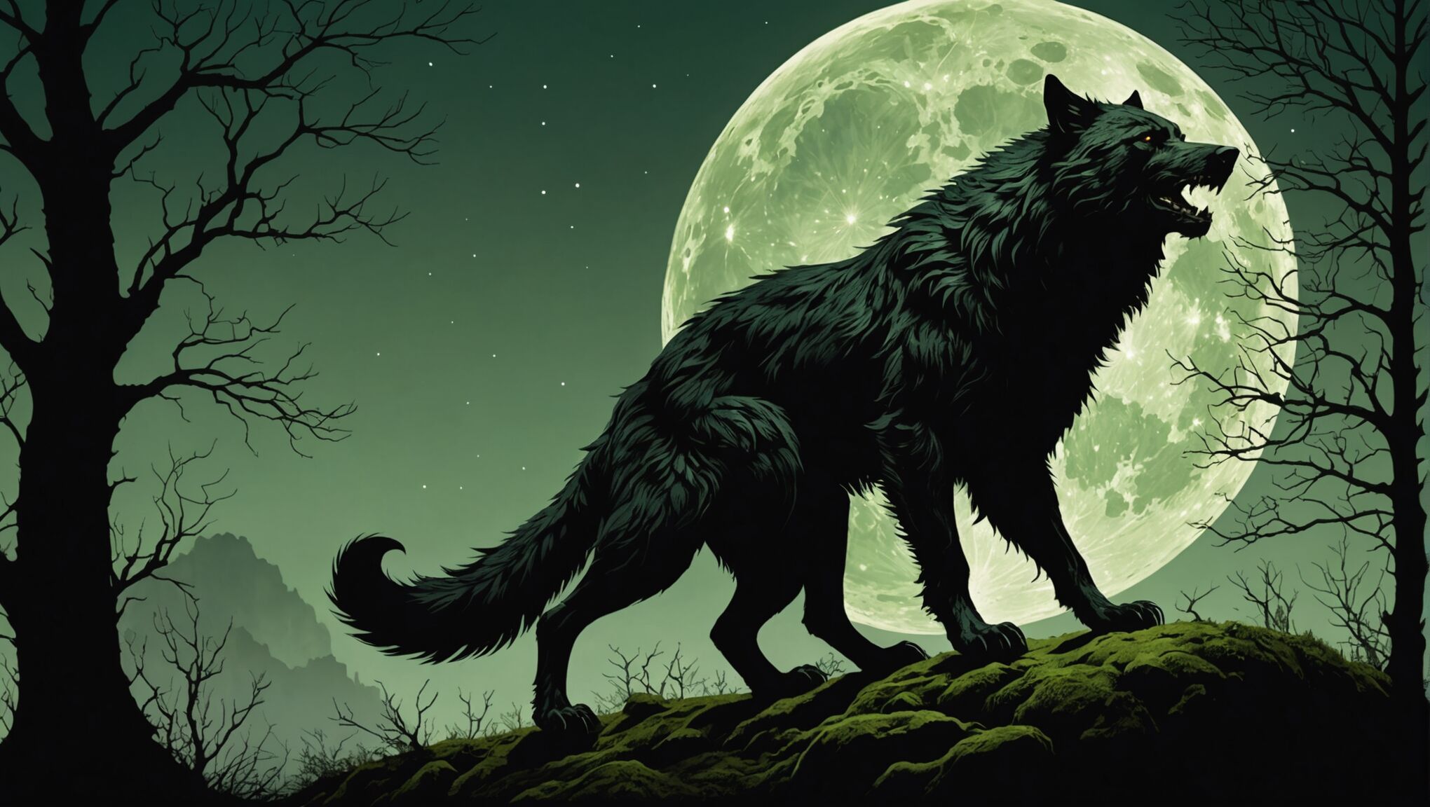
One effective technique is the use of translucent overlays. By applying semi-transparent layers of color or texture, artists can create the illusion of mist, magic, or ethereal energy. This not only adds depth but also obscures certain elements, leaving room for the imagination to fill in the gaps. The interplay between visible and hidden elements mirrors the mysteries within the story, enticing potential readers to uncover what lies beneath.

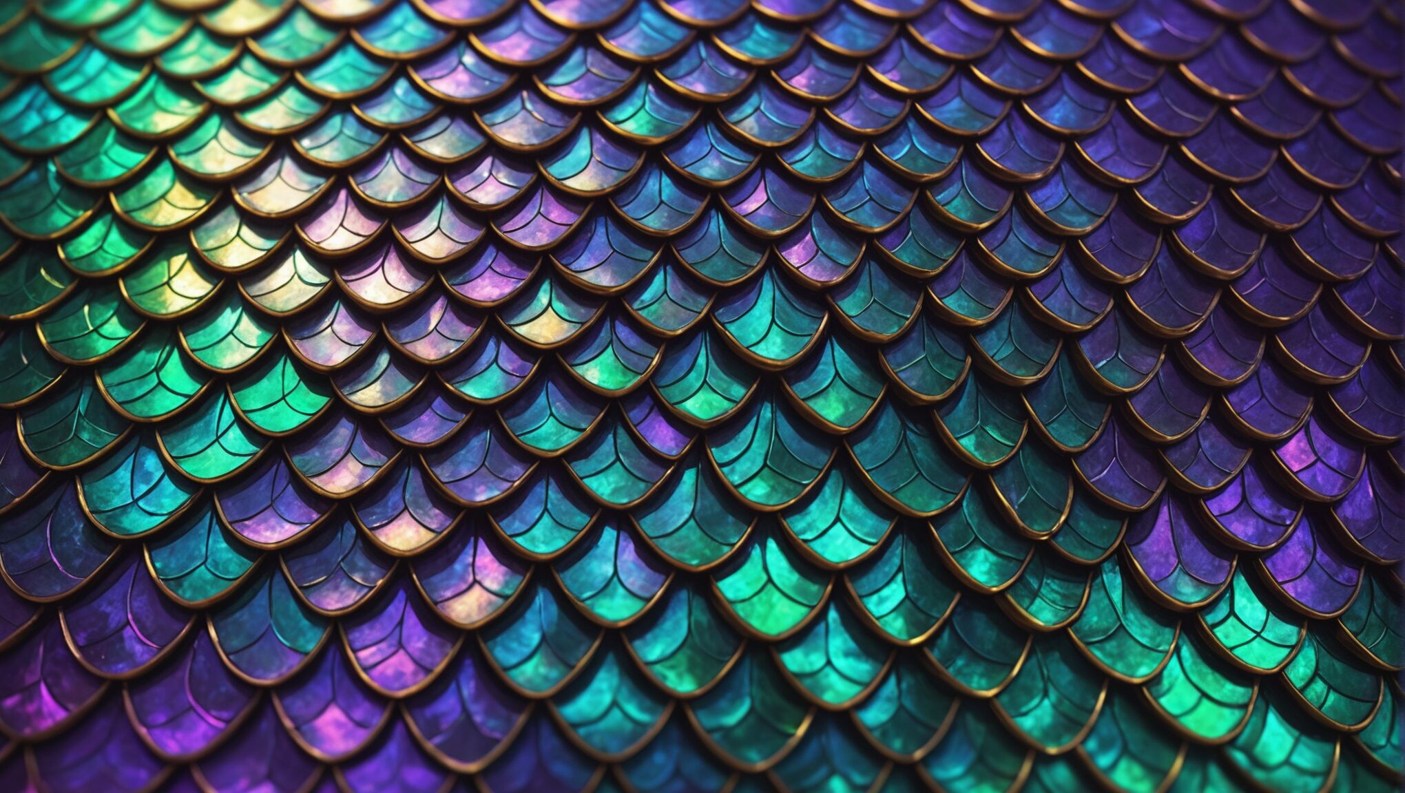
Textural contrasts can also be employed to great effect. Juxtaposing smooth, polished surfaces with rough, organic textures can create visual interest and suggest the coexistence of different realms or forces within the narrative. For instance, a sleek, metallic dragon scale placed against a backdrop of gnarled tree bark can hint at the clash between technology and nature, or the ancient and the modern.

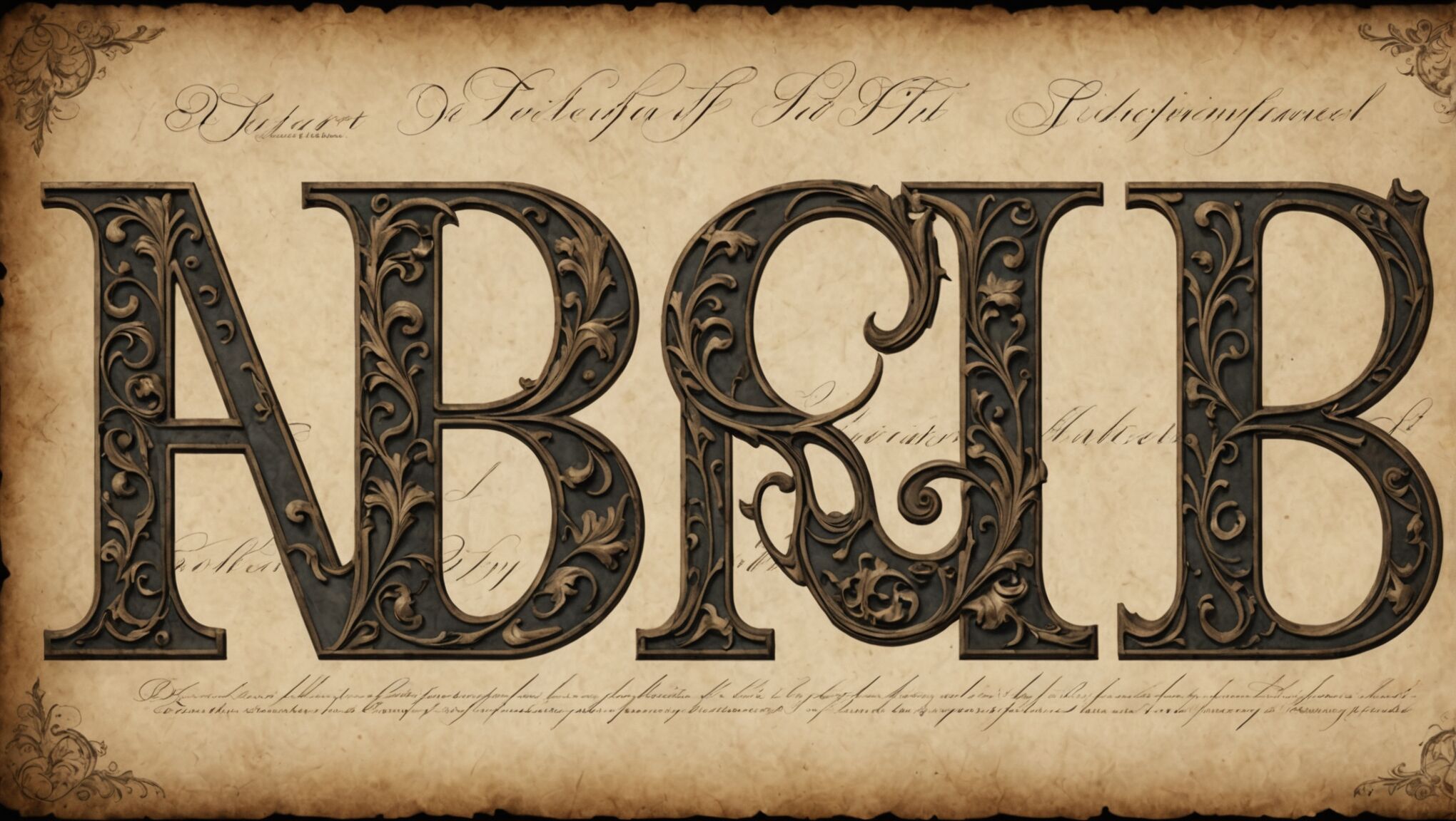
Digital artists often utilize custom brushes to add unique textures that evoke specific materials or atmospheres. A brush that mimics the look of weathered parchment can lend an air of antiquity to certain elements, while one that creates a starry effect can suggest magic or cosmic forces at play. By layering these textures thoughtfully, artists can guide the viewer’s eye through the composition while revealing subtle details with each pass.

The technique of parallax layering, where foreground and background elements move at different rates, can create a sense of depth even in a static image. This can be achieved through careful placement of objects at various distances from the viewer, with closer elements rendered in sharper detail and more saturated colors. When done skillfully, this technique can make a cover feel almost three-dimensional, inviting the viewer to step into the scene.

Another powerful method is the use of fractal patterns and recursive designs. These complex, self-similar structures can suggest infinite depth and otherworldly geometry. When incorporated subtly into landscapes or magical effects, fractals can create a sense of wonder and the unknowable, perfect for fantasy settings that operate on different laws of physics or reality.

Texture mapping on 3D elements within a 2D composition can add incredible depth and realism. By applying detailed textures to sculpted forms, artists can create characters or objects that seem to leap off the page. This technique is particularly effective for depicting intricate armor, scaled creatures, or weathered stone structures that form part of the cover’s focal points.

The layering of different artistic styles within a single composition can also create intrigue. Combining photorealistic elements with more stylized or abstract components can suggest different levels of reality or perception within the story. This technique can be particularly effective in representing dreams, visions, or magical transformations.

As you consider these techniques, ask yourself: How might layering and texture be used to represent the themes of your story visually? What hidden details could you incorporate that would reward close inspection and repeated viewing? How can the interplay of textures evoke the sensory experiences described in your narrative?

Remember, the goal is not just to create a visually appealing image, but to construct a multi-layered visual puzzle that reflects the depth and complexity of the story within. By mastering these techniques, cover artists can create works that are not just illustrations, but gateways to imagination that beckon readers to explore further.

Strategic use of shadow and light

Mastering the interplay of shadow and light is crucial for creating an air of mystery in fantasy cover art. By strategically manipulating these elements, artists can guide the viewer’s eye, conceal or reveal key details, and evoke a sense of the unknown. Deep, elongated shadows can stretch across a landscape, hinting at unseen figures or looming threats. Conversely, a burst of light emerging from darkness can suggest hope, magic, or a sudden revelation within the story.

Chiaroscuro, the strong contrast between light and dark, is a powerful technique for adding drama and intrigue. This approach can be used to create stark silhouettes that leave much to the imagination or to highlight specific elements while shrouding others in darkness. For instance, a character’s face partially illuminated by a magical glow can simultaneously reveal and conceal their identity, prompting viewers to question who they are and what secrets they might hold.

The direction of light sources can also contribute to the mysterious atmosphere. Backlighting can create dramatic silhouettes, while side lighting can accentuate textures and create intriguing shadows. Unusual light sources, such as glowing artifacts or ethereal beings, can cast otherworldly illumination that defies natural laws, immediately signaling the presence of magic or supernatural elements.

Gradients of light and shadow can be employed to suggest depth and distance, drawing the viewer into the scene. A misty forest gradually fading from light to dark can imply hidden dangers or undiscovered realms lying in wait. Similarly, a beam of light cutting through darkness can create a path that leads the eye to a focal point while leaving the surrounding areas shrouded in mystery.

Artists can also use light and shadow to create visual metaphors. Dappled light filtering through leaves might represent the interplay between reality and illusion, while harsh shadows with crisp edges could symbolize the stark choices faced by characters. The careful placement of highlights can draw attention to significant objects or characters without overtly revealing their importance, inviting viewers to speculate on their role in the story.

The color temperature of light can significantly impact the mood and mystery of a cover. Cool, bluish light might evoke a sense of otherworldliness or danger, while warm, golden tones could suggest hidden treasures or ancient magic. By combining different color temperatures, artists can create visual tension that mirrors the conflicts within the narrative.

Reflections and refractions of light can add another layer of intrigue. A distorted reflection in water or a warped image seen through a crystal ball can hint at alternate realities or prophecies yet to unfold. These elements can be subtle nods to the complexity of the fantasy world, encouraging viewers to look closer and contemplate the deeper meanings.

The absence of light can be just as powerful as its presence. Negative space created by deep shadows can form shapes that tell their own stories or hide secrets within their outlines. This technique can be particularly effective in creating optical illusions that reward careful observation and multiple viewings.

By thoughtfully applying these techniques of shadow and light, cover artists can create images that not only capture the essence of the fantasy within but also engage viewers in a visual dialogue, inviting them to unravel the mysteries before they even open the book.

The Impact of Iconography on Romance Cover Appeal

The Impact of Iconography on Romance Cover Appeal

Romance novel covers are a vibrant tapestry of visual elements designed to captivate potential readers and convey the essence of the story within. These covers typically feature a rich palette of colors, with bold hues like deep reds, royal purples, and passionate pinks dominating the scene. The composition often centers around one or two main figures, usually depicting the romantic leads in various stages of embrace or longing gazes. Body language and facial expressions play a crucial role in communicating the emotional intensity and chemistry between the characters.

Background settings are carefully chosen to reflect the novel’s subgenre, whether it’s a sun-drenched beach for a summer romance, a misty castle for a historical bodice-ripper, or a sleek cityscape for a contemporary love story. Typography also plays a significant part, with the author’s name and book title often presented in elaborate, eye-catching fonts that complement the overall design. Embellishments such as swirls, flowers, or genre-specific motifs (like cowboy hats for Western romances) frequently adorn the edges of the cover, adding to its allure.

Lighting effects are employed to create mood and atmosphere, with soft, diffused glows for tender moments or dramatic chiaroscuro for more intense, passionate scenes. The “clinch” cover, featuring the main couple in a passionate embrace, has long been a staple of the genre, though recent trends have seen a move towards more subtle and diverse representations. Negative space is often used strategically to draw focus to key elements or to create a sense of mystery and intrigue. Together, these visual components work in harmony to create an immediate emotional connection with the target audience, promising the fulfillment of romantic fantasies within the pages of the book.

Evolution of romance cover iconography

Over the decades, romance cover iconography has undergone a significant transformation, reflecting changing societal norms, reader preferences, and publishing industry trends. In the 1970s and 1980s, the “bodice-ripper” era dominated, characterized by covers featuring Fabio-esque male models with flowing hair and muscular physiques, often paired with swooning heroines in various states of undress. These covers were bold, unapologetic, and sometimes controversial, yet they played a crucial role in establishing the visual language of the genre.

The covers are a kind of code. They’re not just a marketing device; they’re integral to the experience of reading a romance novel. – Sarah Wendell, co-founder of Smart Bitches, Trashy Books

As the 1990s progressed, a shift towards more sophisticated and diverse imagery began to emerge. Covers started to incorporate elements of mystery and suspense, moving away from the overt sensuality of previous decades. The new millennium brought about a revolution in digital design techniques, allowing for more complex and nuanced cover art. Photorealistic images replaced hand-painted illustrations, and a broader range of ethnicities and body types began to appear on covers, reflecting a growing demand for representation in romance literature.

The rise of paranormal romance in the early 2000s introduced a whole new iconography to the genre, with covers featuring otherworldly creatures, mystical symbols, and dark, brooding atmospheres. Urban fantasy elements blended with traditional romance imagery, creating a unique visual style that appealed to a younger, more diverse readership.

In recent years, there has been a notable trend towards minimalism and abstraction in romance cover design. Many contemporary covers opt for symbolic representations rather than figurative imagery, using bold typography, simple illustrations, or evocative objects to convey the essence of the story. This shift has been particularly pronounced in the growing new adult and LGBTQ+ romance subgenres, which often eschew traditional romance cover tropes in favor of more modern, inclusive designs.

The advent of e-books and self-publishing has also had a profound impact on romance cover iconography. Digital-first covers tend to be bolder and more eye-catching, designed to stand out as thumbnails on online retailer sites. This has led to a resurgence of high-contrast images, vivid colors, and large, legible text.

Social media and online marketing have further influenced cover design, with publishers creating covers that are not only attractive on bookstore shelves but also “Instagram-worthy” and shareable across various platforms. This has resulted in more visually striking and memorable designs that can serve as effective marketing tools in the digital age.

The evolution of romance cover iconography continues to reflect broader cultural shifts and changing reader expectations. While some classic elements persist, the genre’s visual language is constantly adapting, embracing new styles and representations to appeal to an ever-diversifying readership.

Symbolism and reader expectations

The Impact of Iconography on Romance Cover AppealSymbolism in romance novel covers plays a crucial role in shaping reader expectations and creating an immediate emotional connection with potential buyers. These visual cues serve as a shorthand language, communicating genre conventions, story themes, and even the intensity of the romantic relationship within the pages.

One of the most prevalent symbols in romance cover art is the rose, which has long been associated with love and passion. Its presence on a cover can indicate a classic love story, while its color—red for passion, white for purity, or pink for tenderness—can provide further insight into the novel’s tone. Similarly, other flowers like lilies or orchids might suggest more exotic or sophisticated romances.

The use of hearts, whether subtle or overt, is another common symbolic element. A single heart might represent a straightforward love story, while intertwined or broken hearts could hint at more complex relationship dynamics. Chains or locks often symbolize forbidden love or emotional barriers that must be overcome, appealing to readers who enjoy stories of forbidden romance or emotional growth.

Natural elements like stormy skies, calm seas, or lush forests can set the mood and hint at the story’s setting or emotional landscape. A tempestuous ocean might suggest a tumultuous relationship, while a serene lake could imply a more gentle, slow-burning romance. Mountains or cliffs can represent challenges the characters must overcome together.

Certain objects carry specific connotations within the genre. A wedding ring or bridal veil suggests a marriage plot, while a clock or hourglass might indicate a time-travel romance or a story dealing with second chances. For historical romances, period-specific items like quills, corsets, or swords immediately transport the reader to a different era.

Color psychology plays a significant role in creating reader expectations. Deep reds and purples are often associated with passion and luxury, making them popular choices for steamy romances or stories set in high society. Softer pastels might indicate a sweet, wholesome romance, while darker, moodier tones could suggest a romantic suspense or paranormal element.

The positioning and body language of characters on the cover are perhaps the most potent symbols of all. A couple facing each other implies a focus on their relationship, while characters looking away from each other or separated by visual elements might hint at conflict or obstacles to overcome. The level of physical contact between characters—from a chaste hand-holding to a passionate embrace—can set expectations for the heat level of the romance within.

Typography and font choices also carry symbolic weight. Flowing, script-like fonts often suggest a more traditional or historical romance, while bold, modern typefaces might indicate a contemporary or edgy story. The size and placement of the author’s name versus the title can symbolize whether the book is being marketed based on the author’s reputation or the story’s concept.

For paranormal romances, symbolic elements like fangs, wings, or glowing eyes serve as immediate indicators of the supernatural elements readers can expect. Urban fantasy romances might incorporate cityscapes or modern weapons alongside these paranormal symbols, creating a unique blend of contemporary and fantastical imagery.

LGBTQ+ romances often employ rainbow colors or gender symbols to clearly communicate the nature of the relationship within, helping readers quickly identify stories that represent their interests.

As readers become more visually literate in the language of romance covers, their expectations are increasingly shaped by these symbolic elements. A savvy reader can often deduce not only the subgenre but also the tone, heat level, and even potential plot points from a well-designed cover. This creates a sort of visual contract between the publisher and the reader, setting expectations that the story aims to fulfill.

However, it’s important to consider how these symbols and the expectations they create might limit the diversity of stories being told or marketed within the romance genre. As the industry evolves, there’s an ongoing dialogue about expanding the symbolic language of romance covers to be more inclusive and representative of a wider range of love stories.

By understanding and analyzing these symbols, readers can develop a more critical eye for the messages conveyed by romance cover art. This awareness can lead to a deeper appreciation of the artistry involved in cover design and a more nuanced understanding of how marketing shapes our reading choices. It also raises intriguing questions about the interplay between art, commerce, and storytelling in the romance genre.

Marketing implications of cover imagery

Cover imagery plays a pivotal role in the marketing of romance novels, serving as a powerful tool to attract readers and communicate key aspects of the story. Publishers and authors invest considerable resources in crafting covers that not only catch the eye but also resonate with their target audience. The imagery chosen can significantly influence a book’s sales potential and readership.

One of the primary marketing implications of cover imagery is its ability to instantly convey genre and subgenre. A glance at a cover should immediately tell potential readers whether they’re looking at a contemporary romance, a historical bodice-ripper, or a paranormal love story. This quick identification helps readers find books that match their preferences, increasing the likelihood of a purchase.

Cover imagery also plays a crucial role in brand recognition. Established authors often have a consistent style or theme across their book covers, creating a visual brand that loyal readers can easily spot. This branding can extend to series within an author’s work, with cohesive design elements tying multiple books together and encouraging readers to collect the entire set.

The emotional appeal of cover imagery cannot be overstated in its marketing impact. Covers are designed to evoke specific feelings and desires in potential readers, promising the fulfillment of romantic fantasies. A cover that successfully taps into these emotions can create an immediate connection with the viewer, prompting them to pick up the book or click on the digital thumbnail.

In the digital age, cover imagery has taken on new significance in online marketing. Covers must now be designed to be visually striking even when reduced to thumbnail size on e-commerce platforms. This has led to bolder designs, larger text, and simpler imagery that remains impactful at smaller scales. Additionally, covers that are visually appealing and “shareable” on social media can generate organic marketing through reader posts and recommendations.

The diversity and representation depicted in cover imagery have become increasingly important marketing considerations. Publishers are recognizing the demand for covers that reflect a wider range of ethnicities, body types, and relationship dynamics. Inclusive cover art can appeal to previously underserved market segments and demonstrate a publisher’s commitment to diversity, potentially attracting a broader readership.

Cover imagery also plays a role in positioning a book within the market. High-end, sophisticated designs might target readers looking for a more literary romance experience, while bold, sensual imagery might appeal to those seeking steamier content. The style and quality of the cover art can influence perceptions of the book’s value and intended audience.

Seasonal and trend-based marketing strategies often rely heavily on cover imagery. Publishers may adjust cover designs to align with holiday themes or current pop culture trends, making books more attractive as seasonal purchases or capitalizing on broader cultural moments.

The versatility of digital publishing allows for A/B testing of cover designs, enabling publishers to gauge reader response and optimize their marketing approach. This data-driven method can lead to more effective cover designs that resonate with the target audience and potentially increase sales.

Lastly, cover imagery can be a powerful tool in cross-promotion and merchandising. Memorable cover art can be leveraged for promotional materials, merchandise, and tie-in products, extending the book’s brand beyond the pages and creating additional revenue streams.

The marketing implications of cover imagery in romance novels are far-reaching and multifaceted. From genre identification and emotional appeal to digital optimization and brand building, cover art serves as a critical component in the overall marketing strategy for romance publications. As the industry continues to evolve, the thoughtful use of cover imagery remains an essential factor in capturing reader attention and driving book sales in a competitive market.

Top Color Trends for Romance Covers in 2024

Top Color Trends for Romance Covers in 2024

The romance book cover landscape is set to explode with vivacious colors in 2024, captivating readers’ attention and igniting their passion for love stories. Deep, rich reds are making a powerful comeback, symbolizing intense emotions and fiery relationships. These crimson tones are often paired with contrasting whites or golds to create striking visual impact. Alongside red, electric blues are surging in popularity, representing depth, mystery, and the vastness of love. These azure hues are particularly effective for beach romances and summer flings. Emerald greens are also gaining traction, evoking feelings of growth, renewal, and the lushness of romantic settings. “Color is the silent language of book covers,” says renowned cover designer Emma Lawson. “It speaks volumes before a single word is read.” Vibrant purples are making waves too, adding a touch of royalty and luxury to historical romances and contemporary billionaire tales. Yellow, in its brightest forms, is being used to convey joy, optimism, and the lighthearted side of love, perfect for romantic comedies. These bold, saturated colors are not just eye-catching on bookstore shelves but are also designed to stand out in the crowded digital marketplace, where thumbnails need to pop to attract online browsers.

Subtle pastels for contemporary romance

As the contemporary romance genre continues to evolve, subtle pastels are emerging as a powerful trend for cover designs in 2024. These soft, muted tones evoke a sense of tenderness, sophistication, and modern elegance that resonates with readers seeking heartwarming stories of love and connection. Delicate shades of blush pink, mint green, lavender, and powder blue are taking center stage, creating a soothing and inviting aesthetic that perfectly complements the gentle nature of contemporary romance narratives.

These pastel hues are particularly effective in conveying the emotional depth and nuanced relationships often found in contemporary romance novels. Blush pink, for instance, speaks to the blossoming of new love and the warmth of intimate moments. Mint green brings a fresh, rejuvenating energy to covers, suggesting growth and new beginnings in relationships. Lavender adds a touch of whimsy and romance, while powder blue evokes tranquility and trust.

Cover designers are skillfully incorporating these subtle shades into various elements of their designs. Watercolor washes, gradient backgrounds, and soft-focus imagery are popular techniques being employed to showcase these gentle tones. The result is a dreamy, almost ethereal quality that draws readers into the world of the story before they’ve even opened the book.

“Pastel colors on book covers act as a visual whisper, inviting readers to step into a world of gentle romance and heartfelt connections,” notes Sarah Chen, a leading book cover analyst.

Interestingly, the use of pastels is not limited to traditional romantic imagery. Contemporary designers are pairing these soft hues with modern, minimalist graphics and typography to create covers that feel both timeless and current. This approach appeals to a broader audience, including younger readers who might be drawn to a more understated aesthetic.

The versatility of pastel shades allows for creative combinations that can subtly hint at the book’s subgenre. For instance, a pale yellow paired with soft gray might suggest a workplace romance, while a blend of peach and mint could evoke a small-town love story.

Moreover, these gentle tones are proving to be highly effective in the digital marketplace. In the sea of bold, bright covers dominating online bookstores, the subtle pastels stand out by virtue of their softness, offering a visual respite that captures attention in an unexpected way.

As publishers and independent authors alike recognize the power of these understated hues, we can expect to see an influx of pastel-themed covers gracing both physical and virtual bookshelves in the coming year. This trend not only reflects the evolving tastes of romance readers but also signals a shift towards more nuanced and emotionally resonant visual storytelling in the genre.

Bold color combinations for paranormal genres

Top Color Trends for Romance Covers in 2024As we delve into the realm of paranormal romance, the color palette takes a dramatic turn towards bold and unconventional combinations that capture the essence of otherworldly love stories. These striking color pairings are designed to evoke a sense of mystery, danger, and supernatural allure, instantly signaling to readers that they’re about to embark on a thrilling journey beyond the ordinary.

Deep, inky blacks are increasingly being paired with electric neon hues, creating a visual representation of the contrast between darkness and light that is often central to paranormal narratives. Imagine a cover featuring a midnight black background punctuated by streaks of fluorescent blue or acid green, suggesting ethereal energy or magical forces at play.

Blood reds combined with shimmering silvers are gaining popularity, particularly for vampire-themed romances. This potent mix symbolizes the allure of immortality and the passion that often drives these stories. Cover designer Marcus Blackwood notes, “The juxtaposition of red and silver creates a visceral reaction, hinting at both danger and desire.”

For werewolf romances and shifter tales, earthy browns and mossy greens are being boldly accented with vibrant golds or coppers. This combination grounds the story in nature while adding a touch of the extraordinary, perfectly encapsulating the dual nature of shapeshifters.

Ghostly love stories are embracing an interplay of misty grays with pops of vivid purple or turquoise. These ethereal combinations create an atmosphere of otherworldliness and spiritual connection, drawing readers into tales of love that transcend mortality.

In the realm of urban fantasy romance, designers are experimenting with clashing neons – think hot pink against electric blue or lime green against blazing orange. These audacious pairings reflect the high-energy, often chaotic worlds where magic and modernity collide.

Interestingly, some covers are pushing boundaries by incorporating UV-reactive inks or glow-in-the-dark elements. While these features are more common in special edition prints, they add an extra layer of intrigue and interactivity to the cover design, encouraging readers to engage with the book on a physical level.

The use of color gradients is also on the rise, with covers featuring smooth transitions from one bold hue to another. This technique can represent the blending of different worlds or the transformation of characters, a common theme in paranormal romances.

It’s worth noting that these bold color combinations are not just aesthetically pleasing; they serve a crucial marketing function. In a crowded digital marketplace, these vivid covers stand out in thumbnail images, catching the eye of potential readers scrolling through online bookstores.

As readers, it’s fascinating to consider how these color choices influence our perceptions and expectations of a story before we’ve read a single word. How do these bold combinations make you feel? What kind of story do they promise? The next time you’re browsing paranormal romances, take a moment to analyze your emotional response to the cover colors. You might be surprised at how much they reveal about the narrative within.

Moreover, this trend raises intriguing questions about the intersection of visual art and literature. How much of our reading experience is shaped by these initial visual cues? And as the paranormal genre continues to evolve, how will cover designs adapt to reflect new subgenres and themes?

Metallic accents and their rising popularity

As we move into 2024, metallic accents are making a dazzling comeback in romance cover designs, adding a touch of glamour and sophistication to book covers across various subgenres. Gold, silver, and rose gold are leading the charge, with copper and bronze following closely behind. These shimmering elements are being incorporated in innovative ways, catching the eye and elevating the overall aesthetic of romance novels.

Gold accents are particularly popular for historical romances and luxury contemporary settings. Designers are using gold foil for intricate filigree patterns, elegant typography, and delicate border details. This opulent touch not only adds visual interest but also conveys a sense of timelessness and value. “Gold elements on a cover can instantly transform a book into an object of desire,” explains veteran cover artist Lila Moran.

Silver is making waves in paranormal and sci-fi romance covers. Its cool, futuristic sheen is perfect for conveying otherworldly themes or high-tech settings. Silver accents are often used for starry skies, robotic elements, or to highlight supernatural abilities of characters. When combined with deep blues or purples, silver creates a captivating, ethereal effect that draws readers into fantastical worlds.

Rose gold has found its niche in contemporary and new adult romances. Its warm, feminine tone strikes a balance between the luxury of gold and the modernity of metallic finishes. Cover designers are using rose gold for titles, author names, and small decorative elements, often pairing it with soft pastels or deep, rich colors for a striking contrast.

Interestingly, metallic gradients are emerging as a trend within this trend. Covers featuring smooth transitions from one metallic shade to another create a sense of depth and movement. This technique is particularly effective for fantasy romances, where it can represent magical auras or shifting realms.

The application of these metallic accents is not limited to flat designs. Embossing and debossing techniques are being employed to create tactile experiences for physical books. Raised metallic elements invite readers to run their fingers over the cover, creating a multi-sensory connection with the book before it’s even opened.

Digital designs are not being left behind in this metallic revolution. Designers are using advanced rendering techniques to create hyper-realistic metallic effects that shimmer and shift as readers scroll through online bookstores. This dynamic quality helps covers stand out in the digital marketplace, where catching a potential reader’s eye is crucial.

The versatility of metallic accents allows them to complement a wide range of color palettes and design styles. Whether used sparingly for a subtle touch of elegance or boldly as a dominant feature, these shimmering elements add a layer of visual interest that can elevate even the simplest cover designs.

As sustainability becomes an increasing concern in the publishing industry, some designers are exploring eco-friendly alternatives to traditional metallic finishes. Plant-based inks with metallic properties and recycled materials with natural sheen are starting to appear on the cutting edge of cover design, offering a glimpse into a potentially more sustainable future for book production.

The rising popularity of metallic accents in romance cover design reflects a broader trend in visual culture towards luxe, Instagram-worthy aesthetics. In an age where books often serve as both reading material and decor, these eye-catching covers are designed to look as good on a coffee table or in a social media post as they do on a bookshelf.

Exploring the Impact of Minimalism in Romance Book Covers

Exploring the Impact of Minimalism in Romance Book Covers

In recent years, the romance genre has witnessed a significant shift in cover design aesthetics. Publishers and independent authors alike have embraced a less is more approach, moving away from the traditional clinch covers and elaborate illustrations. This trend towards minimalism has gained traction, reflecting broader design movements across various industries.

The minimalist revolution in romance book covers can be traced back to the early 2010s, coinciding with the rise of e-books and self-publishing. As digital storefronts became crowded, authors sought ways to make their titles stand out in thumbnail-sized images. Simplified designs with bold typography and clean lines proved effective in catching readers’ eyes, even on small screens.

Major publishing houses soon took notice of this indie-led trend. They began experimenting with more understated cover designs, often featuring abstract patterns, single objects, or negative space. This departure from the genre’s visual tropes allowed romance novels to appeal to a broader audience, potentially attracting readers who might have been deterred by more explicit or clichéd cover art.

The influence of social media platforms, particularly Instagram, has also played a crucial role in the popularity of minimalist covers. Instagrammable book covers became a marketing strategy in themselves, with simple, aesthetically pleasing designs more likely to be shared and featured in curated feeds. This organic promotion has further fueled the minimalist trend in romance novel design.

Another factor contributing to the rise of minimalism is the desire to challenge stereotypes associated with the romance genre. By adopting more sophisticated and contemporary design elements, publishers aim to elevate the perception of romance literature and appeal to readers seeking a more mature or literary experience.

The minimalist approach has also allowed for greater flexibility in representing diverse stories within the romance genre. Instead of relying on character depictions that might not resonate with all readers, abstract or symbolic cover designs can convey themes and emotions more universally, making books more inclusive and accessible to a wider audience.

As the trend continues to evolve, we see variations within the minimalist style. Some covers incorporate a single, striking photographic element against a plain background, while others play with negative space and geometric shapes. Regardless of the specific execution, the emphasis remains on simplicity, elegance, and visual impact.

Color psychology in minimalist book covers

Color plays a crucial role in the effectiveness of minimalist romance book covers, often serving as the primary visual element that conveys mood, genre, and emotional tone. In the realm of minimalism, where design elements are stripped down to their essentials, the strategic use of color becomes even more significant.

Warm colors like reds, pinks, and oranges are frequently employed in romance novel covers to evoke passion, love, and desire. These hues can instantly communicate the genre to potential readers, even without traditional imagery. For instance, a simple red cover with minimal text can powerfully suggest a steamy romance, while softer pinks might indicate a sweeter, more tender love story.

Cool colors such as blues and purples are often used to convey depth, mystery, or sophistication in romance novels that might have elements of suspense or fantasy. These colors can add an air of intrigue or otherworldliness to a minimalist design, hinting at the story’s complexities beyond the romantic plot.

Neutral tones like beige, gray, or white are increasingly popular in minimalist romance covers, particularly for contemporary or literary romance. These colors can suggest elegance, maturity, and a more serious approach to the genre, potentially appealing to readers looking for romance with substance.

“Color is a power which directly influences the soul.” – Wassily Kandinsky

This quote from the renowned artist Kandinsky underscores the profound impact that color can have on human emotions and perceptions, a principle that designers of minimalist romance covers leverage to great effect.

The use of color gradients or color blocking in minimalist designs can add depth and visual interest while maintaining simplicity. A subtle gradient from light to dark can create a sense of progression or transformation, mirroring the character development often found in romance narratives.

Contrast plays a vital role in minimalist color schemes. A bold, single-color background with contrasting text can create a striking visual that stands out in both physical and digital marketplaces. This high-contrast approach ensures that the cover remains impactful even when viewed as a small thumbnail image online.

Publishers and designers are also experimenting with unexpected color choices to differentiate titles within the saturated romance market. Non-traditional colors for the genre, such as greens or yellows, can pique curiosity and suggest unique storylines or fresh takes on romantic themes.

The psychology of color extends beyond individual hues to color combinations. Complementary colors can create vibrant, eye-catching designs, while analogous color schemes can evoke harmony and balance. These color relationships can subtly communicate the nature of the romantic relationship within the story.

Seasonal color trends also influence minimalist romance cover designs, with publishers often aligning their color choices with current fashion and design trends to ensure covers feel contemporary and relevant.

As the minimalist trend in romance book covers continues to evolve, the strategic use of color remains a powerful tool for conveying emotion, attracting readers, and differentiating titles in a competitive market. The careful selection of hues, tones, and color combinations allows designers to create covers that are both visually striking and rich in meaning, all while adhering to the principles of minimalist design.

Typography and its role in minimal cover designs

Exploring the Impact of Minimalism in Romance Book CoversTypography in minimalist romance book covers plays a pivotal role in conveying the essence of the story and capturing the reader’s attention. In the absence of elaborate imagery, the choice of font, size, and placement of text becomes paramount in communicating the book’s genre, tone, and emotional appeal.

Serif fonts, with their classic and elegant appearance, are often employed to evoke a sense of timelessness and sophistication in romance novels. They can lend an air of literary quality to the cover, appealing to readers seeking a more refined romantic narrative. On the other hand, sans-serif fonts are frequently used for their clean, modern look, which aligns well with contemporary romance or stories set in urban environments.

The weight of the font is another crucial consideration. Bold, heavy typefaces can convey passion, intensity, and drama, while lighter, more delicate fonts might suggest a gentler, more nuanced love story. Designers often play with font weight to create contrast and hierarchy, drawing the eye to the most important elements of the cover, typically the title and author’s name.

Font pairing is an art in itself, with designers carefully selecting complementary typefaces to create visual interest without cluttering the minimalist design. A common approach is to use a bold, eye-catching font for the title and a simpler, more readable font for the author’s name and any taglines.

The placement and layout of text on minimalist covers are equally important. Centered text often conveys a sense of balance and harmony, while asymmetrical layouts can add dynamism and intrigue. Some designers opt for unconventional text orientations, such as vertical or diagonal placements, to create a unique visual impact that stands out on bookshelves or in digital marketplaces.

Negative space, a hallmark of minimalist design, is used strategically in typography to enhance readability and create a sense of elegance. The judicious use of white space around text elements can make the cover feel more open and inviting, allowing the words to breathe and command attention.

Custom lettering and hand-drawn typography have gained popularity in minimalist romance covers, adding a personal touch and uniqueness that can set a book apart in a crowded market. These bespoke typefaces can convey emotion and character in ways that standard fonts cannot, often becoming a visual representation of the story’s tone or the author’s brand.

Typography can also be used to create texture and depth in minimalist designs. Techniques such as embossing, debossing, or foil stamping can add a tactile element to physical book covers, enhancing the overall sensory experience for the reader.

The interplay between typography and color is crucial in minimalist covers. Designers must ensure that the text is legible against the background color while maintaining the desired aesthetic. High contrast between text and background colors can create bold, striking covers, while more subtle color combinations can evoke a sense of sophistication or mystery.

As technology advances, some designers are experimenting with animated typography for e-book covers, adding a dynamic element that can captivate potential readers scrolling through online bookstores.

The power of typography in minimalist romance book covers lies in its ability to convey complex emotions and themes through simple, elegant design choices. By carefully selecting and arranging typefaces, designers can create covers that not only attract the eye but also resonate with the reader on an emotional level, enticing them to delve into the pages within.

As we consider the impact of typography on minimalist romance covers, it’s worth pondering: How much can a font choice influence our perception of a story before we’ve read a single word? How do these design decisions shape our expectations and experiences as readers? These questions invite us to look more closely at the books we encounter, appreciating the artistry and intention behind every typographic choice.

Reader perception and sales impact of minimalist covers

The shift towards minimalist cover designs in romance novels has significantly influenced reader perception and purchasing behavior. As readers increasingly encounter these simplified covers, their expectations and preferences have evolved, leading to notable impacts on sales and market trends.

Minimalist covers have been found to broaden the appeal of romance novels to a wider audience. By moving away from stereotypical imagery, these designs attract readers who might have previously felt self-conscious about being seen with traditional romance covers. This expanded readership has opened up new market segments and contributed to increased sales in some cases.

Studies have shown that minimalist covers can enhance the perceived literary value of romance novels. Readers often associate these sleek designs with more sophisticated content, leading to a shift in the genre’s reputation. This perception change has encouraged some readers to explore romance titles they might have otherwise overlooked, potentially boosting sales in the literary fiction crossover market.

The simplicity of minimalist covers has proven particularly effective in the digital marketplace. With many readers discovering books through small thumbnail images on e-commerce platforms, clean and bold designs stand out more effectively. This increased visibility in online stores has translated to higher click-through rates and, consequently, improved sales for many titles featuring minimalist covers.

However, the impact on sales is not uniformly positive across all segments of the romance market. Some dedicated romance readers express a preference for traditional cover art, feeling that minimalist designs fail to convey the emotional depth or specific subgenre elements they seek. This divide in reader preference has led some publishers to adopt a dual approach, offering different cover designs for print and digital versions of the same book.

Minimalist covers have also influenced reader expectations regarding content. The subtlety of these designs often leads readers to anticipate more nuanced or character-driven stories, which can sometimes result in disappointment if the content doesn’t align with these expectations. This mismatch between cover and content has prompted discussions within the industry about the importance of authentic representation in book design.

The trend has sparked creativity in book marketing strategies. With less reliance on cover art to convey a book’s essence, publishers and authors have had to innovate in their promotional efforts. This has led to more engaging book descriptions, creative social media campaigns, and an increased focus on author branding to complement the minimalist aesthetic.

Reader engagement with minimalist covers on social media platforms has become a significant factor in sales impact. The clean, aesthetically pleasing designs are more likely to be shared and featured in reader posts, creating organic marketing opportunities. This increased visibility on platforms like Instagram and Pinterest has contributed to the discovery of new titles and authors, often translating to improved sales figures.

The minimalist trend has also influenced reader behavior in physical bookstores. The distinctive look of these covers makes them easily identifiable on shelves, often drawing the eye more quickly than busier designs. Booksellers report that minimalist covers frequently prompt readers to pick up and examine books they might not have noticed otherwise, potentially leading to impulse purchases.

As the market continues to adapt to this design trend, publishers are closely monitoring sales data and reader feedback to refine their approach to minimalist covers. The ongoing challenge lies in striking a balance between artistic innovation, market appeal, and accurate representation of the book’s content to ensure sustained positive impacts on reader perception and sales in the ever-evolving romance genre.

The Role of Light and Texture in Conveying Genre on Covers

The Role of Light and Texture in Conveying Genre on Covers

Book cover designers employ a variety of lighting techniques to instantly convey genre and evoke specific emotions in potential readers. For romance novels, soft, warm lighting is often used to create an intimate and dreamy atmosphere. This can be achieved through the use of golden hour lighting or gentle backlighting that gives characters a luminous glow. In contrast, thrillers and horror novels frequently utilize harsh, high-contrast lighting to create shadows and a sense of unease. Chiaroscuro, a technique that emphasizes the interplay between light and dark, is particularly effective in these genres.

Science fiction covers often feature dramatic lighting effects such as lens flares, neon glows, or otherworldly illumination to suggest advanced technology or alien environments. Fantasy books might incorporate magical light sources or ethereal glows to hint at supernatural elements. For historical fiction, designers might mimic the lighting styles of specific eras, such as the soft, painterly quality of Rembrandt lighting for novels set in the 17th century.

Mystery and noir genres frequently employ low-key lighting, with a single, strong light source creating long shadows and areas of darkness. This technique not only reflects the genre’s themes of secrecy and hidden truths but also draws the viewer’s eye to specific elements of the cover. “Lighting is the language of mood,” as one cover designer puts it, and this is particularly true in genre fiction where the right lighting can instantly set the tone for the story within.

Contemporary fiction often uses natural, realistic lighting to create a sense of relatability and everyday life. However, designers might also employ more stylized lighting to highlight themes or emotional states central to the story. For example, a novel dealing with isolation might feature a character illuminated by a single window or streetlight, emphasizing their solitude against a darker background.

Regardless of the genre, the strategic use of lighting on book covers serves multiple purposes. It guides the viewer’s eye to important elements, creates depth and dimension, and most importantly, establishes the mood and atmosphere that readers can expect from the book. By understanding and utilizing genre-specific lighting techniques, designers can create covers that not only accurately represent the book’s content but also appeal to the target audience’s expectations and preferences.

Texture as a genre indicator

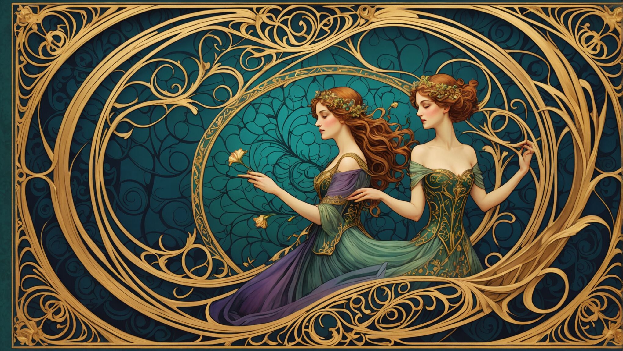
Texture plays a crucial role in conveying genre on book covers, offering tactile and visual cues that resonate with readers’ expectations. In the realm of fantasy, covers often feature richly detailed textures that evoke ancient tomes or magical artifacts. Embossed patterns, metallic foils, and intricate filigree designs are commonly used to create a sense of otherworldliness and mystique. These textures not only appeal to the eye but also invite touch, enhancing the immersive experience even before the book is opened.

For horror and thriller genres, designers frequently employ gritty, rough textures that mirror the unsettling nature of the stories within. Distressed surfaces, scratched metal effects, or textures reminiscent of peeling wallpaper or cracked leather can create an atmosphere of unease and decay. These visual elements serve as a prelude to the psychological tension readers can expect from the narrative.

Romance novels often utilize soft, sensual textures to appeal to their target audience. Satin-like finishes, delicate lace patterns, or the subtle sheen of silk can evoke feelings of luxury and intimacy. These textures are frequently combined with smooth, flowing typography to create a cohesive and inviting cover design that promises a passionate or tender reading experience.

In the realm of historical fiction, textures play a vital role in establishing period authenticity. Designers might incorporate textures that mimic aged parchment, weathered wood, or worn fabric to transport readers to a specific era. These tactile elements not only set the historical context but also lend a sense of gravitas and timelessness to the cover.

Science fiction covers often feature sleek, futuristic textures that suggest advanced technology or alien materials. Smooth, glossy surfaces reminiscent of polished metal or glass can convey a sense of modernity and innovation. Alternatively, designers might use complex, geometric patterns or pixelated textures to hint at digital realms or advanced civilizations.

“The texture of a book cover is the first thing a potential reader feels, both literally and emotionally. It’s a powerful tool for creating an instant connection between the book and its audience.” – Chip Kidd, renowned book cover designer

Contemporary fiction covers tend to employ a wide range of textures, often reflecting the diverse themes and settings of modern stories. Minimalist designs might feature subtle, matte finishes, while more experimental covers could incorporate unconventional materials or textures that relate directly to the book’s content.

Textured elements can also be used to create focal points on the cover, guiding the viewer’s eye to important information such as the title or author’s name. By varying the texture within a single design, designers can create hierarchy and depth, making certain elements stand out while others recede.

The choice of texture can significantly impact the perceived value and quality of a book. Luxury editions often feature high-end textures like leather, suede, or cloth bindings, which not only protect the book but also elevate its status as a collectible object.

In the digital age, where many readers encounter book covers online, designers have adapted by creating texture effects that translate well to screens. While these digital textures may not be tactile, they still evoke sensory responses through visual representation, maintaining the important role of texture in genre identification and reader attraction.

Interplay between light and texture on book covers

The Role of Light and Texture in Conveying Genre on CoversThe interplay between light and texture on book covers creates a powerful synergy that can instantly communicate genre, mood, and narrative themes to potential readers. This dynamic combination allows designers to craft multi-layered visual experiences that engage the viewer on both conscious and subconscious levels.

In horror and thriller genres, for instance, the interaction of harsh, angular lighting with rough, distressed textures can amplify the sense of unease and danger. Shadows cast across a gritty surface can create the illusion of depth and hidden threats, mirroring the psychological tension within the story. The interplay might reveal or obscure certain textural elements, inviting the viewer to look closer and engage with the cover’s details, much like the genre invites readers to unravel complex plots.

For romance novels, soft, diffused lighting often complements smooth, sensual textures. This combination can create a dreamy, ethereal quality that speaks to the genre’s themes of passion and intimacy. The way light catches and highlights certain textural elements—like the sheen on satin or the delicate pattern of lace—can draw the eye and evoke tactile sensations, enhancing the overall emotional appeal of the cover.

In fantasy and science fiction, the relationship between light and texture can be used to create otherworldly effects. Dramatic lighting might interact with metallic or iridescent textures to suggest magical elements or advanced technology. The play of light across intricate, fantastical textures can create a sense of wonder and invite exploration, mirroring the genre’s focus on imagination and discovery.

Historical fiction covers often utilize the interplay of light and texture to evoke a sense of time and place. Warm, golden light reminiscent of candlelight or gas lamps might interact with textures that mimic aged paper or worn leather, creating an authentic period atmosphere. This combination can transport the viewer to a different era before they even open the book.

The strategic use of light can also enhance or subdue certain textural elements to guide the viewer’s focus. For example, a spotlight effect on a richly textured area can draw attention to a key symbol or motif, while softer lighting might be used to create a textured background that adds depth without distracting from the main elements.

Digital design has opened up new possibilities for the interplay of light and texture on book covers. Designers can now create complex lighting effects that interact with digital textures in ways that would be difficult or impossible to achieve in print. This allows for dynamic, almost three-dimensional cover designs that can be particularly effective in online marketplaces where covers need to stand out as small thumbnails.

The combination of light and texture can also be used to create optical illusions or hidden elements within a cover design. For instance, certain textures might only become visible under specific lighting conditions, revealing hidden messages or images that add an extra layer of intrigue to the cover.

Consider how the interplay of light and texture might influence your own perception of book covers. How do these elements work together to create your first impression of a book? Are there covers that have particularly struck you due to their innovative use of light and texture? By examining these aspects critically, readers can gain a deeper appreciation for the artistry involved in book cover design and how it relates to the content within.

As technology advances and design techniques evolve, the possibilities for creative interplay between light and texture on book covers continue to expand. This ongoing evolution challenges designers to push boundaries and find new ways to capture readers’ attention in an increasingly crowded marketplace. By understanding and appreciating these design elements, readers can engage more deeply with the visual storytelling that begins on a book’s cover, enriching their overall literary experience.

Genre conventions in cover lighting and texturing

Genre conventions in cover lighting and texturing have evolved over time, creating a visual shorthand that allows readers to quickly identify and connect with their preferred types of literature. These conventions act as a silent language between publishers and consumers, offering immediate cues about the content and style of the book within.

In the realm of mystery and crime fiction, covers typically employ a dark, moody palette with high-contrast lighting. This creates deep shadows and areas of intense illumination, mirroring the genre’s themes of hidden truths and revelations. Textures often include gritty, rough surfaces that suggest urban environments or weathered evidence. The interplay of light and texture might reveal partial images or text, inviting the reader to piece together clues just as they would in the story.

Romance novels, by contrast, tend to favor soft, diffused lighting that creates a warm, inviting atmosphere. This is often combined with smooth, sensual textures like satin or silk. Many romance covers feature a subtle glow or backlight effect that gives characters an almost ethereal quality. Texture plays a crucial role in conveying the genre’s focus on touch and intimacy, with elements like embossed floral patterns or delicate lace overlays being common choices.

Science fiction covers often push the boundaries of conventional lighting and texturing. Stark, futuristic lighting effects such as lens flares, neon glows, or holographic sheens are frequently used. Textures might range from sleek, metallic surfaces to complex, algorithmic patterns that suggest advanced technology or alien worlds. The interplay between light and texture in this genre often creates a sense of depth and dimensionality, inviting the reader to step into unknown realms.

Fantasy genre conventions typically involve rich, saturated colors and dramatic lighting that hints at magical or mythical elements. Textures are often intricate and detailed, featuring elements like dragon scales, ancient stonework, or mystical symbols. Many fantasy covers use a combination of matte and glossy finishes to create depth and draw attention to key magical elements. The lighting often has an otherworldly quality, with glowing auras or shafts of light that seem to emanate from within the cover itself.

Horror novels tend to employ stark, high-contrast lighting that creates deep, menacing shadows. Textures are often rough, distressed, or organic, suggesting decay or unnatural transformations. The interplay of light and texture in horror covers frequently reveals partial images or creates unsettling optical illusions, playing on the reader’s fear of the unknown.

Literary fiction, while more diverse in its visual approach, often uses subtle, nuanced lighting and texturing to convey sophistication and depth. Matte finishes are common, with textures that might evoke natural materials or abstract concepts related to the book’s themes. The lighting is often softer and more realistic, creating a sense of authenticity and introspection.

Historical fiction covers frequently employ sepia tones or muted color palettes to evoke a sense of age. Textures might mimic weathered paper, aged leather, or period-specific fabrics. Lighting often imitates natural or candlelight sources appropriate to the era, creating a warm, nostalgic glow that transports the reader to a different time.

Thriller novels typically feature sharp, dramatic lighting that creates tension and urgency. Textures might include sleek, modern surfaces for contemporary thrillers or rougher, grittier textures for more hard-boiled narratives. The interplay of light and texture often creates a sense of movement or instability, reflecting the fast-paced nature of the genre.

While these conventions provide a useful framework, innovative designers often play with or subvert these expectations to create covers that stand out in a crowded market. However, even when breaking conventions, successful covers still manage to convey the essence of the genre through their thoughtful use of light and texture, ensuring that readers can quickly identify books that align with their interests and expectations.

How to Convey Emotion Through Book Cover Design

How to Convey Emotion Through Book Cover Design

Colors have a profound impact on human emotions and can effectively communicate the mood and tone of a book at first glance. When designing a book cover, understanding color psychology is crucial to evoke the desired emotional response from potential readers. Warm colors like red, orange, and yellow tend to elicit feelings of excitement, passion, and energy. These hues are often used for thrillers, romance novels, or action-packed stories. In contrast, cool colors such as blue, green, and purple convey calmness, tranquility, and mystery, making them suitable for self-help books, literary fiction, or fantasy genres.

The intensity and saturation of colors also play a significant role in emotional conveyance. Bright, vibrant colors can create a sense of joy and optimism, while muted or pastel tones might suggest a more introspective or melancholic atmosphere. Black and white, when used strategically, can evoke feelings of sophistication, timelessness, or even bleakness, depending on the context. It’s essential to consider color combinations as well, as they can create harmony or tension, further enhancing the emotional impact of the cover design.

Cultural associations with colors should also be taken into account, as they can vary across different regions and demographics. For instance, while white symbolizes purity and innocence in Western cultures, it is associated with mourning in some Eastern cultures. By carefully selecting and combining colors, designers can create a visual language that resonates with the book’s content and target audience, effectively conveying the emotional essence of the story before a single word is read.

Typography and emotional impact

Typography is a powerful tool in book cover design, capable of conveying emotion and setting the tone for the reader’s experience. The choice of font, its size, weight, and arrangement can significantly impact the emotional response elicited by a cover. Serif fonts, with their traditional and elegant appearance, often evoke a sense of reliability, respect, and timelessness. They’re particularly effective for classical literature, historical fiction, or academic works. In contrast, sans-serif fonts project a more modern, clean, and straightforward feel, making them suitable for contemporary fiction, self-help books, or technology-related titles.

“Typography is what language looks like.” – Ellen Lupton

The weight of the font also plays a crucial role in emotional conveyance. Bold, heavy typefaces can communicate strength, importance, or urgency, while lighter weights might suggest delicacy, subtlety, or sophistication. The size and placement of text elements can further amplify these emotions. Large, dominating text can create a sense of power or significance, while smaller, more discreet typography might evoke mystery or intimacy.

The style of lettering can also be tailored to match the book’s genre and emotional tone. Hand-lettered or script fonts can add a personal, intimate touch, perfect for memoirs or romantic novels. Distressed or grunge fonts might be used to convey edginess or rebellion, fitting for certain young adult or alternative genre books. Experimental or decorative typography can be employed to create intrigue or reflect the unique nature of the book’s content.

The spacing between letters (kerning) and lines (leading) can subtly influence the reader’s perception. Tightly spaced text might create tension or claustrophobia, while generous spacing can suggest openness or freedom. The alignment of text – whether centered, justified, or asymmetrical – can also contribute to the overall emotional impact. Centered text often conveys formality or balance, while asymmetrical layouts can create dynamic tension or a sense of movement.

Color and texture in typography add another layer of emotional depth. Metallic or glossy finishes can suggest luxury or futurism, while matte or textured effects might evoke a more organic, earthy feel. The interplay between the typography and other design elements, such as images or patterns, can create compelling visual narratives that resonate with the book’s themes.

Lastly, consider the emotional impact of negative space around the typography. Generous white space can create a sense of calm, sophistication, or allow the text to stand out dramatically. Conversely, densely packed design elements might convey complexity or intensity. By carefully crafting these typographic elements, designers can create book covers that not only catch the eye but also speak to the heart of the story within.

Imagery and symbolism

How to Convey Emotion Through Book Cover DesignVisual imagery and symbolism are powerful tools in book cover design, capable of instantly conveying complex emotions and themes. A well-chosen image or symbol can encapsulate the essence of a book, creating an immediate emotional connection with potential readers. When selecting imagery, designers must consider not only the literal representation of the book’s content but also the underlying emotions and ideas they wish to evoke.

Metaphorical imagery can be particularly effective in stirring emotions. For instance, a single withered rose on a cover might symbolize lost love or the passage of time, evoking feelings of melancholy or nostalgia. Conversely, a vibrant, blooming flower could represent hope, new beginnings, or personal growth. The key is to choose images that resonate on multiple levels, allowing readers to form their own emotional connections.

Symbolic elements can add depth and intrigue to a cover design. Ancient symbols, cultural icons, or even modern logos can be incorporated to hint at the book’s themes or setting. For example, an hourglass might suggest the concept of time running out in a thriller, while a maze could represent the complexity of relationships in a romance novel. These symbols act as visual shorthand, quickly communicating ideas that would take many words to express.

The style of imagery used can also significantly impact emotional response. Photorealistic images might create a sense of immediacy and reality, suitable for non-fiction or contemporary stories. In contrast, illustrated or abstract imagery can evoke a more imaginative or dreamlike quality, perfect for fantasy, children’s books, or experimental literature. The texture and quality of the imagery – whether it’s sharp and clear or intentionally blurred and mysterious – can further enhance the emotional atmosphere.

Color treatment of images plays a crucial role in emotional conveyance. A sepia-toned photograph might evoke nostalgia, while high-contrast black and white could create drama or tension. Vibrant, saturated colors might suggest energy or passion, while muted tones could convey subtlety or melancholy. The interplay between the imagery and the overall color scheme of the cover can create a cohesive emotional experience.

Juxtaposition of contrasting images or symbols can create powerful emotional narratives. For instance, a delicate butterfly perched on a gun barrel could symbolize the fragility of peace in a war novel. Such unexpected combinations can provoke thought and emotional engagement, encouraging readers to delve deeper into the book’s themes.

The scale and placement of imagery on the cover also influence emotional impact. A large, dominating image might create a sense of awe or importance, while smaller, more subtle visual elements could suggest mystery or invite closer inspection. The way images interact with typography and other design elements can create a visual hierarchy that guides the reader’s emotional journey across the cover.

Consider how imagery and symbolism can extend beyond the front cover. Wraparound designs that continue onto the spine and back cover can create a more immersive emotional experience. This approach allows for a broader canvas to tell a visual story, potentially incorporating additional symbolism or imagery that complements the front cover’s emotional message.

As you reflect on the power of imagery and symbolism in book cover design, consider how these elements might be applied to your own creative projects. How might you use visual metaphors to convey complex emotions? What symbols resonate with you personally, and how could they be incorporated into meaningful designs? The art of visual storytelling through cover design offers endless possibilities for emotional expression and connection with readers.

Layout and composition for emotional resonance

The layout and composition of a book cover are crucial elements in creating an emotional resonance with potential readers. A well-structured design can guide the viewer’s eye, emphasize key elements, and create a visual hierarchy that enhances the overall emotional impact. One effective technique is the use of the rule of thirds, which divides the cover into a 3×3 grid. Placing important elements along these lines or at their intersections creates a balanced and visually pleasing composition that can evoke a sense of harmony or tension, depending on the desired effect.

Negative space, or white space, plays a significant role in emotional conveyance. Generous use of empty space can create a sense of calm, simplicity, or isolation, which might be appropriate for minimalist literary fiction or introspective memoirs. Conversely, a densely packed cover with little negative space can evoke feelings of chaos, excitement, or claustrophobia, suitable for action-packed thrillers or complex narratives.

The focal point of the cover is essential in directing the viewer’s emotional response. A centrally placed, dominant image or text can create a sense of importance or stability. Off-center or asymmetrical compositions can generate dynamism and intrigue, encouraging the viewer to explore the cover further. The use of leading lines, whether explicit or implied, can guide the viewer’s gaze and create a sense of movement or direction, potentially reflecting the book’s narrative journey.

Layering elements in the composition can add depth and complexity to the emotional narrative. Overlapping images, text, or patterns can create a sense of mystery, multi-dimensionality, or the passage of time. This technique is particularly effective for novels with intricate plotlines or multiple timelines. Conversely, a clean, uncluttered layout might evoke feelings of clarity, directness, or simplicity.

The orientation of elements on the cover can also influence emotional perception. Vertical lines and arrangements often suggest strength, growth, or aspiration, while horizontal compositions can evoke calmness, stability, or expansiveness. Diagonal lines and arrangements can create a sense of dynamism, tension, or instability, which might be appropriate for action-oriented or psychologically complex narratives.

Scale and proportion in cover design can dramatically affect emotional impact. Oversized elements, such as large typography or images that extend beyond the cover’s boundaries, can create a sense of importance, power, or overwhelming emotion. In contrast, small, delicate elements might evoke feelings of intimacy, detail-orientation, or vulnerability.

The use of frames or borders within the cover design can also contribute to emotional resonance. A strong frame can create a sense of containment or focus, directing attention inward and potentially evoking feelings of intimacy or intensity. Broken or incomplete frames might suggest themes of escape, transformation, or the breaking of boundaries.

Consider the emotional impact of symmetry versus asymmetry in layout. Symmetrical designs often evoke feelings of balance, harmony, and stability, which might be suitable for classic literature or self-help books. Asymmetrical layouts can create tension, excitement, or a sense of the unexpected, potentially more appropriate for contemporary fiction or avant-garde works.

The integration of texture into the layout, whether through actual tactile elements or visual representations, can add another layer of emotional depth. Rough textures might evoke rawness or authenticity, while smooth, glossy surfaces could suggest sophistication or modernity. The interplay of different textures within the composition can create visual interest and emotional complexity.

Consider how the layout and composition interact with the book’s format and physical properties. The way design elements wrap around the spine or extend to the back cover can create a cohesive emotional experience. For ebooks, consider how the cover will appear as a thumbnail and how the composition will translate to smaller screens, ensuring that the emotional impact is maintained across different viewing contexts.

How to Stand Out in a Saturated Market with Your Book Cover

How to Stand Out in a Saturated Market with Your Book Cover

Before diving into the design process, it’s crucial to understand your book’s market and analyze your competitors. Start by identifying the top-selling books in your genre and examining their cover designs. Look for common themes, color schemes, and imagery that resonate with readers. Pay attention to bestseller lists and browse online bookstores to get a sense of current trends. Take note of what works well and what doesn’t, but avoid simply copying successful designs.

Consider your target audience and their preferences. What age group, gender, or interests does your book cater to? This information will help guide your design choices. Conduct surveys or focus groups to gather feedback on potential cover concepts. Social media platforms and online forums can be valuable resources for connecting with your target readers and understanding their expectations.

Analyze your competitors’ strengths and weaknesses. Look for gaps in the market that you can exploit with your cover design. Perhaps there’s an overuse of certain imagery or color schemes that you can deviate from to stand out. “Know your enemy and know yourself, and you can fight a hundred battles without disaster.” This quote from Sun Tzu’s “The Art of War” applies perfectly to market research in the publishing world.

Don’t forget to research industry standards for your specific genre. While you want to stand out, it’s important to ensure your cover still communicates the type of book you’ve written. Readers should be able to identify your book’s genre at a glance. Use this knowledge to strike a balance between conforming to genre expectations and introducing unique elements that set your book apart.

Keep an eye on emerging trends and innovative cover designs. The publishing industry is constantly evolving, and staying ahead of the curve can give you a significant advantage. Attend book fairs, follow design blogs, and study award-winning covers to stay informed about cutting-edge techniques and styles that could inspire your own cover design.

Unique design elements and typography

To create a book cover that truly stands out, it’s essential to incorporate unique design elements and typography that capture the essence of your work while differentiating it from competitors. Begin by brainstorming visual concepts that represent your book’s themes, characters, or key plot points. Consider using unexpected imagery or abstract designs that provoke curiosity and intrigue potential readers.

Experiment with unconventional layouts and compositions. Break away from traditional centered titles and symmetrical designs by exploring asymmetry, diagonal elements, or off-center focal points. This can create a dynamic and eye-catching cover that demands attention on crowded bookshelves or digital marketplaces.

Typography plays a crucial role in cover design. Choose fonts that not only complement your book’s genre but also reflect its tone and mood. Custom lettering or hand-drawn typography can add a personal touch and make your cover truly one-of-a-kind. Consider integrating the title into the overall design, such as having it interact with visual elements or using creative text treatments like embossing, foil stamping, or cut-out effects.

“Design is thinking made visual.” – Saul Bass

This quote from legendary graphic designer Saul Bass emphasizes the importance of thoughtful, conceptual design in visual communication. Apply this principle to your book cover by ensuring every element serves a purpose and contributes to the overall message you want to convey.

Incorporate texture and depth to make your cover more tactile and visually interesting. This can be achieved through the use of patterns, layered elements, or the strategic application of shadow and light. Consider using techniques like spot UV coating or embossing to add a physical dimension to your cover that sets it apart from flat, digital-only designs.

Don’t be afraid to push boundaries and challenge genre conventions. If your book offers a fresh perspective or unique approach to its subject matter, reflect that in your cover design. This could mean using unexpected color combinations, incorporating surreal or abstract elements, or adopting a minimalist approach in a genre typically known for busy covers.

Remember that simplicity can be powerful. Sometimes, a bold, minimalist design with a single striking image or typography can be more effective than a complex composition. Strive for a balance between uniqueness and clarity, ensuring that your cover remains readable and instantly recognizable even at thumbnail size.

Consider the use of negative space as a design element. Clever use of white space can create intriguing silhouettes or hidden images that reward closer inspection and add an extra layer of meaning to your cover.

Lastly, don’t underestimate the power of a well-chosen tagline or subtitle. This text can complement your unique design elements and typography, providing additional context and enticing readers to pick up your book.

By thoughtfully combining these unique design elements and typographic techniques, you can create a book cover that not only stands out in a saturated market but also effectively communicates the essence of your work and appeals to your target audience.

Color psychology and visual impact

How to Stand Out in a Saturated Market with Your Book CoverColors have a profound impact on human emotions and decision-making processes, making them a powerful tool in book cover design. Understanding and leveraging color psychology can help your cover evoke specific feelings and attract your target audience.

Begin by researching the emotional associations of different colors within your genre and target market. For example, warm colors like red and orange often convey energy and excitement, while cool blues and greens can evoke calmness and trust. Consider how these associations align with your book’s themes and the emotions you want to elicit in potential readers.

Contrast is key to creating visual impact. Experiment with complementary colors or unexpected color combinations to make your cover pop. A bold, high-contrast design can catch the eye even when viewed as a small thumbnail on digital platforms. However, be mindful of readability – ensure that your title and author name remain clear against the background.

Consider the use of color gradients or color overlays to add depth and dimension to your cover. These techniques can create a sense of movement or atmosphere that draws the reader in. For instance, a subtle gradient from dark to light can suggest hope or transformation, while a vibrant overlay can add a contemporary edge to your design.

Don’t underestimate the power of monochromatic or limited color palettes. Sometimes, a striking single-color design or a carefully chosen duo-tone can be more impactful than a full-color spread. This approach can also help your book stand out in a sea of colorful competitors.

Think about the cultural significance of colors in different markets. If your book has international appeal, be aware that color meanings can vary across cultures. What conveys positivity in one region might have negative connotations in another.

Consider the psychological effects of color saturation and brightness. Vibrant, saturated colors can create a sense of energy and immediacy, while muted or pastel tones might convey sophistication or nostalgia. The brightness of your chosen colors can also influence perception – brighter hues tend to attract attention quickly, while darker shades can create a sense of mystery or depth.

Experiment with color accents to guide the viewer’s eye. A small pop of an unexpected color can draw attention to key elements of your cover design, such as the title or a significant image. This technique can create a focal point that anchors the entire composition.

Remember that the visual impact of your cover extends beyond its individual elements. Consider how your color choices will look when your book is displayed alongside others. Will it blend in or stand out? How does it appear under different lighting conditions or on various devices?

As you explore color options, consider creating mock-ups of your cover in different settings – on a bookshelf, as an e-book thumbnail, or on social media. This will help you gauge its effectiveness across various platforms and contexts.

Ultimately, the goal is to create a color scheme that not only catches the eye but also resonates with your target audience and accurately represents the content of your book. By thoughtfully applying color psychology and focusing on visual impact, you can create a cover that stands out in a crowded market and compels readers to pick up your book.

Professional branding and consistency

Establishing a strong, professional brand for your book extends beyond the cover itself. It’s about creating a cohesive visual identity that resonates with your target audience and sets you apart as an author. Start by developing a distinctive author logo or signature that can be used consistently across all your marketing materials, including your book cover, website, and social media profiles. This visual element will help readers quickly identify your work and build brand recognition.

Consistency is key when it comes to professional branding. Choose a color palette, typography, and design style that aligns with your book’s genre and your author persona. Use these elements consistently across all your marketing channels to create a unified and memorable brand image. This consistency helps build trust with your audience and makes your work instantly recognizable in a crowded marketplace.

Consider creating a style guide for your author brand. This document should outline your brand’s visual elements, including color codes, font choices, and guidelines for image use. Having a style guide ensures that anyone working on your marketing materials, including designers and publicists, can maintain a consistent look and feel across all platforms.

Invest in high-quality author photos and promotional images that align with your brand. These visuals can be used on your book cover, author website, and social media profiles to create a cohesive and professional appearance. Remember that your author image is part of your brand, so choose photos that reflect the tone and style of your writing.

Develop a unique voice and messaging style that complements your visual branding. This should be reflected in your book’s blurb, your author bio, and all your communications with readers. A consistent tone of voice helps reinforce your brand identity and creates a stronger connection with your audience.

Consider extending your branding to book series or related products. If you’re writing a series, create a cohesive look that ties all the books together while allowing each to stand out individually. This could involve using a consistent layout, typography, or visual motif across all covers in the series.

Don’t forget about the importance of professional packaging. If you’re self-publishing, invest in high-quality printing and materials for physical copies of your book. The feel of a well-produced book can significantly impact a reader’s perception of your brand and the value of your work.

Leverage social media and online platforms to reinforce your brand. Use consistent profile pictures, cover images, and post styles across all your social media accounts. Share behind-the-scenes content, writing tips, or personal insights that align with your brand identity to engage with your audience and build a loyal following.

Consider collaborating with other professionals in the industry, such as book bloggers, podcasters, or fellow authors, to expand your brand’s reach. These partnerships can help you tap into new audiences and strengthen your professional network.

Remember that branding is an ongoing process. Regularly review and update your branding strategy to ensure it remains relevant and effective. Stay open to feedback from your readers and be willing to evolve your brand as your writing career grows and changes.

Creating a Consistent Brand Image with Series Book Covers

Creating a Consistent Brand Image with Series Book Covers

When crafting a series of book covers, several key design elements play a crucial role in creating a cohesive and recognizable brand image. One of the most important aspects is the consistent use of a visual motif across all covers in the series. This could be a recurring symbol, pattern, or graphic element that ties the books together visually. For example, the Harry Potter series famously uses a distinctive font and lightning bolt icon throughout its cover designs.

Another essential element is the layout structure. Establishing a consistent placement of title, author name, and series information helps readers quickly identify books within the same collection. This might involve using a specific grid system or maintaining a particular arrangement of text and images across all covers.

The use of a unified art style is also vital for creating a cohesive look. Whether it’s photographic, illustrated, or typographic, maintaining a consistent artistic approach helps reinforce the series’ identity. This doesn’t mean each cover should be identical, but rather that they should share a common visual language.

Incorporating a logo or series emblem can further strengthen the brand image. This could be a small icon or a specially designed series title that appears on each cover, serving as a visual anchor for the collection. The Penguin Classics series, for instance, uses its distinctive penguin logo to create instant recognition across its vast library of titles.

Consider the spine design as an important element of cohesion. When books are shelved, their spines are often the only visible part. Creating a unified spine design that carries through the entire series can make a striking visual impact and help readers easily spot the complete collection on a bookshelf.

Color schemes and typography

Selecting the right color scheme and typography for a book series is crucial in establishing a strong and consistent brand image. A well-chosen color palette can evoke specific emotions, set the tone for the series, and create instant recognition among readers. It’s essential to select colors that not only complement each other but also reflect the genre and themes of the books.

For example, a fantasy series might employ rich, jewel-toned colors to convey a sense of magic and wonder, while a thriller series might opt for darker, more muted tones to create an atmosphere of suspense. Consistency in color usage across the series helps readers quickly identify books as part of the same collection, even if individual cover designs vary.

Typography plays an equally important role in creating a cohesive look. The choice of fonts for titles, author names, and other cover text should remain consistent throughout the series. This doesn’t mean using the exact same font for every element, but rather establishing a clear hierarchy and style that carries through all the books.

“Typography is the craft of endowing human language with a durable visual form.” – Robert Bringhurst

When selecting fonts, consider readability, genre appropriateness, and how they pair with the overall design aesthetic. A serif font might be chosen for a historical fiction series to evoke a sense of tradition, while a clean sans-serif could be more suitable for a contemporary science fiction series.

It’s also important to consider how the typography interacts with the cover art. The title should be legible and stand out, even when the cover is viewed as a thumbnail online. Consistent placement and sizing of text elements across the series contribute to a unified look.

Color and typography can work together to create distinctive branding elements. For instance, a series might use a specific color treatment for the author’s name or employ a unique typographic layout for the series title that becomes instantly recognizable to fans.

While maintaining consistency, it’s also beneficial to allow for some flexibility within the established color and typography guidelines. This can help individual books stand out while still being identifiable as part of the series. For example, each book might feature a dominant color from the series’ palette, or subtle variations in the title treatment could be used to differentiate volumes while maintaining the overall style.

Remember that color and typography choices should also take into account practical considerations, such as print reproduction quality and legibility across different formats (hardcover, paperback, e-book). Testing designs in various sizes and on different devices can help ensure that the chosen elements work well in all contexts.

By carefully selecting and consistently applying color schemes and typography, publishers can create a strong visual identity for a book series that not only looks cohesive but also resonates with the target audience and stands out in a crowded marketplace.

Character representation across series

Creating a Consistent Brand Image with Series Book CoversWhen it comes to character representation across a book series, consistency is key to maintaining a strong brand image and fostering reader connection. Characters are often the heart of a story, and their visual representation on book covers can significantly impact how readers perceive and remember the series.

For series featuring recurring protagonists, it’s crucial to establish a consistent portrayal that aligns with the character’s description in the text. This doesn’t necessarily mean using photorealistic images or the same exact illustration on every cover. Instead, it’s about capturing the essence of the character in a way that’s instantly recognizable, even if the style or composition changes from book to book.

Consider the evolution of the character throughout the series. As characters grow and change, their representation on the covers can subtly reflect this development. For instance, a coming-of-age series might show the protagonist aging slightly with each book, while still maintaining core visual elements that identify them.

Symbolic representation can be a powerful tool, especially for series where showing character faces might limit readers’ imagination. Using consistent symbols, silhouettes, or objects associated with the character can create a strong visual link without being overly prescriptive about appearance.

For ensemble casts, it’s important to establish a hierarchy or system for character representation. This could involve featuring different characters prominently on each cover while maintaining a consistent style, or creating a visual formula that incorporates multiple characters in a recognizable way across the series.

When dealing with diverse characters, sensitivity and accuracy in representation are paramount. Ensure that characters from different backgrounds are portrayed respectfully and authentically, avoiding stereotypes or tokenism. This might involve collaborating with diverse artists or seeking cultural consultation to ensure appropriate representation.

Consider how character representation interacts with other cover elements. The placement of characters in relation to titles, backgrounds, and other design elements should follow a consistent logic across the series, even if individual covers vary.

For series that span different formats or editions, maintain consistency in character representation across these variations. A character should be recognizable whether on a hardcover, paperback, or digital edition, helping to reinforce the series brand across all platforms.

Remember that character representation isn’t limited to just the front cover. Spines, back covers, and inside flaps can also feature consistent character elements that tie the series together visually.

As you contemplate these aspects of character representation, consider how your favorite book series have handled this challenge. Have you noticed subtle changes in character portrayal across a long-running series? How do these visual cues affect your perception of the story and its world?

Reflecting on these questions can deepen your appreciation for the artistry behind series book covers and inspire you to look more closely at the design choices that shape our reading experiences. How might you apply these principles to your own creative projects or to analyzing the media you consume?

Balancing consistency and uniqueness

Creating a consistent brand image for a book series while ensuring each cover remains unique is a delicate balancing act. Publishers and designers must find ways to maintain a recognizable style that unifies the series while allowing individual titles to stand out. One effective approach is to establish a strong visual framework that can be subtly varied for each book. This might involve using a consistent layout or grid system that allows for different imagery or color schemes within its structure.

Another strategy is to develop a signature element that appears on all covers but can be adapted or reinterpreted for each title. This could be a distinctive frame, a recurring symbol, or a unique treatment of the series title. For example, the “A Song of Ice and Fire” series by George R.R. Martin features different objects or symbols central to each book’s plot, all rendered in a consistent metallic style against a solid background.

Color can play a crucial role in balancing consistency and uniqueness. A series might adopt a specific color palette but use different dominant colors for each book. This allows for visual variety while maintaining a cohesive look when the books are displayed together. The “Hunger Games” trilogy successfully employed this technique, with each book featuring a different color scheme within a consistent design framework.

Typography offers another avenue for creating both unity and distinction. A series can use the same fonts throughout but vary their arrangement, size, or color treatment for each cover. This maintains brand recognition while giving each book its own personality. Additionally, incorporating subtle variations in texture or finishing techniques can add uniqueness to individual covers without disrupting the overall series aesthetic.

It’s also important to consider the evolution of a series over time. As a series progresses, there may be opportunities to subtly update or refine the design approach while maintaining core elements that readers associate with the brand. This gradual evolution can keep the series looking fresh and relevant without losing its established identity.

Balancing consistency and uniqueness also extends to how character representations or thematic elements are handled across covers. While maintaining a consistent style or approach to character depiction, each cover can focus on different aspects of the story or highlight unique elements specific to that particular book.

Ultimately, the key to success lies in creating a flexible design system that can accommodate variety within a clearly defined set of parameters. This approach allows for creativity and adaptation to each book’s individual needs while ensuring that the series maintains a strong, cohesive brand image that readers can easily recognize and connect with.

Using Patterns and Geometrics in Modern Book Covers

Using Patterns and Geometrics in Modern Book Covers

In recent years, book cover design has undergone a significant transformation, embracing minimalism and bold visual elements to captivate readers. “Less is more” has become a guiding principle for many designers, leading to clean, uncluttered layouts that make a strong first impression. Vibrant color palettes are being used strategically to evoke emotions and set the tone for the book’s content, often employing striking contrasts or monochromatic schemes to stand out on crowded shelves.

Typography has taken center stage, with oversized lettering and creative font combinations becoming increasingly popular. Designers are experimenting with unconventional placements and orientations of text, turning titles into integral parts of the overall visual composition. Hand-lettering and custom typefaces are also on the rise, adding a unique and personal touch to covers.

Illustration and abstract art have seen a resurgence, offering a refreshing alternative to photographic imagery. These artistic approaches allow for more imaginative interpretations of a book’s themes and can create an immediate emotional connection with potential readers. Negative space is being utilized more effectively, drawing attention to key elements and creating a sense of intrigue.

Digital effects and 3D rendering techniques are pushing the boundaries of traditional cover design, resulting in eye-catching visuals that blur the line between reality and imagination. Holographic and metallic finishes are being incorporated to add depth and interactivity, enticing readers to pick up and examine books more closely.

Sustainability has also become a significant consideration in contemporary book cover design. Eco-friendly materials and printing techniques are being employed, with some designers opting for minimalist approaches that require less ink and resources. This trend not only appeals to environmentally conscious consumers but also aligns with the growing demand for socially responsible products.

Series design has evolved to create cohesive visual identities across multiple books, utilizing consistent elements while allowing for subtle variations. This approach not only strengthens brand recognition but also encourages readers to collect entire series, driven by the aesthetically pleasing uniformity of the covers.

Incorporating geometric shapes for visual impact

Geometric shapes have emerged as powerful tools in modern book cover design, offering a versatile and visually striking approach to capturing readers’ attention. These simple yet impactful elements can convey complex ideas, evoke specific moods, and create a sense of order or chaos depending on their arrangement and execution.

One of the most effective ways to incorporate geometric shapes is through the use of bold, singular forms that dominate the cover. A large circle, triangle, or square can serve as a focal point, drawing the eye and creating a sense of intrigue. These shapes can be filled with color, patterns, or imagery related to the book’s content, creating a layered visual experience that invites closer inspection.

Overlapping and intersecting geometric shapes can create depth and complexity, suggesting interconnected themes or multiple storylines within the book. This technique can be particularly effective for works of fiction that deal with complex narratives or non-fiction books exploring multifaceted subjects.

“Geometry is the archetype of the beauty of the world.” – Johannes Kepler

Designers are also experimenting with deconstructed geometric forms, breaking down shapes into their component parts to create dynamic and engaging compositions. This approach can suggest themes of fragmentation, transformation, or the exploration of hidden structures within the narrative.

The use of repeating geometric patterns can establish rhythm and movement across the cover, guiding the viewer’s eye and creating a sense of energy. This technique is particularly effective for books dealing with topics such as mathematics, science, or technology, where precision and structure are key themes.

Geometric shapes can also be used to frame text or images, providing a clean and modern structure to the overall design. This framing technique can help to organize information hierarchically, emphasizing certain elements while creating a cohesive visual language for the cover.

Negative space created by geometric shapes can be just as impactful as the shapes themselves. By cleverly incorporating negative space, designers can create hidden images or symbols that reveal themselves upon closer inspection, adding an extra layer of meaning to the cover design.

Color plays a crucial role in the effectiveness of geometric designs. High-contrast color combinations can make shapes pop, while monochromatic or complementary color schemes can create a more subtle, sophisticated look. The choice of color palette can significantly influence the mood and genre associations of the book.

Texture can be introduced through the use of geometric patterns, adding depth and tactile appeal to the cover. This can be achieved through printing techniques such as embossing, debossing, or the use of specialty papers and finishes.

Incorporating asymmetry within geometric designs can create tension and visual interest. This approach can be particularly effective for books that challenge conventional thinking or present unconventional ideas.

By leveraging the power of geometric shapes, book cover designers can create visually impactful designs that not only catch the eye but also communicate key themes and ideas from the book’s content. The versatility of geometric elements allows for endless creative possibilities, ensuring that each cover can be uniquely tailored to its specific book while still tapping into the broader aesthetic appeal of this design trend.

Utilizing repetitive patterns to create texture

Using Patterns and Geometrics in Modern Book CoversRepetitive patterns have become a powerful tool in modern book cover design, offering a way to create visual texture and depth that can instantly captivate potential readers. By skillfully employing these patterns, designers can evoke specific moods, suggest themes, and add a layer of complexity to the overall aesthetic.

One of the most effective uses of repetitive patterns is to create a sense of movement or rhythm across the cover. This can be achieved through the use of interlocking shapes, undulating lines, or cascading elements that guide the eye across the design. Such dynamic patterns can suggest action, progression, or the passage of time, making them particularly suitable for genres like thrillers, science fiction, or historical narratives.

Texture created through patterns can also serve as a subtle nod to the book’s content or setting. For instance, a cover featuring a repeating pattern of leaves might hint at a story set in nature, while a geometric pattern could suggest a more urban or futuristic setting. This technique allows designers to convey information about the book without relying solely on explicit imagery or text.

The scale of patterns plays a crucial role in their impact. Micro-patterns can create a sense of intricacy and detail, inviting closer inspection and suggesting depth of content. Conversely, large-scale patterns can make bold statements and create striking visual impact from a distance, ideal for grabbing attention in crowded bookstores or online marketplaces.

Designers are increasingly experimenting with the interplay between patterns and negative space. By strategically breaking up repetitive elements or allowing them to fade into blank areas, they can create focal points and guide the viewer’s attention to key elements like the title or author’s name.

Color variation within patterns offers another avenue for creativity. Gradients applied to repetitive elements can create a sense of depth or dimension, while contrasting colors can make certain parts of the pattern pop, adding visual interest and hierarchy to the design.

The use of overlapping patterns or the combination of different pattern types can create a rich, layered effect that rewards closer examination. This technique can be particularly effective for books with complex themes or multiple narrative threads, visually representing the intricacy of the content.

Texture through patterns can also be enhanced by employing various printing techniques. Embossing or debossing repetitive elements can add a tactile dimension to the cover, while spot UV coatings can create subtle contrasts in sheen that become apparent as the book is handled.

In some cases, designers are using patterns to create optical illusions or hidden images within the cover design. These clever visual tricks can engage readers, encouraging them to look more closely and potentially discover secondary meanings or Easter eggs related to the book’s content.

The versatility of repetitive patterns allows them to be adapted to various genres and styles. From the intricate arabesques of historical fiction to the clean, minimalist lines of contemporary literature, patterns can be tailored to suit the tone and theme of any book.

As you consider the role of patterns in book cover design, think about how they might be used to enhance or subvert expectations within different genres. How might a unexpected pattern choice challenge preconceptions about a book’s content? In what ways can the texture created by patterns appeal to our tactile senses, even in a digital marketplace?

Reflect on how the use of patterns in book covers mirrors broader trends in visual culture and design. How do these techniques relate to other forms of visual communication you encounter in daily life? By exploring these questions, we can gain a deeper appreciation for the artistry and strategy behind effective book cover design.

Balancing patterns and text for effective communication

When designing a book cover, striking the right balance between patterns and text is crucial for effective communication. The interplay between these elements can make or break a cover’s ability to convey the book’s essence and attract potential readers. Designers must carefully consider how patterns and text interact, ensuring that neither overwhelms the other while creating a harmonious and impactful composition.

One effective approach is to use patterns as a background or framing device, allowing the text to stand out prominently. This can be achieved by choosing patterns with subtle color variations or low contrast, which provide texture without competing for attention. Alternatively, designers may opt for bold patterns but confine them to specific areas of the cover, leaving ample negative space for text to breathe and remain legible.

The size and placement of text in relation to patterns play a critical role in maintaining balance. Large, bold typography can hold its own against intricate patterns, while smaller text may require careful positioning or the use of contrasting colors to ensure readability. Some designers choose to integrate text directly into the pattern, creating a seamless blend that rewards closer inspection.

Layering techniques can be employed to create depth and hierarchy between patterns and text. By placing text on a separate layer above the pattern, designers can use shadows, outlines, or transparency effects to enhance legibility while maintaining the integrity of the underlying design. This approach allows for complex patterns to be used without sacrificing the clarity of essential information.

Color harmony between patterns and text is another crucial consideration. Complementary or contrasting color schemes can help text stand out against patterned backgrounds, while monochromatic designs can create a sophisticated, cohesive look. Designers may also experiment with reversing colors, using light text on dark patterns or vice versa to achieve striking visual effects.

The use of texture in both patterns and typography can create interesting synergies. For example, a textured pattern might be paired with smooth, clean typography to create contrast, or both elements could feature similar textures to reinforce a particular theme or mood. This interplay of textures adds depth and tactile appeal to the cover design.

Negative space is a powerful tool in balancing patterns and text. By strategically incorporating areas of blank space, designers can create breathing room around text elements, enhancing readability and drawing attention to key information. This technique is particularly effective when working with busy or complex patterns.

The genre and target audience of the book should also inform the balance between patterns and text. For academic or professional books, clearer typography and more subdued patterns may be appropriate, while fiction or art books might allow for more experimental and visually dominant pattern work.

Dynamic composition techniques, such as asymmetry or the rule of thirds, can help create visual interest while maintaining balance. By carefully positioning text and pattern elements according to these principles, designers can guide the viewer’s eye across the cover in a deliberate and engaging manner.

It’s important to consider how the cover will appear at different scales, from thumbnail images in online stores to full-size physical books. Patterns and text that work well at one size may lose their effectiveness at another, so designers must ensure that the balance remains effective across various viewing contexts.

Ultimately, the most successful book covers achieve a delicate equilibrium where patterns and text work in concert to communicate the book’s content, genre, and mood. This balance not only captures attention but also provides a visual representation of the reading experience that awaits within the pages.

Best Tools and Software for DIY Book Cover Design

Best Tools and Software for DIY Book Cover Design

When embarking on your DIY book cover design journey, selecting the right software is crucial. Adobe Photoshop reigns supreme as the industry standard, offering unparalleled flexibility and powerful tools for creating stunning covers. However, its steep learning curve and hefty price tag may deter some users. For a more budget-friendly alternative, consider GIMP, a free and open-source program that provides many of Photoshop’s features. Canva has gained popularity among authors for its user-friendly interface and extensive library of templates, making it an excellent choice for beginners.

For those who prefer vector-based designs, Adobe Illustrator is the go-to option, allowing for scalable graphics and precise control over shapes and lines. Inkscape offers a free alternative with similar capabilities. If you’re looking for an all-in-one solution, Affinity Publisher combines layout, image editing, and vector tools in a single package, making it a versatile choice for cover design. “The right software can make or break your design process,” as many experienced designers often say.

For 3D cover mockups, Boxshot is a specialized tool that can create realistic book renderings, while Blender provides a free, open-source option for 3D modeling and rendering. Some authors also find success using more general-purpose design software like Corel PaintShop Pro or Serif DrawPlus, which offer a balance between features and ease of use. Regardless of your chosen software, it’s essential to select a tool that aligns with your skill level, budget, and specific design needs.

Typography and font resources

Typography plays a crucial role in book cover design, setting the tone and conveying the genre at a glance. When selecting fonts for your cover, consider both readability and aesthetics. For professionally designed typefaces, Adobe Fonts (formerly Typekit) offers a vast library of high-quality options included with Creative Cloud subscriptions. Google Fonts provides a free alternative with a wide range of open-source typefaces suitable for commercial use.

“Typography is the craft of endowing human language with a durable visual form.” – Robert Bringhurst

For unique and eye-catching display fonts, explore creative marketplaces like Creative Market, MyFonts, or FontSquirrel. These platforms offer both free and paid typefaces, often with extended licenses for book cover use. When working with display fonts, ensure they complement your cover’s imagery and remain legible at various sizes.

Font pairing is an art in itself. Tools like FontPair and Typewolf can help you find harmonious combinations that enhance your cover’s visual appeal. Remember to limit your selection to two or three typefaces to maintain a cohesive look.

Custom lettering can set your cover apart. If you have the skills, software like Procreate or Adobe Illustrator allows you to create bespoke typography. Alternatively, consider hiring a lettering artist for a truly unique title treatment.

When working with fonts, be mindful of licensing. Ensure you have the proper permissions for commercial use, especially for self-published books. Some fonts require separate licenses for ebook and print versions, so always read the terms carefully.

For those new to typography, resources like Practical Typography by Matthew Butterick or Ellen Lupton’s “Thinking with Type” provide valuable insights into the principles of good type design. Online courses on platforms like Skillshare or Udemy can also help you master the basics of typography for book covers.

Lastly, don’t overlook the importance of kerning and leading. Fine-tuning the spacing between letters and lines can dramatically improve your cover’s overall appearance. Most design software offers manual kerning tools, allowing you to perfect your type layout.

Image editing and manipulation tools

Best Tools and Software for DIY Book Cover DesignWhen it comes to creating a captivating book cover, image editing and manipulation tools are indispensable. These powerful software options allow you to transform ordinary photographs or illustrations into eye-catching visual elements that can make your book stand out on the shelves or in digital marketplaces.

Adobe Photoshop remains the gold standard for image editing, offering a comprehensive suite of tools for retouching, compositing, and creating complex visual effects. Its layers system and extensive filter options provide endless possibilities for creativity. However, for those seeking a more accessible alternative, Affinity Photo offers similar capabilities at a fraction of the cost, with a one-time purchase model rather than a subscription.

For authors working with a tighter budget, GIMP (GNU Image Manipulation Program) is a free, open-source option that can handle most image editing tasks required for book cover design. While its interface may not be as polished as commercial alternatives, it’s a powerful tool in the hands of a skilled user.

Online platforms like Pixlr and Fotor provide browser-based image editing solutions, ideal for quick touch-ups or basic manipulations. These tools are particularly useful for authors who prefer not to install software on their devices or need to make edits on the go.

When working with stock images, tools like Shutterstock Editor or Adobe Stock’s built-in editor allow for quick adjustments and customizations before downloading, saving time and streamlining the design process.

For those interested in creating surreal or fantastical cover art, specialized software like Corel Painter or Krita excel at mimicking traditional art media and can help achieve unique, painterly effects that set your cover apart.

It’s crucial to understand the principles of color correction and image resolution when preparing images for print. Software like ColorSync Utility (for Mac) or DisplayCAL can help ensure your colors appear as intended across different devices and in print.

Remember that image manipulation isn’t just about editing existing photos. Tools like DAZ Studio or Poser allow you to create 3D rendered figures and scenes, which can be particularly useful for science fiction or fantasy covers where photographing real subjects might be impossible or cost-prohibitive.

When working with text overlays on images, masking techniques become essential. Learning to use layer masks in your chosen software can help you achieve seamless integration of text and imagery, creating a cohesive design that guides the reader’s eye.

As you explore these tools, consider how they can help you convey your book’s theme or genre. A horror novel might benefit from high-contrast edits and eerie color grading, while a romance could use soft focus and warm tones to create an inviting atmosphere.

Experiment with different techniques like double exposure, texture overlays, or photo manipulation to create unique and memorable covers. These advanced techniques can elevate your design from amateur to professional-looking with practice and patience.

As you delve deeper into image editing, you’ll discover that the possibilities are virtually limitless. Each tool and technique you master opens up new avenues for creative expression. How will you push the boundaries of your cover design? What visual stories can you tell with a single, compelling image?

Consider the emotional impact of your edited images. How can you use color, contrast, and composition to evoke the right feelings in potential readers? Remember, a book cover is often the first point of contact between your story and its audience – make it count.

Layout and composition techniques

Creating a visually striking book cover requires more than just choosing the right images and fonts; it’s about arranging these elements in a way that captures attention and conveys the essence of your book. The Rule of Thirds is a fundamental principle in cover design, dividing your canvas into a 3×3 grid and placing key elements along these lines or at their intersections to create a balanced and visually appealing composition.

Hierarchy is crucial in guiding the reader’s eye across your cover. Typically, the title should be the most prominent element, followed by the author’s name and any subtitle or tagline. Use size, color, and positioning to establish this hierarchy clearly. White space, or negative space, is equally important. Don’t feel compelled to fill every inch of your cover; strategic use of empty space can make your design more impactful and easier to read at a glance.

Consider the emotional impact of different layouts. Symmetrical designs often convey stability and traditional values, while asymmetrical layouts can create tension or excitement. Diagonal lines can add dynamism to your cover, directing the eye and creating a sense of movement. Experiment with various layouts to find one that best represents your book’s mood and genre.

Color theory plays a significant role in composition. Use complementary colors to create contrast and make elements pop, or opt for analogous colors for a more harmonious feel. Remember that colors evoke emotions and associations; choose your palette wisely to align with your book’s themes.

When working with images, the focal point is critical. Ensure that the main visual element of your cover aligns with your book’s core message or plot. Use techniques like blurring, vignetting, or color adjustments to direct focus to this central image. If using multiple images, consider creating a cohesive look through consistent color grading or overlays.

For text layout, alignment is key. Left-aligned text is often easier to read, but centered text can create a more formal or classic look. Experiment with text wrapping around images or integrating text into the visual elements for a more dynamic design. Be mindful of readability, especially when your cover will be viewed as a thumbnail in online stores.

Consider the book’s spine and back cover as part of your overall composition. While the front cover is crucial, a well-designed spine can catch a reader’s eye on a bookshelf, and an engaging back cover can seal the deal. Ensure that these elements work together cohesively.

Mockups are invaluable for testing your layout. Create digital mockups of your cover on various backgrounds and in different formats (hardcover, paperback, e-book) to ensure your design translates well across all mediums. This step can help you identify and address any compositional issues before finalizing your design.

Remember that simplicity often trumps complexity in cover design. A clean, well-executed concept can be more effective than an overly busy layout. As you refine your composition, constantly ask yourself if each element serves a purpose and contributes to the overall impact of your cover.