Skip to content

Using Abstract Art in Fantasy and Romance Book Covers

Using Abstract Art in Fantasy and Romance Covers

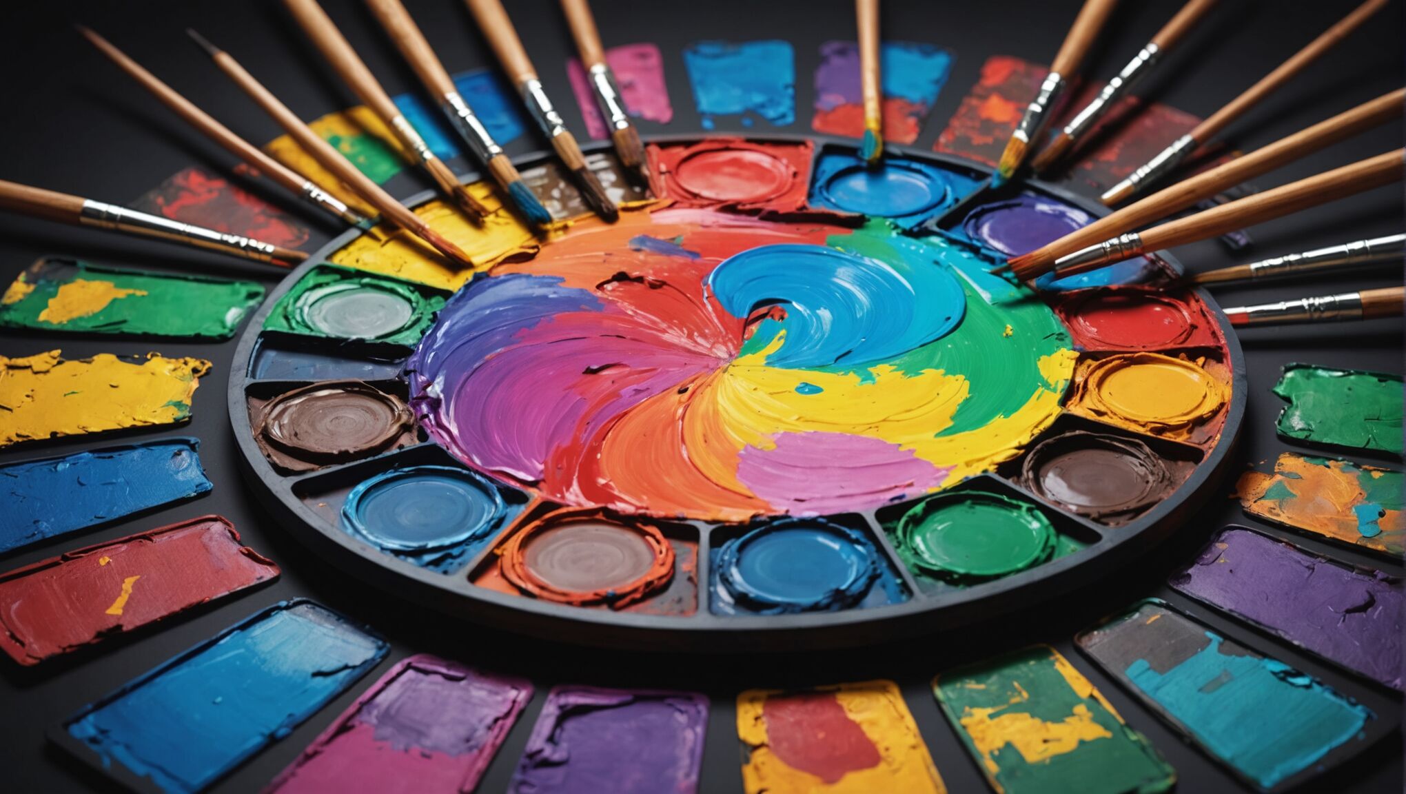
Abstract art elements have become increasingly popular in fantasy and romance cover design, offering a unique way to capture readers’ attention and convey complex themes. These elements can range from simple geometric shapes to intricate patterns and textures, each serving a specific purpose in the overall composition. Fluid lines and organic forms are particularly effective in creating a sense of movement and energy, which can be especially appealing for action-packed fantasy novels or passionate romance stories. Designers often incorporate swirling brushstrokes, splatter effects, or abstract landscapes to evoke a sense of mystery or otherworldliness.

Another key aspect of using abstract art in cover design is the strategic use of negative space. By leaving certain areas of the cover intentionally blank or minimally decorated, designers can create a powerful contrast that draws the eye to specific focal points. This technique is particularly useful for highlighting important text elements such as the book title or author’s name. Texture and layering also play a crucial role in abstract cover designs, adding depth and visual interest. Designers may incorporate techniques like digital collage, mixed media, or even tactile elements to create a multi-dimensional effect that entices potential readers to pick up the book.

Abstract elements can also be used to subtly hint at the book’s content without giving too much away. For example, a fantasy novel featuring elemental magic might incorporate abstract representations of fire, water, earth, and air into its cover design. Similarly, a romance novel could use abstract heart shapes or intertwining lines to suggest the connection between characters. By employing these abstract art elements thoughtfully, designers can create covers that are both visually striking and thematically relevant, effectively capturing the essence of the story within.

Conveying emotion through abstraction

Abstraction in cover design offers a powerful tool for evoking emotions and setting the tone for fantasy and romance novels. By moving away from literal representations, abstract elements can tap into the viewer’s subconscious, creating an immediate emotional response that resonates with the book’s themes and atmosphere.

“Art is not what you see, but what you make others see.” – Edgar Degas

This quote perfectly encapsulates the essence of using abstraction to convey emotion in cover design. The goal is not to present a clear image, but to create a feeling that aligns with the story within.

Color plays a crucial role in this emotional conveyance. Vibrant reds and oranges can evoke passion and intensity, making them ideal for steamy romance novels or action-packed fantasy adventures. Conversely, cool blues and purples might be used to create a sense of mystery or magic, perfect for ethereal fantasy worlds or introspective romantic journeys.

The use of texture in abstract designs can also elicit strong emotional responses. Rough, jagged textures might convey conflict or turmoil, while smooth, flowing textures can suggest harmony or serenity. By combining these textural elements with appropriate color choices, designers can create covers that speak to readers on an instinctual level.

Shape and form are equally important in abstract emotional conveyance. Soft, curved shapes often evoke feelings of comfort and sensuality, making them well-suited for romance novels. On the other hand, sharp angles and dynamic forms can create tension and excitement, ideal for high-stakes fantasy narratives.

Layering and opacity effects can add depth to abstract designs, allowing for complex emotional landscapes. By overlapping different elements with varying levels of transparency, designers can create a sense of mystery or reveal hidden depths, mirroring the complexities of character relationships or fantastical worlds.

The use of abstract symbols can also be a powerful tool for emotional conveyance. A stylized heart might represent love, while a spiral could suggest transformation or the passage of time. These symbols, when integrated into an abstract design, can communicate core themes of the book without resorting to literal imagery.

Motion and direction in abstract designs can guide the viewer’s eye and evoke specific emotions. Upward-moving elements might suggest hope or aspiration, while downward or chaotic movements could represent conflict or turmoil. This sense of movement can be particularly effective in conveying the emotional journey of characters in both fantasy and romance genres.

By carefully considering these abstract elements and their emotional impacts, designers can create covers that not only catch the eye but also resonate with potential readers on a deeper level. The goal is to create an immediate emotional connection that compels the viewer to pick up the book and dive into the world within.

Balancing abstract and figurative elements
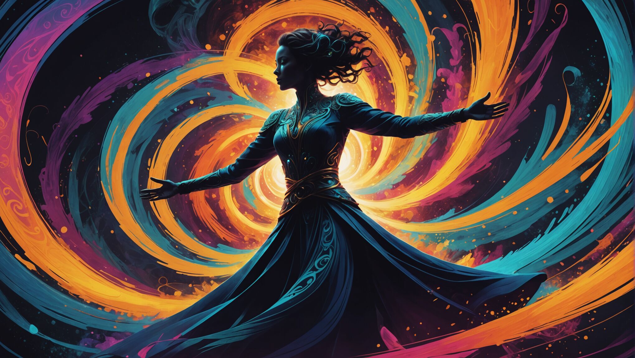
Using Abstract Art in Fantasy and Romance CoversStriking the right balance between abstract and figurative elements in fantasy and romance cover design is a delicate art that requires careful consideration and artistic finesse. This harmony can create a visually compelling cover that both intrigues potential readers and accurately represents the book’s content.

Figurative elements, such as character depictions or recognizable objects, provide a tangible connection to the story and can help readers quickly identify the genre. However, when combined with abstract elements, these figurative components can take on new depths of meaning and intrigue.

One effective approach is to use abstract elements to frame or enhance figurative aspects. For instance, a fantasy novel might feature a realistic portrait of the protagonist surrounded by swirling, abstract patterns that hint at magical forces or otherworldly realms. This juxtaposition can create a dynamic visual tension that draws the eye and sparks curiosity.

Another technique is to blend figurative and abstract elements seamlessly. This can be achieved by incorporating abstract textures or patterns into figurative elements, such as a character’s clothing or hair. This approach can add a layer of complexity and intrigue to the cover, suggesting that there’s more to the story than meets the eye.

The level of abstraction can also be adjusted to suit the specific needs of the book. A high fantasy novel might lean more heavily on abstract elements to convey a sense of the unknown and magical, while a contemporary romance might use more subtle abstract touches to enhance an otherwise realistic scene.

Negative space plays a crucial role in balancing these elements. By strategically leaving areas of the cover open or minimally decorated, designers can create breathing room that allows both abstract and figurative elements to shine without overwhelming the viewer.

Color can be used as a unifying factor, tying abstract and figurative elements together into a cohesive whole. A limited color palette applied across both abstract and figurative components can create a sense of unity and purpose in the design.

It’s important to consider the target audience when balancing these elements. Younger readers might respond better to more figurative elements, while mature audiences might appreciate a higher degree of abstraction. However, these are not hard and fast rules, and breaking conventions can sometimes lead to standout covers that capture attention.

The placement of text elements, such as the title and author’s name, should also be considered in this balance. These can be integrated into the design, becoming part of the abstract-figurative interplay, or they can be used to separate and define different areas of the cover.

Ultimately, the goal is to create a cover that is visually striking, emotionally resonant, and true to the essence of the book. By thoughtfully balancing abstract and figurative elements, designers can create covers that not only stand out on shelves or online marketplaces but also provide a tantalizing glimpse into the worlds contained within the pages.

As you consider these principles, reflect on how they might apply to your favorite book covers. How do they balance the abstract and the figurative? What emotions do they evoke, and how do they achieve this? By analyzing existing designs and experimenting with your own ideas, you can develop a deeper appreciation for this art form and perhaps even create your own captivating cover designs.

Color theory for fantasy and romance covers

Color theory plays a crucial role in creating compelling fantasy and romance book covers. The strategic use of color can evoke specific emotions, set the mood, and draw potential readers into the world of the story. For fantasy covers, rich, saturated colors often dominate the palette. Deep purples and blues can create a sense of mystery and magic, while vibrant greens might suggest lush, otherworldly landscapes. Gold accents are frequently used to convey a sense of regality or ancient power, essential elements in many fantasy narratives.

Romance covers, on the other hand, often lean towards warmer tones. Soft pinks and reds are classic choices, symbolizing love and passion. However, contemporary romance designs might incorporate bolder, more unexpected color combinations to stand out in a crowded market. Designers might use complementary colors to create visual tension, mirroring the conflicts and attractions between characters.

The use of color gradients can be particularly effective in both genres. In fantasy covers, a gradient from dark to light might represent the journey from danger to triumph, or from the mundane world to a magical realm. For romance, a subtle blend of colors can create a dreamy, romantic atmosphere that draws the reader in.

Contrast is another critical aspect of color theory in cover design. High contrast between light and dark elements can create drama and intrigue, perfect for high-stakes fantasy adventures or passionate romances. Conversely, low contrast and muted tones might be used for more introspective or historical works in either genre.

Color psychology also plays a significant role. Blue, often associated with trust and stability, might be used in a romance cover to suggest a deep, lasting connection between characters. In fantasy, it could represent magical ice or the vastness of the sea. Red, with its associations of passion and danger, can be equally effective in both genres, signaling intense emotions or perilous situations.

The interplay between warm and cool colors can create dynamic and engaging compositions. A predominantly cool-toned fantasy cover might use a splash of warm color to draw attention to a crucial element, such as a magical artifact or a heroic character. Similarly, a romance cover dominated by warm, passionate tones could incorporate cooler colors to represent obstacles or conflicting emotions in the relationship.

Designers must also consider how colors will appear in different formats. What looks striking on a physical book cover may not have the same impact when viewed as a small thumbnail image online. This consideration often leads to the use of bold, easily distinguishable color schemes that maintain their impact across various platforms.

Seasonal color trends can influence cover design as well. While it’s important to create a timeless look, being aware of current color preferences can help a book stand out in the market. However, designers must balance trendiness with the need to accurately represent the book’s content and appeal to its target audience.

Ultimately, the most effective use of color in fantasy and romance covers comes from a deep understanding of the story itself. The chosen color palette should not only attract attention but also provide insight into the book’s themes, characters, and emotional landscape. When used skillfully, color becomes a powerful storytelling tool, capable of conveying complex ideas and emotions at a single glance.


How to Add Fantasy Elements to Romance Book Covers

How to Add Fantasy Elements to Romance Book Covers

When designing a romance book cover with fantasy elements, the color palette plays a crucial role in setting the tone and atmosphere. Opt for rich, vibrant hues that evoke a sense of magic and wonder. Deep purples, midnight blues, and emerald greens can create an air of mystery and enchantment. Consider incorporating metallic accents like gold or silver to add a touch of ethereal elegance. Iridescent colors can also be effective in conveying a magical ambiance, as they shift and change depending on the light and viewing angle.

Experiment with gradients and color blending techniques to achieve a dreamy, otherworldly effect. Soft, misty backgrounds in pastel shades can evoke a sense of fantasy realms, while bold, contrasting colors can create a more dramatic and intense atmosphere. Don’t shy away from unconventional color combinations that might not typically be associated with romance, such as deep reds paired with electric blues or smoky grays with hints of shimmering rose gold. These unexpected pairings can help your cover stand out and immediately signal to readers that they’re in for a unique blend of romance and fantasy.

Consider the specific fantasy elements or themes in your story when selecting your color scheme. For example, if your romance features fire magic, incorporate warm oranges, reds, and yellows. For a story set in an enchanted forest, lean towards lush greens and earthy browns with pops of magical, glowing elements. “Color is a power which directly influences the soul,” as noted by artist Wassily Kandinsky, and this principle is especially true when crafting a fantasy romance cover that aims to captivate and transport readers to another world.

Magical symbols and motifs

To enhance the magical atmosphere of your fantasy romance book cover, incorporate symbols and motifs that resonate with the mystical elements of your story. Ancient runes, alchemical symbols, and celestial designs can add layers of intrigue and depth to your cover. Consider including elements like spirals, which symbolize growth and evolution, or the tree of life, representing interconnectedness and wisdom.

Magical motifs can be subtly woven into the background or prominently featured as part of the main design. For instance, a delicate pattern of constellations or zodiac signs could frame the central image, hinting at celestial influences in the story. Alternatively, a large, ornate key or an intricate dreamcatcher could serve as a focal point, symbolizing unlocked secrets or protected dreams.

“Symbols and signs rule the world, not words nor laws.” – Confucius

This ancient wisdom underscores the power of visual elements in conveying complex ideas and emotions, making symbols particularly effective on book covers.

When selecting magical symbols, ensure they align with your story’s themes and setting. For a romance set in a world of elemental magic, consider incorporating stylized representations of earth, air, fire, and water. If your tale involves time travel or prophecy, clockwork gears or an hourglass might be appropriate motifs.

Don’t overlook the power of flora and fauna in magical symbolism. Mystical creatures like phoenixes or dragons can be subtly integrated into decorative borders or as small emblems. Similarly, flowers with magical associations, such as roses for love or lilies for purity, can add both beauty and meaning to your cover design.

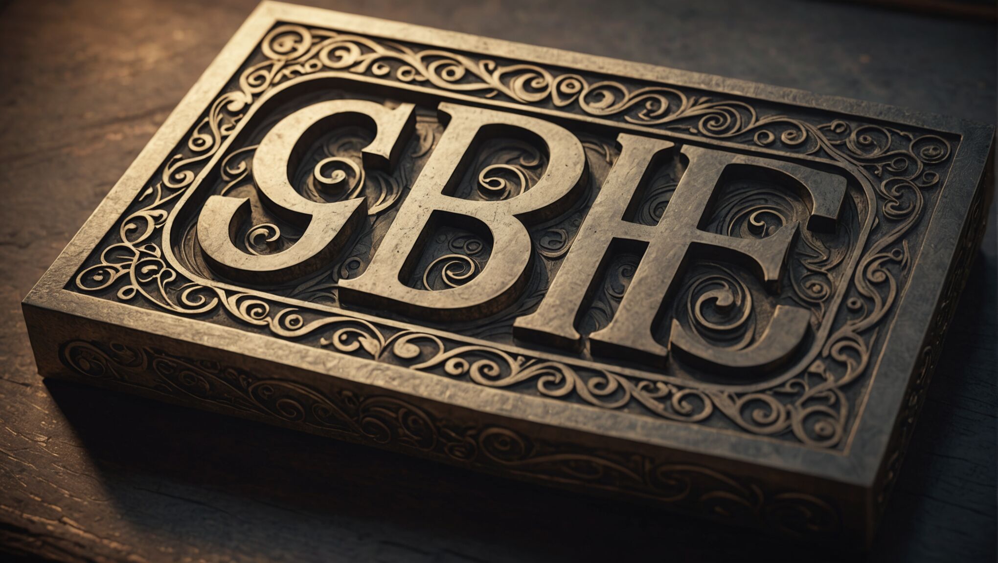
Typography can also play a role in conveying magical elements. Choose fonts that evoke a sense of fantasy, such as elegant scripts or runic-inspired lettering. The title itself can be adorned with magical flourishes or integrated with symbolic elements to create a cohesive and enchanting design.

Remember to balance these magical symbols and motifs with romantic elements to maintain the genre’s appeal. A heart-shaped locket engraved with mystical symbols or lovers’ silhouettes formed by constellations can beautifully merge the romantic and fantastical aspects of your story.

Lastly, consider the use of negative space in your design. Sometimes, the absence of elements can be just as powerful as their presence. A seemingly simple cover with a single, potent magical symbol can be incredibly striking and memorable.

Incorporating mythical creatures

How to Add Fantasy Elements to Romance Book CoversIncorporating mythical creatures into romance book covers can significantly enhance the fantasy elements and create an immediate visual impact. These beings, drawn from folklore, legends, and imagination, can serve as powerful symbols of the magical world within your story.

Consider featuring majestic creatures like dragons, unicorns, or phoenixes as central figures or subtle background elements. A dragon coiled protectively around a couple could symbolize fierce love and passion, while a unicorn peeking through a misty forest might represent purity and the magical nature of true love.

Mermaids and mermen are excellent choices for romance covers with aquatic themes. Their alluring and mysterious nature perfectly blends fantasy with romantic intrigue. You could depict a passionate embrace between a human and a merperson, hinting at a forbidden love story that transcends the boundaries between worlds.

For a more subtle approach, incorporate smaller mythical beings like fairies, pixies, or will-o’-the-wisps. These can be scattered across the cover, creating a magical atmosphere without overshadowing the romantic elements. Glowing fireflies that, upon closer inspection, reveal themselves to be tiny fairies can add a delightful touch of whimsy and enchantment.

Creatures from various mythologies can also be powerful additions. A majestic griffin or a wise sphinx could suggest a story rich in lore and adventure. Alternatively, shapeshifters like werewolves or selkies offer opportunities to explore themes of duality and transformation in both the cover art and the story itself.

When incorporating these creatures, pay attention to scale and positioning. A massive kraken tentacle wrapping around the edge of the cover can create intrigue without revealing the full creature. Similarly, the silhouette of a phoenix rising in the background can add a layer of symbolism without dominating the composition.

Consider the interaction between the mythical creatures and the human elements on your cover. A tender moment between a character and a normally fearsome beast can convey themes of trust, understanding, and the transformative power of love.

Texture and detail are crucial when depicting mythical creatures. The scales of a dragon, the iridescent wings of a fairy, or the luminous mane of a unicorn can add depth and visual interest to your cover. Use techniques like embossing or spot UV printing to make these textures pop and invite tactile exploration.

Remember that the mythical creatures you choose should resonate with the themes and setting of your story. A cover featuring a playful sprite might not be suitable for a dark, intense romance, just as a menacing chimera might be out of place on a light-hearted romantic comedy.

As you explore these options, consider how different cultures perceive and depict mythical creatures. This can lead to unique and diverse representations that set your cover apart and potentially appeal to a broader audience.

Ultimately, the key is to strike a balance between the fantastical and the romantic. The mythical creatures should enhance the love story, not overshadow it. When done right, these magical beings can elevate your romance book cover, making it irresistible to readers seeking a blend of love and fantasy.

Blending realistic and fantastical elements

Creating a harmonious blend of realistic and fantastical elements on a romance book cover is an art that requires careful consideration and creativity. This approach allows you to ground the cover in familiar reality while simultaneously hinting at the magical aspects of your story. Start by selecting a realistic base for your cover, such as a photograph or realistic illustration of your main characters or a romantic scene. This provides a relatable anchor for potential readers.

Once you have your realistic foundation, begin layering fantastical elements subtly. For instance, you might add a soft, ethereal glow around the characters, suggesting an otherworldly aura or magical energy. Alternatively, incorporate small magical details into the background, like floating orbs of light, shimmering particles, or delicate, translucent fairy wings barely visible behind a character’s silhouette.

Playing with perspective and scale can be an effective way to blend realism with fantasy. Consider placing a hyper-realistic couple in the foreground while featuring a fantastical landscape or mythical creature in the background. This juxtaposition creates intrigue and invites viewers to imagine the story within. You could also experiment with surreal elements, such as objects defying gravity or impossible architecture, to hint at a world where magic bends the rules of reality.

Texture and lighting play crucial roles in seamlessly merging realistic and fantastical elements. Use lighting effects to create an atmosphere of mystery and magic. Soft, diffused light can give a dreamy quality to realistic elements, while strategic use of lens flares or light beams can suggest magical occurrences. When it comes to texture, ensure that fantastical elements have a level of detail that matches the realistic portions of the cover. This consistency helps to create a cohesive overall image.

Color grading is another powerful tool for blending elements. Apply a uniform color treatment across both realistic and fantastical components to tie them together visually. This could involve adding a subtle magical hue to the entire image or using color to highlight the transition between the real and the magical.

Consider incorporating fantastical elements that interact with realistic ones. For example, magical vines could be entwining around a realistic couple, or mystical mist might be partially obscuring a true-to-life landscape. This interaction helps to create a sense of cohesion and believability in the merging of two worlds.

Remember that the human eye is drawn to faces and expressions. If your cover features characters, their expressions and body language should reflect both the romantic and fantastical elements of your story. A look of wonder, a mysterious smile, or a gaze fixed on something beyond the frame can all hint at the magical aspects of your narrative.

Lastly, don’t underestimate the power of negative space and minimalism. Sometimes, a single, well-executed fantastical element against a realistic backdrop can be more impactful than a cover crowded with magical details. The key is to find the right balance that intrigues readers without overwhelming them, inviting them to explore the unique blend of romance and fantasy that your book offers.

Designing Covers for International Audiences: What to Consider

Designing Covers for International Audiences: What to Consider

When designing covers for international audiences, it’s crucial to consider the diverse cultural sensitivities and symbolism that exist across different regions. What may be perfectly acceptable in one culture could be offensive or misinterpreted in another. “Cultural intelligence is the key to successful global design,” as many experts in the field often emphasize. Designers must research and understand the target audience’s cultural context, including religious beliefs, historical events, and social norms.

Symbols and images that seem innocuous in one country might carry unexpected meanings elsewhere. For instance, the thumbs-up gesture is generally positive in Western cultures but can be considered vulgar in parts of the Middle East and West Africa. Similarly, animals like pigs or cows may be seen as cute or friendly in some cultures but could be offensive or taboo in others due to religious or cultural reasons.

It’s also important to be aware of political sensitivities, especially when dealing with maps or national symbols. Territorial disputes or historical conflicts can make certain depictions controversial. For example, showing Kashmir as part of either India or Pakistan could spark outrage depending on the audience. Cultural appropriation is another pitfall to avoid, as using traditional patterns, dress, or symbols without proper context or permission can be seen as disrespectful.

To navigate these complexities, designers should consult with local experts or cultural advisors when possible. Conducting thorough research and user testing with members of the target audience can also help identify potential issues before they become problematic. By approaching cover design with cultural sensitivity and awareness, creators can ensure their work resonates positively with diverse international audiences while avoiding unintended offense or misunderstandings.

Color psychology across cultures

Colors play a crucial role in how audiences perceive and interact with cover designs, and their meanings can vary significantly across cultures. Understanding these differences is essential for creating covers that resonate with international audiences and convey the intended message effectively.

“Color is a power which directly influences the soul.” – Wassily Kandinsky

In Western cultures, for instance, white often symbolizes purity and cleanliness, while in many Asian countries, it’s associated with mourning and death. Similarly, red is considered lucky and auspicious in China but can signify danger or warning in Western contexts. These cultural variances in color interpretation can significantly impact how a cover design is received.

Blue is generally viewed positively in many cultures, often associated with trust, stability, and calmness. However, in some Middle Eastern countries, it can be seen as a protective color against the evil eye. Green, while commonly linked to nature and growth in many parts of the world, holds special significance in Islamic cultures as a sacred color.

Yellow, often associated with happiness and optimism in Western cultures, can signify cowardice in some countries. In Egypt, it’s the color of mourning. Purple, traditionally linked to royalty and luxury in the West, can have different connotations in other parts of the world. In Brazil, for example, it’s sometimes associated with mourning.

When designing for a global audience, it’s crucial to consider the cultural context of color combinations as well. Some color pairings might be strongly associated with national flags or political parties, potentially leading to unintended implications or biases.

To navigate these complexities, designers should conduct thorough research on color preferences and meanings in target markets. This may involve consulting color psychology studies specific to different regions or working with local experts who can provide insights into cultural nuances.

It’s also important to consider the practical aspects of color use in different parts of the world. For example, in countries with strong sunlight, certain color combinations might be more visually effective than others due to how they’re perceived in bright light conditions.

Testing designs with focus groups from the target audience can provide valuable feedback on color perceptions and emotional responses. This user-centric approach helps ensure that the chosen color scheme aligns with cultural expectations and effectively communicates the intended message.

While adhering to cultural color norms is important, designers should also balance this with brand consistency. If a brand has a strong color identity, finding ways to adapt it sensitively to different cultural contexts without losing core brand recognition is key.

By carefully considering the psychological and cultural implications of color choices, designers can create cover designs that not only avoid potential cultural faux pas but also resonate deeply with international audiences, enhancing the overall impact and appeal of their work.

Typography and language considerations

Designing Covers for International Audiences: What to ConsiderWhen it comes to typography and language considerations for international cover designs, the challenges are multifaceted and require careful attention to detail. The choice of typeface, font size, and overall layout can significantly impact readability and cultural appropriateness across different languages and writing systems.

One of the primary considerations is the direction of text flow. While many Western languages read from left to right, others, such as Arabic and Hebrew, read from right to left. This fundamental difference can greatly affect the overall design layout and visual hierarchy. Designers must be prepared to create flexible layouts that can accommodate these variations without compromising the aesthetic appeal or functionality of the cover.

Font selection is another critical aspect. Different writing systems have unique characteristics that may require specific font types. For instance, Chinese characters are more complex than Latin letters and may need larger font sizes or different spacing to maintain legibility. Similarly, Arabic script requires fonts that can handle the intricate ligatures and contextual forms inherent to the language.

It’s also essential to consider the cultural connotations of certain typefaces. What may appear elegant or professional in one culture could be perceived as outdated or inappropriate in another. Serif fonts, for example, are often associated with tradition and formality in Western cultures but might not carry the same connotations elsewhere.

When dealing with multilingual covers, designers must grapple with the challenge of maintaining visual harmony while accommodating text in different languages. This often involves finding a balance between preserving the original design concept and adapting it to suit various linguistic needs. Sometimes, this may require creating separate covers for different language editions rather than trying to fit multiple languages on a single cover.

Typography also plays a crucial role in conveying tone and emotion. The weight, style, and arrangement of text can dramatically alter the message’s impact. What works in one language may not translate effectively to another, both literally and figuratively. Designers must be sensitive to these nuances and work closely with translators and local experts to ensure that the typographic choices align with the intended message and cultural expectations.

Another important consideration is the potential for text expansion or contraction when translating between languages. Some languages, like German, tend to use longer words and phrases compared to English, which can affect layout and spacing. Conversely, languages like Chinese may require less space due to the compact nature of its characters. Designers need to anticipate these variations and create flexible layouts that can accommodate different text lengths without compromising the overall design integrity.

Legal and regulatory requirements regarding language use on covers can also vary by country. Some regions may require certain information to be displayed in specific languages or formats, which can impact the design process. Staying informed about these regulations is crucial to avoid potential legal issues or the need for costly redesigns.

As technology continues to advance, designers must also consider how typography will render across different devices and platforms. What looks crisp and clear on a physical book cover may not translate well to a small smartphone screen or e-reader. Ensuring that the chosen typography remains legible and effective across various mediums is increasingly important in our digital age.

By carefully considering these typographic and language factors, designers can create covers that not only look visually appealing but also effectively communicate across linguistic and cultural boundaries. This attention to detail can significantly enhance the global reach and impact of a publication, making it accessible and appealing to a diverse international audience.

Visual hierarchy for global appeal

Creating a visual hierarchy that appeals to global audiences requires a delicate balance between universal design principles and cultural nuances. The goal is to guide the viewer’s eye through the cover’s elements in a way that’s intuitive and engaging across different cultural contexts. This often involves using a combination of size, color, contrast, and placement to emphasize key information and create a cohesive visual narrative.

One effective approach is to use imagery that transcends language barriers. Iconic symbols or universally recognizable images can quickly convey the essence of the content without relying heavily on text. However, it’s crucial to ensure that these visual elements are culturally appropriate and don’t carry unintended meanings in different regions.

The placement of elements on the cover should follow a logical flow that aligns with the reading patterns of the target audience. While many Western cultures follow a left-to-right, top-to-bottom reading pattern, this isn’t universal. Designers must be mindful of how different cultures process visual information and adjust their layouts accordingly.

Contrast plays a vital role in creating visual hierarchy. By using contrasting colors, sizes, or styles, designers can draw attention to the most important elements of the cover. However, the interpretation of contrast can vary across cultures. What might be seen as a bold, attention-grabbing design in one culture could be perceived as chaotic or overwhelming in another.

Whitespace, or negative space, is another powerful tool in creating global appeal. It can help create a sense of balance and sophistication that translates well across cultures. However, the amount of whitespace that’s considered appropriate can vary. Some cultures may prefer more densely packed designs, while others appreciate minimalism.

When incorporating text, it’s important to consider how different languages and scripts will affect the overall layout. Titles or key phrases should be prominently displayed and easily readable, regardless of the language. This may require flexible design templates that can accommodate varying text lengths and character sets without losing their visual impact.

The use of grids can provide a structure that’s universally understood and appreciated. Grids help organize information in a clear, logical manner that can be adapted to different cultural preferences while maintaining a sense of order and professionalism.

Incorporating local design elements or motifs can make a cover more appealing to specific markets. However, this should be done thoughtfully and authentically, avoiding stereotypes or superficial representations. Collaborating with local designers or cultural experts can provide valuable insights into creating visually appealing covers that resonate with particular audiences while maintaining global appeal.

Testing designs with diverse focus groups can provide crucial feedback on how different elements of the visual hierarchy are perceived across cultures. This iterative process allows designers to refine their approach and create covers that truly have global appeal.

Ultimately, creating a visual hierarchy for global appeal requires a deep understanding of both universal design principles and cultural specifics. It’s about finding common ground in visual communication while respecting and celebrating cultural differences. By carefully considering these factors, designers can create covers that not only catch the eye but also effectively communicate across diverse international audiences.

How Dark Fantasy Themes Are Shaping Book Covers in 2024

How Dark Fantasy Themes Are Shaping Book Covers in 2024

The landscape of book cover design is undergoing a dramatic transformation in 2024, with dark fantasy themes taking center stage. Gone are the days of bright, cheerful covers dominating bookstore shelves; instead, readers are drawn to moody, atmospheric designs that hint at the brooding narratives within. This shift reflects a growing appetite for stories that explore darker themes and complex emotions. Cover artists are embracing shadowy silhouettes, misty landscapes, and eerie, moonlit scenes to capture the essence of these tales. Texture plays a crucial role, with designers incorporating tactile elements like embossed lettering, velvet finishes, and foil accents to create an immersive sensory experience. “The cover is the reader’s first glimpse into the world of the book,” notes renowned designer Sarah Blackwood. “For dark fantasy, we’re creating portals that beckon readers into realms of mystery and danger.” Intricate details hidden within the artwork are becoming increasingly popular, rewarding closer inspection and hinting at plot elements without giving too much away. Many covers feature partially obscured faces or figures, leaving room for the reader’s imagination to fill in the gaps. The use of negative space is also on the rise, with designers leveraging the power of what’s left unseen to evoke a sense of unease and anticipation. As the genre continues to evolve, we can expect to see even more innovative approaches to dark aesthetics in cover design, pushing the boundaries of what’s possible in visual storytelling.

Symbolism and occult imagery

In 2024, book covers in the dark fantasy genre are increasingly incorporating symbolism and occult imagery to captivate readers and convey the mysterious and supernatural elements of the stories within. These designs draw heavily from ancient mythologies, esoteric traditions, and arcane symbols, creating a visual language that speaks directly to the subconscious of potential readers.

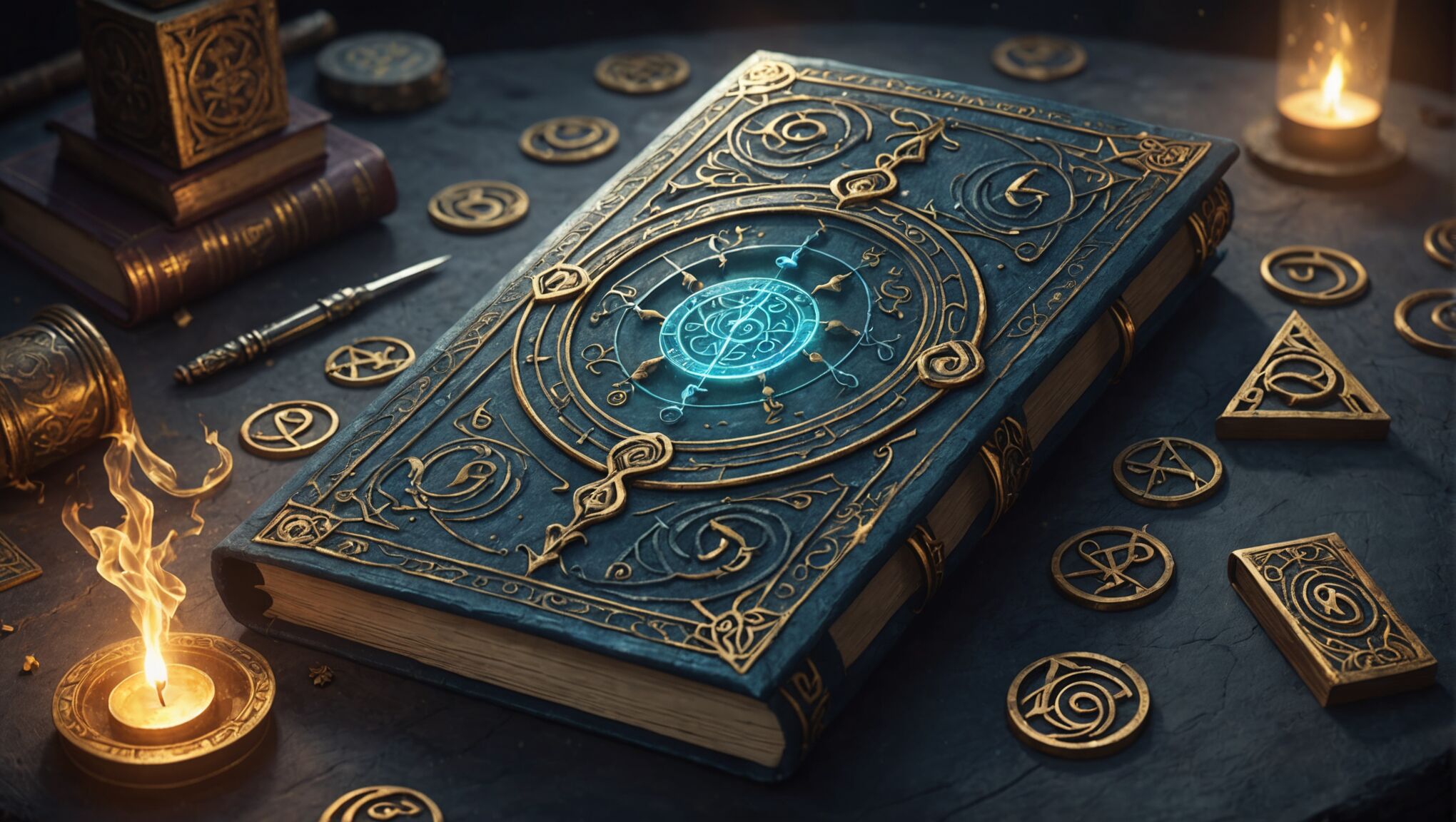
Alchemical symbols, once the domain of obscure texts, are now finding their way onto mainstream book covers. Intricate diagrams of the philosopher’s stone, ouroboros, and celestial bodies intertwine with modern design elements, creating a bridge between the ancient and the contemporary. Tarot card imagery is also experiencing a resurgence, with designers reinterpreting the major arcana in dark, brooding styles that hint at the fateful journeys awaiting the characters inside.

Occult sigils and runes are being woven into cover designs with increasing sophistication. These enigmatic marks, often subtly integrated into borders or background patterns, add layers of meaning for those versed in esoteric knowledge while intriguing casual observers. Some publishers are even experimenting with glow-in-the-dark inks to reveal hidden symbols when the lights are turned off, adding an interactive element to the cover experience.

Animal symbolism remains a powerful tool in dark fantasy cover design. Ravens, wolves, and serpents continue to be popular choices, but designers are also exploring less conventional creatures like the multi-eyed seraphim or chimerical beasts from various mythologies. These beings are often rendered in silhouette or with minimal detail, allowing the viewer’s imagination to fill in the terrifying specifics.

“Symbols are the language of the unconscious. By incorporating them into cover art, we’re speaking directly to the part of the reader that craves mystery and magic,” explains occult scholar and cover design consultant, Dr. Elena Ravencroft.

Mandala-like structures are gaining prominence, often used to frame central images or titles. These intricate, symmetrical designs evoke a sense of cosmic order and hidden knowledge, drawing the eye into their hypnotic patterns. Some covers feature partial or broken mandalas, symbolizing the disruption of natural order that often occurs in dark fantasy narratives.

The use of sacred geometry is also on the rise, with the golden ratio, spirals, and complex polyhedra integrated into cover compositions. These mathematical forms lend a sense of underlying order to the chaotic and otherworldly themes of dark fantasy, suggesting that even in the darkest tales, there are hidden patterns and truths to be uncovered.

Astrological and zodiacal imagery is being reimagined for the dark fantasy aesthetic, with constellations twisted into ominous shapes and planetary alignments hinting at cosmic horror. Moon phases, particularly the dark moon, are frequently used to suggest transformation and hidden influences.

Designers are also drawing inspiration from grimoires and spell books, incorporating faux aged paper textures, arcane writing systems, and illustrations reminiscent of medieval woodcuts. These elements not only set the tone for the story but also transform the book itself into an artifact that feels like it could have been plucked from the fictional world it represents.

As the genre continues to evolve, we can expect to see even more innovative uses of symbolism and occult imagery in dark fantasy cover design. The challenge for designers will be to strike a balance between esoteric authenticity and broad appeal, creating covers that intrigue both dedicated fans of the occult and casual readers alike.

Typography trends in dark fantasy

How Dark Fantasy Themes Are Shaping Book Covers in 2024Typography in dark fantasy book covers is undergoing a dramatic evolution, with designers pushing the boundaries of traditional lettering to create visually arresting and thematically resonant titles. The trend leans towards fonts that evoke a sense of antiquity, mystery, and otherworldliness, often with a touch of the macabre.

Hand-lettered titles are gaining prominence, offering a bespoke feel that sets each book apart. These custom typefaces often feature distressed edges, subtle imperfections, and organic flourishes that suggest a connection to the supernatural or the passage of time. Some designers are even incorporating calligraphic elements inspired by medieval manuscripts, adding an air of forgotten lore to the cover.

Texture plays a crucial role in typography for dark fantasy. Embossed or debossed lettering creates a tactile experience, inviting readers to run their fingers over the title. Metallic foils in deep, rich hues like bronze, copper, or tarnished silver are being used to give titles a sense of depth and luxury, catching the light in intriguing ways.

Negative space is being leveraged to create typography that seems to emerge from the shadows. Letters may be partially obscured or filled with intricate patterns, forcing the viewer to engage more deeply with the cover to decipher the title. This technique not only adds visual interest but also mirrors the theme of hidden knowledge often present in dark fantasy narratives.

Designers are experimenting with unconventional letter placement, breaking traditional layout rules to create tension and unease. Titles might be vertically aligned, spiral around central images, or be split across the cover in unexpected ways. This disruptive approach reflects the genre’s penchant for upending expectations and challenging norms.

Layering is becoming increasingly sophisticated, with typography interacting with cover art in complex ways. Letters might appear to be woven into illustrations, partially obscured by mist, or seemingly carved into stone or wood. This integration of text and image creates a unified visual narrative that draws the reader in.

Font choices are moving beyond the typical Gothic styles associated with dark themes. While ornate serif fonts remain popular, there’s a growing trend towards sleek, modern sans-serif typefaces used in unexpected ways. The contrast between clean, minimalist lettering and ornate background elements can create a striking visual dynamic.

Animated typography is emerging as a cutting-edge trend for e-book covers and online marketing. Letters that subtly shift, glitch, or reveal hidden elements when viewed digitally add an extra layer of intrigue and interactivity to the cover design.

The use of multiple typefaces within a single title is becoming more common, with designers skillfully blending contrasting fonts to create visual hierarchy and emphasize certain words or concepts. This technique can subtly influence how readers interpret the title and set expectations for the story.

As we delve deeper into 2024, the typography trends in dark fantasy book covers continue to evolve, challenging our perceptions and inviting us to look closer. These designs not only serve to attract readers but also function as the first chapter of the story, setting the tone and atmosphere before a single page is turned.

What hidden messages might be lurking in the intricate details of these typographic designs? How do these visual cues shape our expectations and experiences of the stories within? As readers and observers, we’re invited to engage more deeply with these covers, to decode their secrets, and to consider how the artistry of typography contributes to the overall narrative experience.

Color palettes for ominous atmosphere

In the realm of dark fantasy book covers, color palettes play a crucial role in establishing an ominous atmosphere that captivates readers and sets the tone for the narrative within. Designers are moving away from bright, vibrant hues in favor of more muted, somber tones that evoke a sense of unease and intrigue. Deep, inky blacks serve as a foundation, symbolizing the unknown and the mysterious depths of the stories. These are often contrasted with rich, dark purples that hint at royalty, magic, and the supernatural, creating a regal yet unsettling effect.

Blood reds are making a strong appearance, not in their bright, primary form, but as deep, oxidized hues that suggest ancient rituals and hidden dangers. These are often used sparingly, as accents or for specific elements like titles or symbolic imagery, to create focal points that draw the eye and evoke a visceral response. Complementing these darker tones, designers are incorporating muted greens reminiscent of decay and toxic environments, further enhancing the sense of otherworldliness and danger.

Metallic accents are gaining popularity, with tarnished golds, aged silvers, and oxidized coppers adding a touch of opulence to the darkness. These metallic elements often catch the light in intriguing ways, creating a dynamic visual experience as the book is handled. Designers are also experimenting with iridescent and holographic effects, which shift and change as the cover moves, mimicking the elusive and shape-shifting nature of many dark fantasy creatures and concepts.

Gradients are being used to great effect, with colors seamlessly blending from one dark hue to another, creating an illusion of depth and dimensionality. These gradients often mimic the transition from twilight to full darkness, reinforcing the liminal spaces where many dark fantasy stories take place. Smoky textures and misty overlays add to this effect, obscuring parts of the cover and leaving room for the imagination to fill in the gaps.

Cool tones dominate the palette, with midnight blues and stormy grays evoking a sense of isolation and impending doom. These are occasionally punctuated by warmer tones like amber or deep orange, used sparingly to represent flickering firelight or magical energy, providing a stark contrast to the overall coolness of the design. The interplay between warm and cool creates tension within the cover, reflecting the conflicts often found in dark fantasy narratives.

Designers are also exploring the power of near-monochromatic color schemes, using subtle variations of a single hue to create depth and interest. For example, a cover might feature multiple shades of charcoal gray, from almost-black to lighter smoke tones, creating a foggy, dreamlike quality that blurs the lines between reality and fantasy. This technique requires masterful control of value and tone to ensure that important elements remain distinct and legible.

The use of negative space is becoming increasingly sophisticated, with designers leveraging the absence of color to create striking silhouettes and shapes. White or very light colors are used minimally but effectively, often to represent moonlight, ghostly apparitions, or to highlight critical text elements that stand out starkly against the darker background.

As environmental concerns grow, there’s a trend towards using natural, earthy tones that evoke ancient forests and primordial landscapes. Deep forest greens, rich earth browns, and stormy ocean blues are being combined to create palettes that feel both timeless and slightly forbidding, perfect for tales of dark fae or vengeful nature spirits.

Digital techniques are allowing for more complex color interactions, with some covers featuring subtle color shifts or hidden elements that only become visible under certain light conditions or when viewed from specific angles. This adds an interactive element to the cover, encouraging readers to engage more deeply with the book as a physical object.

The overall effect of these color choices is to create book covers that are not just visually striking but also emotionally evocative. They promise readers a journey into worlds where darkness reigns, magic lurks in the shadows, and danger awaits at every turn. As the dark fantasy genre continues to evolve, we can expect to see even more innovative uses of color to create atmospheres that are both beautiful and unsettling, drawing readers into the mysterious realms that lie within the pages.

How Typography Sets the Tone for Book Covers

How Typography Sets the Tone for Book Covers

Book covers serve as the first point of contact between readers and stories, and typography plays a crucial role in this visual narrative. The choice of typeface, its arrangement, and style can convey a wealth of information about the book’s content, genre, and tone before a single page is turned. “Typography is the voice of the written word,” and on book covers, it becomes the visual voice of the entire story.

Elegant serif fonts might whisper tales of historical romance, while bold sans-serif typefaces could shout the excitement of a thriller. The way letters are shaped, spaced, and sized can evoke emotions, set expectations, and even hint at the time period or setting of the narrative. For instance, a distressed typeface might suggest a post-apocalyptic world, while flowing scripts could indicate a whimsical fantasy adventure.

Typography also works in harmony with other design elements to create a cohesive visual story. The interplay between text and images can reinforce themes, create intrigue, or highlight key plot elements. Visual hierarchy achieved through typography guides the reader’s eye, emphasizing the title, author’s name, or tagline in a deliberate sequence that mirrors the importance of each element.

Moreover, typography can be used to create visual metaphors that relate to the book’s content. Letters might be formed from relevant objects, integrated with illustrations, or manipulated to represent key themes. This level of typographic creativity not only catches the eye but also engages potential readers on a deeper level, inviting them to decode the visual puzzle and connect with the story before they’ve even opened the book.

In the digital age, where thumbnails of book covers are often the first exposure readers have to a title, typography’s storytelling power becomes even more critical. It must work effectively at various sizes, conveying the essence of the book even when reduced to a small image on a screen. This challenge has led designers to create increasingly bold and innovative typographic solutions that stand out in the crowded digital marketplace.

Font choice and genre expectations

When it comes to book cover design, the choice of font is far from arbitrary. It’s a deliberate decision that taps into readers’ subconscious expectations and associations with different genres. Each typeface carries its own personality and historical context, which designers leverage to create an immediate connection between the book and its intended audience.

Typography is the art and technique of arranging type to make written language legible, readable, and appealing when displayed.

In the realm of fiction, certain fonts have become almost synonymous with specific genres. For thrillers and crime novels, sans-serif fonts with sharp edges and strong lines are often employed to convey tension and urgency. These clean, modern typefaces reflect the contemporary settings of many suspense stories and can create a sense of unease or impending danger.

Romance novels, on the other hand, frequently feature elegant serif fonts or flowing scripts that evoke a sense of passion and timelessness. The curves and flourishes in these typefaces mirror the emotional depth and romantic themes within the pages, inviting readers into a world of love and relationships.

Fantasy and science fiction genres often push the boundaries of typography, using custom or heavily modified fonts that transport readers to other worlds. These might include otherworldly letterforms for fantasy epics or sleek, futuristic typefaces for sci-fi adventures. The goal is to create a visual language that immediately signals the book’s departure from reality.

Historical fiction relies on fonts that evoke a sense of the past. Designers might choose typefaces that were popular during the era in which the story is set, or opt for fonts that have a weathered, aged appearance to suggest the passage of time. This attention to period-appropriate typography helps to establish the book’s historical context before the reader even begins the first chapter.

For non-fiction works, the font choice often reflects the subject matter and the book’s approach to it. Academic texts might use traditional, authoritative serif fonts to convey seriousness and credibility. Self-help books might opt for friendly, approachable sans-serif fonts that feel modern and accessible. Biographies might blend elements of both, depending on the subject and the tone of the work.

Typography also plays a crucial role in children’s books, where the font itself can become part of the storytelling. Playful, hand-drawn typefaces or letters that incorporate pictorial elements can engage young readers and complement the illustrations.

The expectations set by font choices are so ingrained that using an unconventional typeface for a particular genre can be a powerful tool for subverting reader expectations. This technique can be used to signal that a book offers a fresh take on a familiar genre or to create intrigue through visual contradiction.

As the publishing industry evolves, so do typographic trends in book cover design. However, the fundamental principle remains: the font is a silent ambassador for the book’s content, setting the tone and inviting the right readers to explore further. Designers must balance adherence to genre conventions with the need for originality, creating covers that both meet and thoughtfully challenge reader expectations.

Size and placement for maximum impact

How Typography Sets the Tone for Book CoversThe size and placement of typography on a book cover are critical elements that can make or break its visual impact. Designers must carefully consider how to use these factors to create a hierarchy of information and guide the reader’s eye across the cover.

Large, bold typography can command attention and create a sense of importance or urgency. This technique is often used for bestsellers or high-profile authors, where the author’s name or book title becomes the dominant element on the cover. The sheer size of the text can make it impossible to ignore, even when viewed as a small thumbnail online.

Conversely, smaller text can create intrigue and encourage closer inspection. It can be used to add subtle details or create a sense of mystery. Some designers use this technique to hide Easter eggs or additional information within the cover design, rewarding those who take a closer look.

The placement of text elements is equally crucial. Centered text often conveys a sense of balance and formality, while off-center or asymmetrical placements can create dynamic tension and visual interest. Text placed at the edges of the cover can frame the design or lead the eye towards central imagery.

Layering text over images can create depth and integrate the typography with the visual elements. This technique requires careful consideration of contrast and legibility. Sometimes, designers intentionally obscure parts of the text to create a sense of revelation or to symbolize hidden depths within the story.

Vertical or diagonal text orientations can break the monotony of horizontal layouts and add a modern, edgy feel to the design. This approach can be particularly effective for books that challenge conventions or offer fresh perspectives.

The interplay between different text elements is also crucial. The relative sizes of the title, author name, and any taglines or quotes must be balanced to create a clear hierarchy. This hierarchy should reflect the marketing strategy for the book – is the author’s name the main selling point, or is it the intriguing title?

Negative space around text can be just as important as the text itself. Generous white space can create a sense of luxury or importance, while tighter spacing might suggest density of content or intensity of narrative.

In some cases, designers push the boundaries by using oversized typography that extends beyond the edges of the cover. This can create a bold, attention-grabbing effect and suggest that the story is larger than life or too big to be contained within conventional boundaries.

The malleability of digital typography allows for creative approaches like text that follows curved paths, wraps around objects, or morphs into imagery. These techniques can reinforce themes or create visual metaphors related to the book’s content.

As readers, we often process these typographic choices subconsciously, but they significantly influence our perception of the book. By understanding these principles, we can become more discerning consumers of book cover design and appreciate the artistry behind it.

Consider how the size and placement of text on your favorite book covers contribute to their overall impact. How might changing these elements alter your perception of the book? As you browse bookstores or online catalogs, challenge yourself to analyze the typographic choices and how they influence your interest in different titles.

Color and contrast in typographic design

Color and contrast in typographic design are powerful tools that can elevate a book cover from merely informative to visually captivating. The choice of color for typography can evoke specific emotions, set the mood, and even provide subtle hints about the book’s content. Bold, vibrant colors might suggest an energetic or adventurous story, while muted tones could indicate a more serious or introspective work.

Contrast is equally important in ensuring readability and creating visual interest. High contrast between the text and background can make typography pop, ensuring it stands out even when viewed from a distance or as a small thumbnail online. Designers often play with light text on dark backgrounds or vice versa to achieve this effect. However, sometimes intentionally low contrast can be used to create a sense of mystery or to encourage closer inspection of the cover.

The interplay of colors within the typography itself can add depth and complexity to the design. Gradient effects, for instance, can create a sense of dimension or movement. Multi-colored lettering might be used to represent different aspects of the story or to create a playful, dynamic feel appropriate for certain genres like children’s books or contemporary fiction.

Color can also be used to establish a hierarchy among different text elements on the cover. For example, the title might be in a bold, attention-grabbing hue, while the author’s name is in a complementary but less dominant color. This technique guides the viewer’s eye and emphasizes the most important information.

In some cases, designers opt for metallic or reflective finishes on typography, which can add a touch of luxury or otherworldliness to the cover. This is particularly effective for special editions or books in the fantasy and science fiction genres. The way these finishes interact with light can make the cover feel alive and dynamic.

The relationship between the color of the typography and other design elements on the cover is crucial. Text color might be pulled from elements in the cover illustration, creating a cohesive look. Alternatively, contrasting colors can be used to make the typography stand out against complex backgrounds.

Cultural associations with colors should also be considered, especially for books with international audiences. Red might signify luck and prosperity in one culture but danger in another. Thoughtful color choices can help the book resonate with its intended readership.

Environmental factors play a role in color selection as well. Designers must consider how the colors will appear under different lighting conditions, both in physical bookstores and on various digital screens. Colors that look vibrant in one setting might appear dull or muddy in another.

The use of negative space or “white space” (which doesn’t necessarily have to be white) can be just as important as the colored elements. Strategic use of blank areas can make colored typography more impactful and prevent the design from feeling cluttered or overwhelming.

Ultimately, the goal of color and contrast in typographic design for book covers is to create an immediate emotional connection with potential readers. When done effectively, it can communicate the essence of the book at a glance, enticing readers to pick up the book or click for more information. As trends in design evolve, so too do the approaches to color and contrast, but the fundamental principle remains: to use these elements to tell a visual story that complements and enhances the written one within the pages.

The Evolution of Book Cover Design Over the Decades

The Evolution of Book Cover Design Over the Decades

As the publishing industry blossomed in the early 1900s, book cover design underwent a significant transformation. Publishers began to recognize the marketing potential of eye-catching covers, moving away from plain, text-heavy bindings. This era saw the emergence of decorative cloth covers adorned with intricate gilt designs and embossed patterns. Artists and illustrators were commissioned to create visually appealing jacket designs, often featuring romantic or dramatic scenes that reflected the book’s content.

The Art Nouveau movement heavily influenced cover aesthetics during this period, with its flowing lines, natural forms, and ornate typography. Renowned artists like Aubrey Beardsley and Alphonse Mucha lent their distinctive styles to book covers, elevating them to works of art in their own right. As printing technologies advanced, publishers experimented with color lithography, introducing vibrant hues and complex illustrations to capture readers’ attention.

The 1920s and 1930s brought about a shift towards more streamlined designs, influenced by Art Deco and modernist principles. Geometric shapes, bold typography, and stylized illustrations became prevalent. Notable designers like Edward McKnight Kauffer and Rockwell Kent pushed the boundaries of cover design, creating iconic images that remain influential to this day.

During this period, dust jackets also gained prominence. Initially designed to protect books during shipping, they evolved into powerful marketing tools. Publishers began using dust jackets to showcase enticing artwork and promotional text, while the actual book covers underneath often remained relatively simple.

The early 20th century also saw the rise of genre-specific design conventions. Mystery novels, for instance, often featured dark, brooding covers with elements of suspense, while romance books embraced softer colors and romantic imagery. These visual cues helped readers quickly identify the type of story they could expect, a practice that continues to influence book marketing strategies today.

Influences of mid-century modernism on cover art

As the mid-20th century approached, book cover design experienced a dramatic shift influenced by the modernist movement sweeping through various art forms. The austere, function-driven aesthetics of modernism began to reshape the visual landscape of literature, moving away from the ornate designs of the early 1900s.

Designers embraced clean lines, bold geometric shapes, and a more abstract approach to imagery. The influence of Bauhaus principles became evident, with covers featuring asymmetrical layouts, sans-serif typography, and a focus on the interplay between positive and negative space. This new aesthetic was not merely decorative but sought to convey the essence of the book’s content through visual metaphor and symbolism.

“Design is not just what it looks like and feels like. Design is how it works.” – Steve Jobs

Although not specifically about book covers, this quote encapsulates the modernist approach to design that influenced cover art during this period. Designers strived to create covers that were not only visually striking but also communicated the book’s themes and tone effectively.

Color palettes became more experimental, with designers employing vibrant hues and high-contrast combinations to create eye-catching effects. The use of photography in cover design also gained prominence, often manipulated or combined with graphic elements to create surreal and thought-provoking compositions.

Influential designers like Paul Rand and Alvin Lustig revolutionized the field with their innovative approaches. Rand’s covers for Vintage Books, characterized by their playful use of collage and typography, became iconic representations of modernist design principles. Lustig’s work for New Directions Publishing showcased abstract compositions that captured the essence of avant-garde literature.

The mid-century period also saw a greater collaboration between designers and authors. Many writers, recognizing the importance of visual presentation, worked closely with designers to ensure that their book covers accurately represented their work. This partnership often resulted in covers that were as intellectually stimulating as the texts they adorned.

As paperback books gained popularity in the 1950s and 1960s, cover design adapted to the new format. The need to stand out on crowded bookstore shelves led to bolder, more attention-grabbing designs. Illustrators like James Avati and Robert McGinnis created vivid, often provocative cover art for pulp fiction and genre novels, establishing visual tropes that would define these categories for decades.

The influence of mid-century modernism on book cover design extended beyond aesthetics, encouraging a more conceptual approach to visual storytelling. Designers began to view the cover as an integral part of the reader’s experience, capable of setting the tone and creating expectations before the first page was turned.

This period also saw the emergence of series design, where publishers created cohesive visual identities for collections of books. Penguin Books, under the art direction of Germano Facetti, exemplified this trend with its color-coded series and consistently applied typography, creating a recognizable brand identity that elevated the perceived value of paperback books.

The legacy of mid-century modernism in book cover design continues to influence contemporary designers, who often draw inspiration from this era’s bold experimentation and conceptual rigor. The period’s emphasis on visual communication and the integration of design with content remains a cornerstone of effective book cover creation to this day.

The rise of minimalism and typography-driven designs

The Evolution of Book Cover Design Over the DecadesAs the 1970s dawned, a new aesthetic began to emerge in book cover design, characterized by a shift towards minimalism and typography-driven layouts. This movement was a reaction to the bold, busy designs of the mid-century period, embracing simplicity and negative space as powerful design elements.

Designers started to favor stark, pared-down compositions that relied heavily on typography to convey the book’s essence. Fonts became more than just vehicles for text; they were treated as graphic elements in their own right, with designers experimenting with size, placement, and distortion to create visually arresting covers.

The use of color became more strategic, with many designers opting for monochromatic schemes or limited palettes to create a sense of sophistication and restraint. White space, once considered empty and to be filled, was now embraced as an active design element, creating a sense of calm and focusing attention on key visual elements.

This minimalist approach was particularly influential in the design of literary fiction covers. Books by authors like Don DeLillo, Joan Didion, and John Updike often featured covers with large, bold typography set against solid color backgrounds or subtle textures. These designs not only stood out on bookstore shelves but also conveyed a sense of intellectual gravitas.

The rise of Swiss Style or International Typographic Style had a significant impact on this trend. Designers like Massimo Vignelli and Josef Müller-Brockmann popularized the use of grid systems, sans-serif typefaces, and asymmetrical layouts, principles that were readily adopted by book cover designers.

However, this move towards minimalism wasn’t universal. Genre fiction, particularly in categories like science fiction and fantasy, continued to favor more illustrative covers. Yet even here, the influence of minimalism could be seen in cleaner compositions and more thoughtful use of typography.

As computer technology began to play a larger role in design, typography-driven covers became easier to produce and experiment with. Designers could now manipulate type in ways that were previously impossible or prohibitively expensive, leading to innovative and sometimes playful typographic treatments.

This period also saw the rise of conceptual cover design, where a single, powerful image or typographic treatment could encapsulate the entire theme of a book. Designers like Chip Kidd became known for their ability to distill complex narratives into striking visual concepts, often using clever juxtapositions of type and image.

The minimalist approach extended beyond individual books to entire series designs. Publishers like Faber and Faber in the UK adopted consistent typographic styles across their line of poetry books, creating a recognizable brand identity while allowing for subtle variations in color and imagery.

As we reflect on this period of book cover design, it’s worth considering how these minimalist and typography-driven approaches continue to influence contemporary design. In an age of digital distractions and information overload, the power of a simple, well-crafted cover to capture attention and convey meaning remains as relevant as ever.

Moreover, this era challenges us to think about the relationship between form and content in design. How can the visual presentation of a book enhance or even transform our understanding of its contents? What role does typography play in shaping our expectations and experiences as readers?

These questions invite us to look more closely at the book covers we encounter, to appreciate the thought and creativity that goes into their design, and to consider how they shape our interaction with the written word. As we move forward, it’s exciting to contemplate how future technological and cultural shifts might further evolve the art of book cover design.

Digital age and the impact of online book sales

The digital age has brought about a seismic shift in the world of book cover design, largely driven by the rise of online book sales and e-books. As readers increasingly browse and purchase books through digital platforms, designers have had to adapt their approach to create covers that are visually appealing and legible at thumbnail size. This new constraint has led to bolder, simpler designs with larger typography and high-contrast color schemes that can capture attention even when reduced to a small image on a crowded screen.

The proliferation of e-readers has also influenced cover design, with designers now considering how their work will appear on various devices, from smartphones to tablets. This has led to a resurgence of typographic designs, as text often renders more clearly than complex images on digital screens. However, this doesn’t mean a complete abandonment of imagery; rather, designers are finding innovative ways to combine striking visuals with clear, readable text.

Another significant impact of the digital age is the increased importance of branding and series design. With online algorithms often recommending books based on readers’ previous purchases, creating a cohesive visual identity across an author’s body of work has become crucial. This has resulted in more uniform designs within genres and series, helping readers quickly identify books they might enjoy.

The digital age has also democratized book cover design to some extent. Self-publishing authors now have access to design tools and stock image libraries, allowing them to create their own covers or work with freelance designers. While this has led to an explosion of creativity, it has also flooded the market with covers of varying quality, making it even more challenging for books to stand out.

Social media platforms have emerged as powerful marketing tools for books, influencing cover design in unexpected ways. Covers that are visually striking or contain intriguing details are more likely to be shared on platforms like Instagram, potentially reaching a wider audience. This has led to a trend of creating “Instagrammable” covers, designed not just to catch the eye in a bookstore but to pop on a smartphone screen.

The ability to easily update e-book covers has also introduced a new level of flexibility to book design. Publishers can now A/B test different covers, analyze performance data, and make changes based on consumer response. This data-driven approach to design is reshaping the industry, allowing for more responsive and targeted visual marketing strategies.

Despite these digital innovations, physical books remain popular, leading to a interesting dichotomy in cover design. Designers must now create covers that work equally well as small digital thumbnails and as tactile objects on a bookshelf. This has resulted in a renaissance of special printing techniques for physical books, such as embossing, foil stamping, and textured covers, which add value to the physical product and cannot be replicated digitally.

The digital age has also seen a resurgence of illustrated covers, particularly in literary fiction. These designs often feature custom artwork or hand-lettering, providing a counterpoint to the sleek, minimalist designs common in the digital space. This trend reflects a desire for authenticity and craftsmanship in an increasingly digital world.

As we look to the future, emerging technologies like augmented reality (AR) are beginning to influence book cover design. Some publishers are experimenting with AR-enhanced covers that come to life when viewed through a smartphone camera, offering readers an interactive experience before they even open the book.

The impact of the digital age on book cover design has been profound and multifaceted. While it has presented new challenges, it has also opened up exciting possibilities for creativity and innovation. As the publishing industry continues to evolve, book cover designers will undoubtedly find new ways to capture readers’ imaginations and entice them to explore the worlds within the pages, whether physical or digital.

Using Landscape as a Character in Fantasy Book Covers

Using Landscape as a Character in Fantasy Book Covers

In the realm of fantasy book covers, landscapes serve as powerful visual storytellers, capable of conveying entire worlds within a single image. These scenic elements can instantly transport readers to far-off lands, mystical realms, or alien planets, setting the stage for the adventure that awaits within the pages. Evocative landscapes can hint at the scale of the story, whether it’s an intimate tale set in a secluded forest glade or an epic saga spanning vast desert empires. By carefully selecting and crafting the landscape, artists can provide crucial context about the book’s setting, atmosphere, and even its central conflicts.

The use of perspective and composition in landscape-focused covers can guide the viewer’s eye and create a sense of narrative flow. A winding path through a misty mountain range might suggest a perilous journey, while a looming castle silhouetted against a stormy sky could foreshadow impending danger or political intrigue. “The landscape is a character in itself,” as many authors and artists often say, and this is particularly true for fantasy book covers where the environment can be as magical and otherworldly as the protagonists themselves.

Intricate details within the landscape can also serve as Easter eggs for attentive readers, offering clues about the story’s plot or hidden aspects of the fantasy world. A distant dragon circling a mountain peak, barely visible amidst the clouds, might hint at the presence of these mythical creatures in the narrative. Similarly, ancient ruins half-buried in a lush jungle could suggest a lost civilization waiting to be discovered. These subtle elements not only enrich the cover’s visual appeal but also pique the curiosity of potential readers, encouraging them to delve into the book to uncover the secrets hinted at by the landscape.

The dynamic interplay between light and shadow in landscape illustrations can dramatically influence the mood and tone of the cover. A sun-drenched valley might evoke a sense of hope and new beginnings, while a landscape shrouded in mist could create an air of mystery and uncertainty. Artists can use these lighting techniques to foreshadow the emotional journey that awaits the reader, setting expectations for the story’s overall atmosphere without revealing too much of the plot.

Symbolism in fantasy landscapes

Fantasy landscapes are rich with symbolism, offering a visual language that speaks directly to the reader’s imagination. In these meticulously crafted scenes, every element can carry deeper meaning, reflecting themes, foreshadowing events, or representing character traits within the story.

Mountains, for instance, often symbolize challenges or spiritual journeys. Their towering presence on a cover might hint at the protagonist’s uphill battle or quest for enlightenment. Conversely, valleys can represent safety or hidden treasures, suggesting a sanctuary or a secret to be uncovered within the narrative.

Water features are particularly potent symbols in fantasy landscapes. A turbulent sea might signify emotional turmoil or adventure, while a placid lake could represent introspection or hidden depths. Rivers often symbolize the passage of time or a journey, their winding paths mirroring the twists and turns of the plot.

Trees and forests are frequently imbued with symbolic significance. An ancient, gnarled tree might represent wisdom or the passage of time, while a lush forest could symbolize life, mystery, or even danger lurking in the shadows. The iconic image of a lone tree standing against a vast backdrop can be a powerful symbol of resilience or isolation.

“In fantasy, the landscape is not just a setting, but a mirror of the inner world of characters and themes. It’s a canvas where every rock, tree, and cloud can whisper secrets of the story.” – Ursula K. Le Guin

Celestial elements in fantasy landscapes carry their own symbolic weight. A full moon might hint at transformation or hidden knowledge, while a starry sky could represent hope or destiny. The positioning of these elements can also be significant – a sun rising over the horizon might symbolize new beginnings, while a setting sun could foreshadow an ending or great change.

Color symbolism plays a crucial role in fantasy landscapes. A cover dominated by lush greens might suggest growth, renewal, or the natural world’s power. Conversely, a landscape painted in shades of red could symbolize passion, danger, or conflict. The interplay of light and dark within the landscape can represent the battle between good and evil, a common theme in fantasy literature.

Ruins or ancient structures within a landscape can symbolize the weight of history, lost knowledge, or the cyclical nature of civilizations. These elements might hint at a rich backstory or the discovery of long-forgotten magic or technology within the narrative.

Weather conditions in fantasy landscapes are often symbolic. Storm clouds gathering on the horizon might foreshadow conflict or emotional turbulence, while a rainbow could symbolize hope or the promise of treasure. Mist or fog can represent uncertainty or hidden truths, inviting the reader to peer deeper into the story’s mysteries.

By skillfully incorporating these symbolic elements, cover artists can create landscapes that are not merely backdrops, but integral parts of the story’s visual narrative. These symbolic landscapes serve as a bridge between the physical book and the rich, imaginary world within, inviting readers to decode their meanings and immerse themselves in the fantasy realm before they even turn the first page.

Techniques for integrating characters and scenery

Using Landscape as a Character in Fantasy Book CoversIntegrating characters and scenery on fantasy book covers requires a delicate balance to create a cohesive and captivating image. One effective technique is to use scale and proportion to establish the relationship between the characters and their environment. By placing a small figure against a vast, sweeping landscape, artists can convey a sense of adventure and the epic scope of the story. Conversely, a character dominating the foreground with the landscape as a backdrop can emphasize the protagonist’s importance and power within the narrative.

Layering is another crucial technique that allows for seamless integration. By carefully overlapping elements of the landscape with the character, artists can create a sense of depth and immersion. This might involve having a character partially obscured by foliage or emerging from behind a rocky outcropping, suggesting that they are an integral part of the world rather than simply placed upon it.

The use of lighting and color harmony is paramount in blending characters with their surroundings. By ensuring that the light source affecting the landscape also illuminates the characters in a consistent manner, artists can create a unified visual experience. Color palettes can be shared between the character’s clothing or features and elements of the landscape, further tying them together visually.

Silhouettes and negative space can be powerful tools for integration. A character’s outline can be designed to echo the shapes found in the landscape, creating a visual harmony. Alternatively, the landscape itself can form the silhouette of a character, a technique that can produce striking and memorable covers.

Motion and action within the composition can also help integrate characters and scenery. A character’s pose or movement can be designed to follow the natural lines of the landscape, guiding the viewer’s eye across the cover and reinforcing the connection between figure and environment.

Symbolic elements can serve as bridges between characters and their surroundings. For example, a character might be holding or interacting with an object that is reflected in the landscape, such as a glowing orb that mirrors a distant moon or a flowing cape that echoes a cascading waterfall.

Atmospheric effects like mist, rain, or magical energy can be used to blend the edges between characters and scenery, creating a unified visual field. These effects can soften hard lines and create a dreamlike quality that enhances the fantasy aesthetic.

Perspective manipulation can be employed to create unique integrations. By playing with the viewer’s perception of space, artists can create covers where the landscape itself forms part of a character’s body or where characters seem to emerge from or meld with geographical features.

Texture matching is a subtle yet effective technique. By ensuring that the textures used for characters’ clothing or skin complement the textures found in the landscape, artists can create a sense of belonging and cohesion.

Finally, the use of framing devices within the landscape, such as archways, tree branches, or rock formations, can help to naturally incorporate characters into the scene. These elements can draw attention to the character while simultaneously anchoring them within the environment.

As we consider these techniques, it’s worth pondering how they might apply beyond the realm of fantasy book covers. How might we, in our daily lives, better integrate ourselves with our surroundings? What can we learn from these artistic approaches about our relationship with the natural world? By reflecting on these questions, we may gain new perspectives on our place within the landscapes we inhabit, both real and imagined.

Color palettes and mood in landscape-focused covers

The color palette chosen for a fantasy book cover plays a crucial role in establishing the mood and atmosphere of the story within. Warm, vibrant hues like reds, oranges, and golds can evoke a sense of adventure, passion, or danger. These colors might be used to depict a fiery landscape, a desert realm, or a world on the brink of war. Cooler tones such as blues, greens, and purples often convey mystery, magic, or serenity. They might represent ethereal forests, underwater kingdoms, or nighttime scenes filled with arcane energy.

Artists often use color gradients to create depth and dimension in landscape-focused covers. A shift from dark foreground to light background can give the impression of vast distance or the promise of hope on the horizon. Conversely, a gradient from light to dark might suggest an encroaching threat or the unknown lurking beyond the visible world.

The intensity and saturation of colors can dramatically affect the mood of a cover. Highly saturated colors tend to create a more energetic, fantastical feel, while muted or desaturated tones can lend a sense of melancholy, age, or realism to a fantasy setting. Some artists opt for monochromatic color schemes to create a powerful, focused emotional impact. A cover rendered entirely in shades of blue, for instance, might evoke a profound sense of calm or sadness.

Complementary color schemes can be used to create visual tension and excitement. A landscape featuring the stark contrast of a purple mountain range against a yellow sky immediately draws the eye and suggests a world of heightened reality and magic. Analogous color schemes, on the other hand, can create a harmonious, unified feel that might represent a more cohesive or peaceful fantasy world.

The use of metallic or iridescent elements within a landscape can add a touch of magic and wonder. Gold-leafed details in a forest scene or silver-tinged clouds can elevate a standard nature scene into something truly otherworldly. These special finishes catch the light and the reader’s attention, hinting at the enchantments that await within the pages.

Lighting effects within the color palette can set the time of day and the overall tone of the story. A landscape bathed in the golden light of dawn might suggest a tale of new beginnings or hope, while the long shadows and purple hues of twilight could hint at impending darkness or the blurring of boundaries between worlds.

Some artists use color to create visual metaphors within the landscape. A path transitioning from cool, dark colors to warm, bright ones might symbolize a character’s journey from adversity to triumph. Similarly, islands of vivid color within a largely monochromatic landscape could represent beacons of hope or magical sanctuaries in a bleak world.

The emotional associations of colors can be leveraged to great effect in fantasy landscapes. Green, often associated with growth and nature, might dominate a cover for a story about druids or forest magic. Black, with its connotations of mystery and the unknown, could be the primary color for a tale of shadow realms or dark prophecies.

Texture in color application can also influence the mood of a landscape-focused cover. Smooth, airbrushed color gradients might convey a sense of tranquility or otherworldliness, while rough, painterly strokes can add energy and a tactile quality to the depicted world. Some artists incorporate abstract color elements to suggest magical forces or emotional undercurrents within the landscape.

Ultimately, the choice of color palette in fantasy book covers is a powerful tool for storytelling. It can instantly communicate genre, set expectations for the reader, and create an emotional connection before a single word is read. By carefully selecting and combining colors, artists can transform a simple landscape into a character in its own right, one that speaks volumes about the fantastical journey that awaits within the pages of the book.

Adding Subtle Details to Create Mystery in Fantasy Covers

Adding Subtle Details to Create Mystery in Fantasy Covers

Fantasy book covers are a gateway to the magical worlds within, and clever use of symbolism can entice readers while hinting at deeper mysteries. Artists often weave subtle visual clues into their designs, rewarding attentive observers with hidden meanings and foreshadowing. A seemingly innocuous object in the foreground might represent a character’s inner struggle or a pivotal plot point. For instance, a partially obscured hourglass could suggest time manipulation or impending doom. Alchemical symbols are particularly effective in fantasy cover art, adding an air of arcane knowledge and mysticism. These esoteric signs can be discreetly incorporated into borders, clothing patterns, or even integrated into landscape elements.

Color symbolism plays a crucial role in conveying mood and themes. A predominance of purple might hint at royalty or magic, while a splash of red could signify danger or passion. Artists can use this to their advantage, creating visual paradoxes that pique curiosity. For example, a serene blue backdrop punctuated by a single, vibrant red object can immediately draw the eye and suggest conflict. “Visual storytelling” through symbolism extends to character positioning and interactions as well. A figure turning away from the viewer or obscured by shadow can imply secrets or a hidden identity, while intertwined elements like vines or smoke can represent complex relationships or interconnected destinies.

Incorporating mythological references adds another layer of intrigue for knowledgeable readers. A discreet Ouroboros symbol might hint at cycles or eternity, while a subtle nod to classical creatures like the Phoenix could suggest themes of rebirth. These elements not only enrich the cover’s visual appeal but also provide a satisfying “aha” moment for those who recognize the references. By carefully selecting and placing symbolic elements, cover artists can create a visual puzzle that mirrors the mystery within the book, inviting potential readers to unravel the enigma before they even open the first page.

Atmospheric elements to evoke intrigue

Atmospheric elements play a crucial role in evoking intrigue on fantasy book covers. The skilled use of mist, fog, or smoke can create an air of mystery, obscuring parts of the scene and leaving viewers to wonder what lies beyond. These ethereal elements not only add depth to the composition but also suggest the presence of magic or otherworldly forces at work. A thin veil of mist rising from the ground can transform an ordinary forest into an enchanted grove, while wisps of smoke curling around a character can hint at hidden powers or a looming threat.

Lighting effects are equally powerful in setting an intriguing mood. A cover bathed in the soft glow of twilight immediately creates a sense of the in-between, a time when anything might happen. Alternatively, a single beam of light piercing through darkness can draw the eye to a focal point while leaving the surroundings shrouded in mystery. Artists can use dramatic backlighting to create silhouettes, leaving the viewer to imagine the details of a character or creature.

Weather elements can also contribute to the atmosphere of intrigue. A storm brewing on the horizon suggests impending conflict or danger, while a swirling vortex of leaves or snow can imply magical forces at play. Even subtle details like a light drizzle or the suggestion of a breeze through long grass can add movement and life to a static image, inviting the viewer to imagine what’s causing these effects.

“The task of the artist is to make the human being uncomfortable.” – Lucian Freud

This quote from Lucian Freud resonates with the goal of creating intrigue in fantasy cover art. By incorporating unsettling or mysterious atmospheric elements, artists can create a sense of discomfort that compels viewers to look closer and question what they see.

Color palettes are instrumental in setting the tone and evoking emotion. Deep, rich hues like midnight blues, forest greens, and burgundies can create a sense of depth and hidden secrets. Conversely, using unexpected pops of vibrant color against a muted background can create visual tension and draw attention to specific elements. The interplay of warm and cool tones can suggest conflict or duality within the story.

Texture in atmospheric elements adds another layer of intrigue. The rough edges of storm clouds, the smooth surface of still water reflecting a mysterious sky, or the grainy quality of sand being blown by desert winds can all contribute to the sensory experience of the cover. These textures invite the viewer to imagine how the world feels, not just how it looks.

By carefully orchestrating these atmospheric elements, cover artists can create a sense of wonder and mystery that entices potential readers. The goal is to present a world that feels alive and full of secrets, prompting viewers to pick up the book and discover what lies within those intriguing pages.

Texture and layering techniques for depth

Adding Subtle Details to Create Mystery in Fantasy CoversTexture and layering techniques are powerful tools in the arsenal of fantasy cover artists, allowing them to create depth and intrigue that goes beyond surface-level imagery. By skillfully combining various textures and layers, artists can craft a visual experience that invites viewers to explore the cover as if it were a portal to the fantasy world itself.

One effective technique is the use of translucent overlays. By applying semi-transparent layers of color or texture, artists can create the illusion of mist, magic, or ethereal energy. This not only adds depth but also obscures certain elements, leaving room for the imagination to fill in the gaps. The interplay between visible and hidden elements mirrors the mysteries within the story, enticing potential readers to uncover what lies beneath.

Textural contrasts can also be employed to great effect. Juxtaposing smooth, polished surfaces with rough, organic textures can create visual interest and suggest the coexistence of different realms or forces within the narrative. For instance, a sleek, metallic dragon scale placed against a backdrop of gnarled tree bark can hint at the clash between technology and nature, or the ancient and the modern.

Digital artists often utilize custom brushes to add unique textures that evoke specific materials or atmospheres. A brush that mimics the look of weathered parchment can lend an air of antiquity to certain elements, while one that creates a starry effect can suggest magic or cosmic forces at play. By layering these textures thoughtfully, artists can guide the viewer’s eye through the composition while revealing subtle details with each pass.

The technique of parallax layering, where foreground and background elements move at different rates, can create a sense of depth even in a static image. This can be achieved through careful placement of objects at various distances from the viewer, with closer elements rendered in sharper detail and more saturated colors. When done skillfully, this technique can make a cover feel almost three-dimensional, inviting the viewer to step into the scene.

Another powerful method is the use of fractal patterns and recursive designs. These complex, self-similar structures can suggest infinite depth and otherworldly geometry. When incorporated subtly into landscapes or magical effects, fractals can create a sense of wonder and the unknowable, perfect for fantasy settings that operate on different laws of physics or reality.

Texture mapping on 3D elements within a 2D composition can add incredible depth and realism. By applying detailed textures to sculpted forms, artists can create characters or objects that seem to leap off the page. This technique is particularly effective for depicting intricate armor, scaled creatures, or weathered stone structures that form part of the cover’s focal points.

The layering of different artistic styles within a single composition can also create intrigue. Combining photorealistic elements with more stylized or abstract components can suggest different levels of reality or perception within the story. This technique can be particularly effective in representing dreams, visions, or magical transformations.

As you consider these techniques, ask yourself: How might layering and texture be used to represent the themes of your story visually? What hidden details could you incorporate that would reward close inspection and repeated viewing? How can the interplay of textures evoke the sensory experiences described in your narrative?

Remember, the goal is not just to create a visually appealing image, but to construct a multi-layered visual puzzle that reflects the depth and complexity of the story within. By mastering these techniques, cover artists can create works that are not just illustrations, but gateways to imagination that beckon readers to explore further.

Strategic use of shadow and light

Mastering the interplay of shadow and light is crucial for creating an air of mystery in fantasy cover art. By strategically manipulating these elements, artists can guide the viewer’s eye, conceal or reveal key details, and evoke a sense of the unknown. Deep, elongated shadows can stretch across a landscape, hinting at unseen figures or looming threats. Conversely, a burst of light emerging from darkness can suggest hope, magic, or a sudden revelation within the story.

Chiaroscuro, the strong contrast between light and dark, is a powerful technique for adding drama and intrigue. This approach can be used to create stark silhouettes that leave much to the imagination or to highlight specific elements while shrouding others in darkness. For instance, a character’s face partially illuminated by a magical glow can simultaneously reveal and conceal their identity, prompting viewers to question who they are and what secrets they might hold.

The direction of light sources can also contribute to the mysterious atmosphere. Backlighting can create dramatic silhouettes, while side lighting can accentuate textures and create intriguing shadows. Unusual light sources, such as glowing artifacts or ethereal beings, can cast otherworldly illumination that defies natural laws, immediately signaling the presence of magic or supernatural elements.

Gradients of light and shadow can be employed to suggest depth and distance, drawing the viewer into the scene. A misty forest gradually fading from light to dark can imply hidden dangers or undiscovered realms lying in wait. Similarly, a beam of light cutting through darkness can create a path that leads the eye to a focal point while leaving the surrounding areas shrouded in mystery.

Artists can also use light and shadow to create visual metaphors. Dappled light filtering through leaves might represent the interplay between reality and illusion, while harsh shadows with crisp edges could symbolize the stark choices faced by characters. The careful placement of highlights can draw attention to significant objects or characters without overtly revealing their importance, inviting viewers to speculate on their role in the story.

The color temperature of light can significantly impact the mood and mystery of a cover. Cool, bluish light might evoke a sense of otherworldliness or danger, while warm, golden tones could suggest hidden treasures or ancient magic. By combining different color temperatures, artists can create visual tension that mirrors the conflicts within the narrative.

Reflections and refractions of light can add another layer of intrigue. A distorted reflection in water or a warped image seen through a crystal ball can hint at alternate realities or prophecies yet to unfold. These elements can be subtle nods to the complexity of the fantasy world, encouraging viewers to look closer and contemplate the deeper meanings.

The absence of light can be just as powerful as its presence. Negative space created by deep shadows can form shapes that tell their own stories or hide secrets within their outlines. This technique can be particularly effective in creating optical illusions that reward careful observation and multiple viewings.

By thoughtfully applying these techniques of shadow and light, cover artists can create images that not only capture the essence of the fantasy within but also engage viewers in a visual dialogue, inviting them to unravel the mysteries before they even open the book.

The Impact of Iconography on Romance Cover Appeal

The Impact of Iconography on Romance Cover Appeal

Romance novel covers are a vibrant tapestry of visual elements designed to captivate potential readers and convey the essence of the story within. These covers typically feature a rich palette of colors, with bold hues like deep reds, royal purples, and passionate pinks dominating the scene. The composition often centers around one or two main figures, usually depicting the romantic leads in various stages of embrace or longing gazes. Body language and facial expressions play a crucial role in communicating the emotional intensity and chemistry between the characters.

Background settings are carefully chosen to reflect the novel’s subgenre, whether it’s a sun-drenched beach for a summer romance, a misty castle for a historical bodice-ripper, or a sleek cityscape for a contemporary love story. Typography also plays a significant part, with the author’s name and book title often presented in elaborate, eye-catching fonts that complement the overall design. Embellishments such as swirls, flowers, or genre-specific motifs (like cowboy hats for Western romances) frequently adorn the edges of the cover, adding to its allure.

Lighting effects are employed to create mood and atmosphere, with soft, diffused glows for tender moments or dramatic chiaroscuro for more intense, passionate scenes. The “clinch” cover, featuring the main couple in a passionate embrace, has long been a staple of the genre, though recent trends have seen a move towards more subtle and diverse representations. Negative space is often used strategically to draw focus to key elements or to create a sense of mystery and intrigue. Together, these visual components work in harmony to create an immediate emotional connection with the target audience, promising the fulfillment of romantic fantasies within the pages of the book.

Evolution of romance cover iconography

Over the decades, romance cover iconography has undergone a significant transformation, reflecting changing societal norms, reader preferences, and publishing industry trends. In the 1970s and 1980s, the “bodice-ripper” era dominated, characterized by covers featuring Fabio-esque male models with flowing hair and muscular physiques, often paired with swooning heroines in various states of undress. These covers were bold, unapologetic, and sometimes controversial, yet they played a crucial role in establishing the visual language of the genre.

The covers are a kind of code. They’re not just a marketing device; they’re integral to the experience of reading a romance novel. – Sarah Wendell, co-founder of Smart Bitches, Trashy Books

As the 1990s progressed, a shift towards more sophisticated and diverse imagery began to emerge. Covers started to incorporate elements of mystery and suspense, moving away from the overt sensuality of previous decades. The new millennium brought about a revolution in digital design techniques, allowing for more complex and nuanced cover art. Photorealistic images replaced hand-painted illustrations, and a broader range of ethnicities and body types began to appear on covers, reflecting a growing demand for representation in romance literature.

The rise of paranormal romance in the early 2000s introduced a whole new iconography to the genre, with covers featuring otherworldly creatures, mystical symbols, and dark, brooding atmospheres. Urban fantasy elements blended with traditional romance imagery, creating a unique visual style that appealed to a younger, more diverse readership.

In recent years, there has been a notable trend towards minimalism and abstraction in romance cover design. Many contemporary covers opt for symbolic representations rather than figurative imagery, using bold typography, simple illustrations, or evocative objects to convey the essence of the story. This shift has been particularly pronounced in the growing new adult and LGBTQ+ romance subgenres, which often eschew traditional romance cover tropes in favor of more modern, inclusive designs.

The advent of e-books and self-publishing has also had a profound impact on romance cover iconography. Digital-first covers tend to be bolder and more eye-catching, designed to stand out as thumbnails on online retailer sites. This has led to a resurgence of high-contrast images, vivid colors, and large, legible text.

Social media and online marketing have further influenced cover design, with publishers creating covers that are not only attractive on bookstore shelves but also “Instagram-worthy” and shareable across various platforms. This has resulted in more visually striking and memorable designs that can serve as effective marketing tools in the digital age.

The evolution of romance cover iconography continues to reflect broader cultural shifts and changing reader expectations. While some classic elements persist, the genre’s visual language is constantly adapting, embracing new styles and representations to appeal to an ever-diversifying readership.

Symbolism and reader expectations

The Impact of Iconography on Romance Cover AppealSymbolism in romance novel covers plays a crucial role in shaping reader expectations and creating an immediate emotional connection with potential buyers. These visual cues serve as a shorthand language, communicating genre conventions, story themes, and even the intensity of the romantic relationship within the pages.

One of the most prevalent symbols in romance cover art is the rose, which has long been associated with love and passion. Its presence on a cover can indicate a classic love story, while its color—red for passion, white for purity, or pink for tenderness—can provide further insight into the novel’s tone. Similarly, other flowers like lilies or orchids might suggest more exotic or sophisticated romances.

The use of hearts, whether subtle or overt, is another common symbolic element. A single heart might represent a straightforward love story, while intertwined or broken hearts could hint at more complex relationship dynamics. Chains or locks often symbolize forbidden love or emotional barriers that must be overcome, appealing to readers who enjoy stories of forbidden romance or emotional growth.

Natural elements like stormy skies, calm seas, or lush forests can set the mood and hint at the story’s setting or emotional landscape. A tempestuous ocean might suggest a tumultuous relationship, while a serene lake could imply a more gentle, slow-burning romance. Mountains or cliffs can represent challenges the characters must overcome together.

Certain objects carry specific connotations within the genre. A wedding ring or bridal veil suggests a marriage plot, while a clock or hourglass might indicate a time-travel romance or a story dealing with second chances. For historical romances, period-specific items like quills, corsets, or swords immediately transport the reader to a different era.

Color psychology plays a significant role in creating reader expectations. Deep reds and purples are often associated with passion and luxury, making them popular choices for steamy romances or stories set in high society. Softer pastels might indicate a sweet, wholesome romance, while darker, moodier tones could suggest a romantic suspense or paranormal element.

The positioning and body language of characters on the cover are perhaps the most potent symbols of all. A couple facing each other implies a focus on their relationship, while characters looking away from each other or separated by visual elements might hint at conflict or obstacles to overcome. The level of physical contact between characters—from a chaste hand-holding to a passionate embrace—can set expectations for the heat level of the romance within.

Typography and font choices also carry symbolic weight. Flowing, script-like fonts often suggest a more traditional or historical romance, while bold, modern typefaces might indicate a contemporary or edgy story. The size and placement of the author’s name versus the title can symbolize whether the book is being marketed based on the author’s reputation or the story’s concept.

For paranormal romances, symbolic elements like fangs, wings, or glowing eyes serve as immediate indicators of the supernatural elements readers can expect. Urban fantasy romances might incorporate cityscapes or modern weapons alongside these paranormal symbols, creating a unique blend of contemporary and fantastical imagery.

LGBTQ+ romances often employ rainbow colors or gender symbols to clearly communicate the nature of the relationship within, helping readers quickly identify stories that represent their interests.

As readers become more visually literate in the language of romance covers, their expectations are increasingly shaped by these symbolic elements. A savvy reader can often deduce not only the subgenre but also the tone, heat level, and even potential plot points from a well-designed cover. This creates a sort of visual contract between the publisher and the reader, setting expectations that the story aims to fulfill.

However, it’s important to consider how these symbols and the expectations they create might limit the diversity of stories being told or marketed within the romance genre. As the industry evolves, there’s an ongoing dialogue about expanding the symbolic language of romance covers to be more inclusive and representative of a wider range of love stories.

By understanding and analyzing these symbols, readers can develop a more critical eye for the messages conveyed by romance cover art. This awareness can lead to a deeper appreciation of the artistry involved in cover design and a more nuanced understanding of how marketing shapes our reading choices. It also raises intriguing questions about the interplay between art, commerce, and storytelling in the romance genre.

Marketing implications of cover imagery

Cover imagery plays a pivotal role in the marketing of romance novels, serving as a powerful tool to attract readers and communicate key aspects of the story. Publishers and authors invest considerable resources in crafting covers that not only catch the eye but also resonate with their target audience. The imagery chosen can significantly influence a book’s sales potential and readership.

One of the primary marketing implications of cover imagery is its ability to instantly convey genre and subgenre. A glance at a cover should immediately tell potential readers whether they’re looking at a contemporary romance, a historical bodice-ripper, or a paranormal love story. This quick identification helps readers find books that match their preferences, increasing the likelihood of a purchase.

Cover imagery also plays a crucial role in brand recognition. Established authors often have a consistent style or theme across their book covers, creating a visual brand that loyal readers can easily spot. This branding can extend to series within an author’s work, with cohesive design elements tying multiple books together and encouraging readers to collect the entire set.

The emotional appeal of cover imagery cannot be overstated in its marketing impact. Covers are designed to evoke specific feelings and desires in potential readers, promising the fulfillment of romantic fantasies. A cover that successfully taps into these emotions can create an immediate connection with the viewer, prompting them to pick up the book or click on the digital thumbnail.

In the digital age, cover imagery has taken on new significance in online marketing. Covers must now be designed to be visually striking even when reduced to thumbnail size on e-commerce platforms. This has led to bolder designs, larger text, and simpler imagery that remains impactful at smaller scales. Additionally, covers that are visually appealing and “shareable” on social media can generate organic marketing through reader posts and recommendations.

The diversity and representation depicted in cover imagery have become increasingly important marketing considerations. Publishers are recognizing the demand for covers that reflect a wider range of ethnicities, body types, and relationship dynamics. Inclusive cover art can appeal to previously underserved market segments and demonstrate a publisher’s commitment to diversity, potentially attracting a broader readership.

Cover imagery also plays a role in positioning a book within the market. High-end, sophisticated designs might target readers looking for a more literary romance experience, while bold, sensual imagery might appeal to those seeking steamier content. The style and quality of the cover art can influence perceptions of the book’s value and intended audience.

Seasonal and trend-based marketing strategies often rely heavily on cover imagery. Publishers may adjust cover designs to align with holiday themes or current pop culture trends, making books more attractive as seasonal purchases or capitalizing on broader cultural moments.

The versatility of digital publishing allows for A/B testing of cover designs, enabling publishers to gauge reader response and optimize their marketing approach. This data-driven method can lead to more effective cover designs that resonate with the target audience and potentially increase sales.

Lastly, cover imagery can be a powerful tool in cross-promotion and merchandising. Memorable cover art can be leveraged for promotional materials, merchandise, and tie-in products, extending the book’s brand beyond the pages and creating additional revenue streams.

The marketing implications of cover imagery in romance novels are far-reaching and multifaceted. From genre identification and emotional appeal to digital optimization and brand building, cover art serves as a critical component in the overall marketing strategy for romance publications. As the industry continues to evolve, the thoughtful use of cover imagery remains an essential factor in capturing reader attention and driving book sales in a competitive market.

Top Color Trends for Romance Covers in 2024

Top Color Trends for Romance Covers in 2024

The romance book cover landscape is set to explode with vivacious colors in 2024, captivating readers’ attention and igniting their passion for love stories. Deep, rich reds are making a powerful comeback, symbolizing intense emotions and fiery relationships. These crimson tones are often paired with contrasting whites or golds to create striking visual impact. Alongside red, electric blues are surging in popularity, representing depth, mystery, and the vastness of love. These azure hues are particularly effective for beach romances and summer flings. Emerald greens are also gaining traction, evoking feelings of growth, renewal, and the lushness of romantic settings. “Color is the silent language of book covers,” says renowned cover designer Emma Lawson. “It speaks volumes before a single word is read.” Vibrant purples are making waves too, adding a touch of royalty and luxury to historical romances and contemporary billionaire tales. Yellow, in its brightest forms, is being used to convey joy, optimism, and the lighthearted side of love, perfect for romantic comedies. These bold, saturated colors are not just eye-catching on bookstore shelves but are also designed to stand out in the crowded digital marketplace, where thumbnails need to pop to attract online browsers.

Subtle pastels for contemporary romance

As the contemporary romance genre continues to evolve, subtle pastels are emerging as a powerful trend for cover designs in 2024. These soft, muted tones evoke a sense of tenderness, sophistication, and modern elegance that resonates with readers seeking heartwarming stories of love and connection. Delicate shades of blush pink, mint green, lavender, and powder blue are taking center stage, creating a soothing and inviting aesthetic that perfectly complements the gentle nature of contemporary romance narratives.

These pastel hues are particularly effective in conveying the emotional depth and nuanced relationships often found in contemporary romance novels. Blush pink, for instance, speaks to the blossoming of new love and the warmth of intimate moments. Mint green brings a fresh, rejuvenating energy to covers, suggesting growth and new beginnings in relationships. Lavender adds a touch of whimsy and romance, while powder blue evokes tranquility and trust.

Cover designers are skillfully incorporating these subtle shades into various elements of their designs. Watercolor washes, gradient backgrounds, and soft-focus imagery are popular techniques being employed to showcase these gentle tones. The result is a dreamy, almost ethereal quality that draws readers into the world of the story before they’ve even opened the book.

“Pastel colors on book covers act as a visual whisper, inviting readers to step into a world of gentle romance and heartfelt connections,” notes Sarah Chen, a leading book cover analyst.

Interestingly, the use of pastels is not limited to traditional romantic imagery. Contemporary designers are pairing these soft hues with modern, minimalist graphics and typography to create covers that feel both timeless and current. This approach appeals to a broader audience, including younger readers who might be drawn to a more understated aesthetic.

The versatility of pastel shades allows for creative combinations that can subtly hint at the book’s subgenre. For instance, a pale yellow paired with soft gray might suggest a workplace romance, while a blend of peach and mint could evoke a small-town love story.

Moreover, these gentle tones are proving to be highly effective in the digital marketplace. In the sea of bold, bright covers dominating online bookstores, the subtle pastels stand out by virtue of their softness, offering a visual respite that captures attention in an unexpected way.

As publishers and independent authors alike recognize the power of these understated hues, we can expect to see an influx of pastel-themed covers gracing both physical and virtual bookshelves in the coming year. This trend not only reflects the evolving tastes of romance readers but also signals a shift towards more nuanced and emotionally resonant visual storytelling in the genre.

Bold color combinations for paranormal genres

Top Color Trends for Romance Covers in 2024As we delve into the realm of paranormal romance, the color palette takes a dramatic turn towards bold and unconventional combinations that capture the essence of otherworldly love stories. These striking color pairings are designed to evoke a sense of mystery, danger, and supernatural allure, instantly signaling to readers that they’re about to embark on a thrilling journey beyond the ordinary.

Deep, inky blacks are increasingly being paired with electric neon hues, creating a visual representation of the contrast between darkness and light that is often central to paranormal narratives. Imagine a cover featuring a midnight black background punctuated by streaks of fluorescent blue or acid green, suggesting ethereal energy or magical forces at play.

Blood reds combined with shimmering silvers are gaining popularity, particularly for vampire-themed romances. This potent mix symbolizes the allure of immortality and the passion that often drives these stories. Cover designer Marcus Blackwood notes, “The juxtaposition of red and silver creates a visceral reaction, hinting at both danger and desire.”

For werewolf romances and shifter tales, earthy browns and mossy greens are being boldly accented with vibrant golds or coppers. This combination grounds the story in nature while adding a touch of the extraordinary, perfectly encapsulating the dual nature of shapeshifters.

Ghostly love stories are embracing an interplay of misty grays with pops of vivid purple or turquoise. These ethereal combinations create an atmosphere of otherworldliness and spiritual connection, drawing readers into tales of love that transcend mortality.

In the realm of urban fantasy romance, designers are experimenting with clashing neons – think hot pink against electric blue or lime green against blazing orange. These audacious pairings reflect the high-energy, often chaotic worlds where magic and modernity collide.

Interestingly, some covers are pushing boundaries by incorporating UV-reactive inks or glow-in-the-dark elements. While these features are more common in special edition prints, they add an extra layer of intrigue and interactivity to the cover design, encouraging readers to engage with the book on a physical level.

The use of color gradients is also on the rise, with covers featuring smooth transitions from one bold hue to another. This technique can represent the blending of different worlds or the transformation of characters, a common theme in paranormal romances.

It’s worth noting that these bold color combinations are not just aesthetically pleasing; they serve a crucial marketing function. In a crowded digital marketplace, these vivid covers stand out in thumbnail images, catching the eye of potential readers scrolling through online bookstores.

As readers, it’s fascinating to consider how these color choices influence our perceptions and expectations of a story before we’ve read a single word. How do these bold combinations make you feel? What kind of story do they promise? The next time you’re browsing paranormal romances, take a moment to analyze your emotional response to the cover colors. You might be surprised at how much they reveal about the narrative within.

Moreover, this trend raises intriguing questions about the intersection of visual art and literature. How much of our reading experience is shaped by these initial visual cues? And as the paranormal genre continues to evolve, how will cover designs adapt to reflect new subgenres and themes?

Metallic accents and their rising popularity

As we move into 2024, metallic accents are making a dazzling comeback in romance cover designs, adding a touch of glamour and sophistication to book covers across various subgenres. Gold, silver, and rose gold are leading the charge, with copper and bronze following closely behind. These shimmering elements are being incorporated in innovative ways, catching the eye and elevating the overall aesthetic of romance novels.

Gold accents are particularly popular for historical romances and luxury contemporary settings. Designers are using gold foil for intricate filigree patterns, elegant typography, and delicate border details. This opulent touch not only adds visual interest but also conveys a sense of timelessness and value. “Gold elements on a cover can instantly transform a book into an object of desire,” explains veteran cover artist Lila Moran.

Silver is making waves in paranormal and sci-fi romance covers. Its cool, futuristic sheen is perfect for conveying otherworldly themes or high-tech settings. Silver accents are often used for starry skies, robotic elements, or to highlight supernatural abilities of characters. When combined with deep blues or purples, silver creates a captivating, ethereal effect that draws readers into fantastical worlds.

Rose gold has found its niche in contemporary and new adult romances. Its warm, feminine tone strikes a balance between the luxury of gold and the modernity of metallic finishes. Cover designers are using rose gold for titles, author names, and small decorative elements, often pairing it with soft pastels or deep, rich colors for a striking contrast.

Interestingly, metallic gradients are emerging as a trend within this trend. Covers featuring smooth transitions from one metallic shade to another create a sense of depth and movement. This technique is particularly effective for fantasy romances, where it can represent magical auras or shifting realms.

The application of these metallic accents is not limited to flat designs. Embossing and debossing techniques are being employed to create tactile experiences for physical books. Raised metallic elements invite readers to run their fingers over the cover, creating a multi-sensory connection with the book before it’s even opened.

Digital designs are not being left behind in this metallic revolution. Designers are using advanced rendering techniques to create hyper-realistic metallic effects that shimmer and shift as readers scroll through online bookstores. This dynamic quality helps covers stand out in the digital marketplace, where catching a potential reader’s eye is crucial.

The versatility of metallic accents allows them to complement a wide range of color palettes and design styles. Whether used sparingly for a subtle touch of elegance or boldly as a dominant feature, these shimmering elements add a layer of visual interest that can elevate even the simplest cover designs.

As sustainability becomes an increasing concern in the publishing industry, some designers are exploring eco-friendly alternatives to traditional metallic finishes. Plant-based inks with metallic properties and recycled materials with natural sheen are starting to appear on the cutting edge of cover design, offering a glimpse into a potentially more sustainable future for book production.

The rising popularity of metallic accents in romance cover design reflects a broader trend in visual culture towards luxe, Instagram-worthy aesthetics. In an age where books often serve as both reading material and decor, these eye-catching covers are designed to look as good on a coffee table or in a social media post as they do on a bookshelf.

Exploring the Impact of Minimalism in Romance Book Covers

Exploring the Impact of Minimalism in Romance Book Covers

In recent years, the romance genre has witnessed a significant shift in cover design aesthetics. Publishers and independent authors alike have embraced a less is more approach, moving away from the traditional clinch covers and elaborate illustrations. This trend towards minimalism has gained traction, reflecting broader design movements across various industries.

The minimalist revolution in romance book covers can be traced back to the early 2010s, coinciding with the rise of e-books and self-publishing. As digital storefronts became crowded, authors sought ways to make their titles stand out in thumbnail-sized images. Simplified designs with bold typography and clean lines proved effective in catching readers’ eyes, even on small screens.

Major publishing houses soon took notice of this indie-led trend. They began experimenting with more understated cover designs, often featuring abstract patterns, single objects, or negative space. This departure from the genre’s visual tropes allowed romance novels to appeal to a broader audience, potentially attracting readers who might have been deterred by more explicit or clichéd cover art.

The influence of social media platforms, particularly Instagram, has also played a crucial role in the popularity of minimalist covers. Instagrammable book covers became a marketing strategy in themselves, with simple, aesthetically pleasing designs more likely to be shared and featured in curated feeds. This organic promotion has further fueled the minimalist trend in romance novel design.

Another factor contributing to the rise of minimalism is the desire to challenge stereotypes associated with the romance genre. By adopting more sophisticated and contemporary design elements, publishers aim to elevate the perception of romance literature and appeal to readers seeking a more mature or literary experience.

The minimalist approach has also allowed for greater flexibility in representing diverse stories within the romance genre. Instead of relying on character depictions that might not resonate with all readers, abstract or symbolic cover designs can convey themes and emotions more universally, making books more inclusive and accessible to a wider audience.

As the trend continues to evolve, we see variations within the minimalist style. Some covers incorporate a single, striking photographic element against a plain background, while others play with negative space and geometric shapes. Regardless of the specific execution, the emphasis remains on simplicity, elegance, and visual impact.

Color psychology in minimalist book covers

Color plays a crucial role in the effectiveness of minimalist romance book covers, often serving as the primary visual element that conveys mood, genre, and emotional tone. In the realm of minimalism, where design elements are stripped down to their essentials, the strategic use of color becomes even more significant.

Warm colors like reds, pinks, and oranges are frequently employed in romance novel covers to evoke passion, love, and desire. These hues can instantly communicate the genre to potential readers, even without traditional imagery. For instance, a simple red cover with minimal text can powerfully suggest a steamy romance, while softer pinks might indicate a sweeter, more tender love story.

Cool colors such as blues and purples are often used to convey depth, mystery, or sophistication in romance novels that might have elements of suspense or fantasy. These colors can add an air of intrigue or otherworldliness to a minimalist design, hinting at the story’s complexities beyond the romantic plot.

Neutral tones like beige, gray, or white are increasingly popular in minimalist romance covers, particularly for contemporary or literary romance. These colors can suggest elegance, maturity, and a more serious approach to the genre, potentially appealing to readers looking for romance with substance.

“Color is a power which directly influences the soul.” – Wassily Kandinsky

This quote from the renowned artist Kandinsky underscores the profound impact that color can have on human emotions and perceptions, a principle that designers of minimalist romance covers leverage to great effect.

The use of color gradients or color blocking in minimalist designs can add depth and visual interest while maintaining simplicity. A subtle gradient from light to dark can create a sense of progression or transformation, mirroring the character development often found in romance narratives.

Contrast plays a vital role in minimalist color schemes. A bold, single-color background with contrasting text can create a striking visual that stands out in both physical and digital marketplaces. This high-contrast approach ensures that the cover remains impactful even when viewed as a small thumbnail image online.

Publishers and designers are also experimenting with unexpected color choices to differentiate titles within the saturated romance market. Non-traditional colors for the genre, such as greens or yellows, can pique curiosity and suggest unique storylines or fresh takes on romantic themes.

The psychology of color extends beyond individual hues to color combinations. Complementary colors can create vibrant, eye-catching designs, while analogous color schemes can evoke harmony and balance. These color relationships can subtly communicate the nature of the romantic relationship within the story.

Seasonal color trends also influence minimalist romance cover designs, with publishers often aligning their color choices with current fashion and design trends to ensure covers feel contemporary and relevant.

As the minimalist trend in romance book covers continues to evolve, the strategic use of color remains a powerful tool for conveying emotion, attracting readers, and differentiating titles in a competitive market. The careful selection of hues, tones, and color combinations allows designers to create covers that are both visually striking and rich in meaning, all while adhering to the principles of minimalist design.

Typography and its role in minimal cover designs

Exploring the Impact of Minimalism in Romance Book CoversTypography in minimalist romance book covers plays a pivotal role in conveying the essence of the story and capturing the reader’s attention. In the absence of elaborate imagery, the choice of font, size, and placement of text becomes paramount in communicating the book’s genre, tone, and emotional appeal.

Serif fonts, with their classic and elegant appearance, are often employed to evoke a sense of timelessness and sophistication in romance novels. They can lend an air of literary quality to the cover, appealing to readers seeking a more refined romantic narrative. On the other hand, sans-serif fonts are frequently used for their clean, modern look, which aligns well with contemporary romance or stories set in urban environments.

The weight of the font is another crucial consideration. Bold, heavy typefaces can convey passion, intensity, and drama, while lighter, more delicate fonts might suggest a gentler, more nuanced love story. Designers often play with font weight to create contrast and hierarchy, drawing the eye to the most important elements of the cover, typically the title and author’s name.

Font pairing is an art in itself, with designers carefully selecting complementary typefaces to create visual interest without cluttering the minimalist design. A common approach is to use a bold, eye-catching font for the title and a simpler, more readable font for the author’s name and any taglines.

The placement and layout of text on minimalist covers are equally important. Centered text often conveys a sense of balance and harmony, while asymmetrical layouts can add dynamism and intrigue. Some designers opt for unconventional text orientations, such as vertical or diagonal placements, to create a unique visual impact that stands out on bookshelves or in digital marketplaces.

Negative space, a hallmark of minimalist design, is used strategically in typography to enhance readability and create a sense of elegance. The judicious use of white space around text elements can make the cover feel more open and inviting, allowing the words to breathe and command attention.

Custom lettering and hand-drawn typography have gained popularity in minimalist romance covers, adding a personal touch and uniqueness that can set a book apart in a crowded market. These bespoke typefaces can convey emotion and character in ways that standard fonts cannot, often becoming a visual representation of the story’s tone or the author’s brand.

Typography can also be used to create texture and depth in minimalist designs. Techniques such as embossing, debossing, or foil stamping can add a tactile element to physical book covers, enhancing the overall sensory experience for the reader.

The interplay between typography and color is crucial in minimalist covers. Designers must ensure that the text is legible against the background color while maintaining the desired aesthetic. High contrast between text and background colors can create bold, striking covers, while more subtle color combinations can evoke a sense of sophistication or mystery.

As technology advances, some designers are experimenting with animated typography for e-book covers, adding a dynamic element that can captivate potential readers scrolling through online bookstores.

The power of typography in minimalist romance book covers lies in its ability to convey complex emotions and themes through simple, elegant design choices. By carefully selecting and arranging typefaces, designers can create covers that not only attract the eye but also resonate with the reader on an emotional level, enticing them to delve into the pages within.

As we consider the impact of typography on minimalist romance covers, it’s worth pondering: How much can a font choice influence our perception of a story before we’ve read a single word? How do these design decisions shape our expectations and experiences as readers? These questions invite us to look more closely at the books we encounter, appreciating the artistry and intention behind every typographic choice.

Reader perception and sales impact of minimalist covers

The shift towards minimalist cover designs in romance novels has significantly influenced reader perception and purchasing behavior. As readers increasingly encounter these simplified covers, their expectations and preferences have evolved, leading to notable impacts on sales and market trends.

Minimalist covers have been found to broaden the appeal of romance novels to a wider audience. By moving away from stereotypical imagery, these designs attract readers who might have previously felt self-conscious about being seen with traditional romance covers. This expanded readership has opened up new market segments and contributed to increased sales in some cases.

Studies have shown that minimalist covers can enhance the perceived literary value of romance novels. Readers often associate these sleek designs with more sophisticated content, leading to a shift in the genre’s reputation. This perception change has encouraged some readers to explore romance titles they might have otherwise overlooked, potentially boosting sales in the literary fiction crossover market.

The simplicity of minimalist covers has proven particularly effective in the digital marketplace. With many readers discovering books through small thumbnail images on e-commerce platforms, clean and bold designs stand out more effectively. This increased visibility in online stores has translated to higher click-through rates and, consequently, improved sales for many titles featuring minimalist covers.

However, the impact on sales is not uniformly positive across all segments of the romance market. Some dedicated romance readers express a preference for traditional cover art, feeling that minimalist designs fail to convey the emotional depth or specific subgenre elements they seek. This divide in reader preference has led some publishers to adopt a dual approach, offering different cover designs for print and digital versions of the same book.

Minimalist covers have also influenced reader expectations regarding content. The subtlety of these designs often leads readers to anticipate more nuanced or character-driven stories, which can sometimes result in disappointment if the content doesn’t align with these expectations. This mismatch between cover and content has prompted discussions within the industry about the importance of authentic representation in book design.

The trend has sparked creativity in book marketing strategies. With less reliance on cover art to convey a book’s essence, publishers and authors have had to innovate in their promotional efforts. This has led to more engaging book descriptions, creative social media campaigns, and an increased focus on author branding to complement the minimalist aesthetic.

Reader engagement with minimalist covers on social media platforms has become a significant factor in sales impact. The clean, aesthetically pleasing designs are more likely to be shared and featured in reader posts, creating organic marketing opportunities. This increased visibility on platforms like Instagram and Pinterest has contributed to the discovery of new titles and authors, often translating to improved sales figures.

The minimalist trend has also influenced reader behavior in physical bookstores. The distinctive look of these covers makes them easily identifiable on shelves, often drawing the eye more quickly than busier designs. Booksellers report that minimalist covers frequently prompt readers to pick up and examine books they might not have noticed otherwise, potentially leading to impulse purchases.

As the market continues to adapt to this design trend, publishers are closely monitoring sales data and reader feedback to refine their approach to minimalist covers. The ongoing challenge lies in striking a balance between artistic innovation, market appeal, and accurate representation of the book’s content to ensure sustained positive impacts on reader perception and sales in the ever-evolving romance genre.